Metrics Analysis
After data collection is reported to the workspace, you can perform data queries and analysis on metrics and other data types (logs, basic objects, resource catalogs, events, APM, RUM, security checks, network, Profiling, etc.) on the Metrics > Metrics Analysis page.
Query Methods
You can perform metrics analysis through the following methods: simple query, expression query, DQL query, PromQL query, and adding data sources.
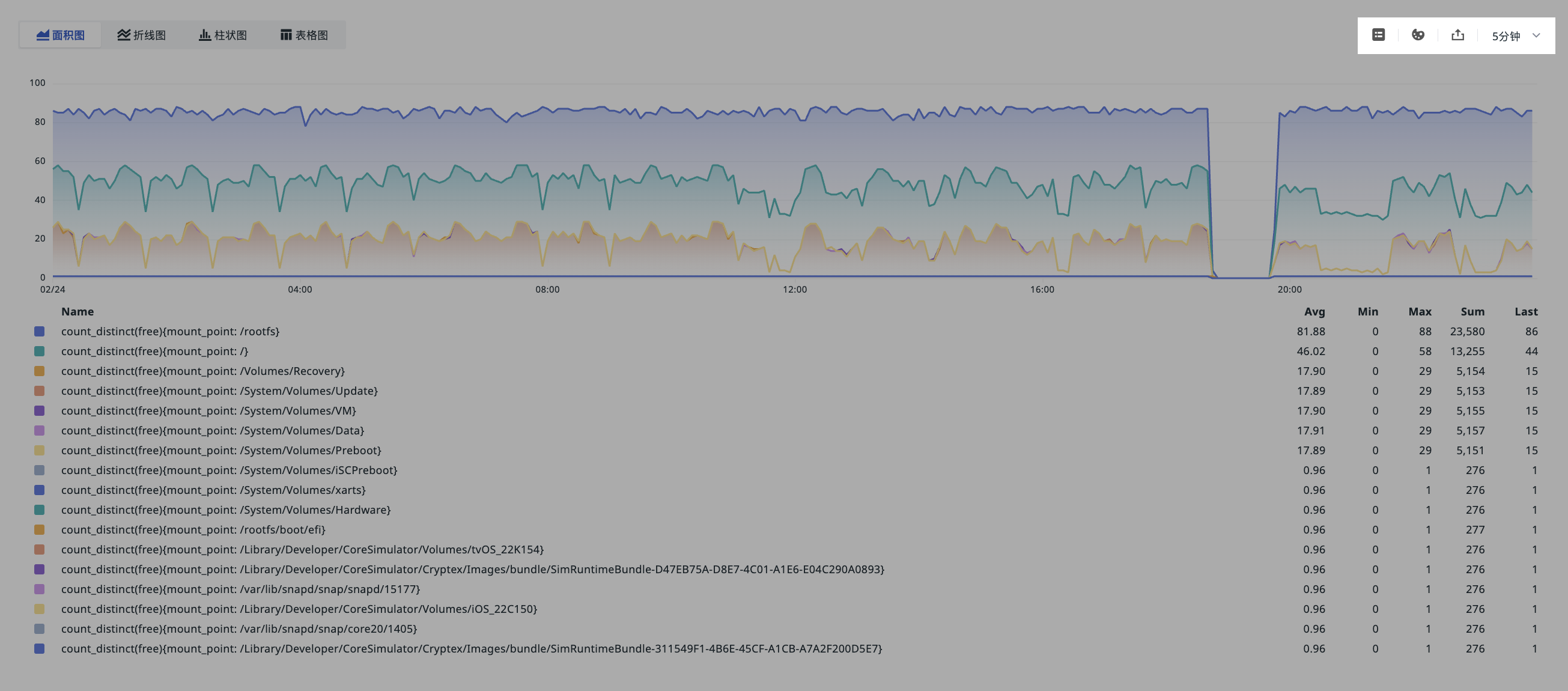
Query results can be viewed in four visualization modes: area chart, line chart, bar chart, or table chart.
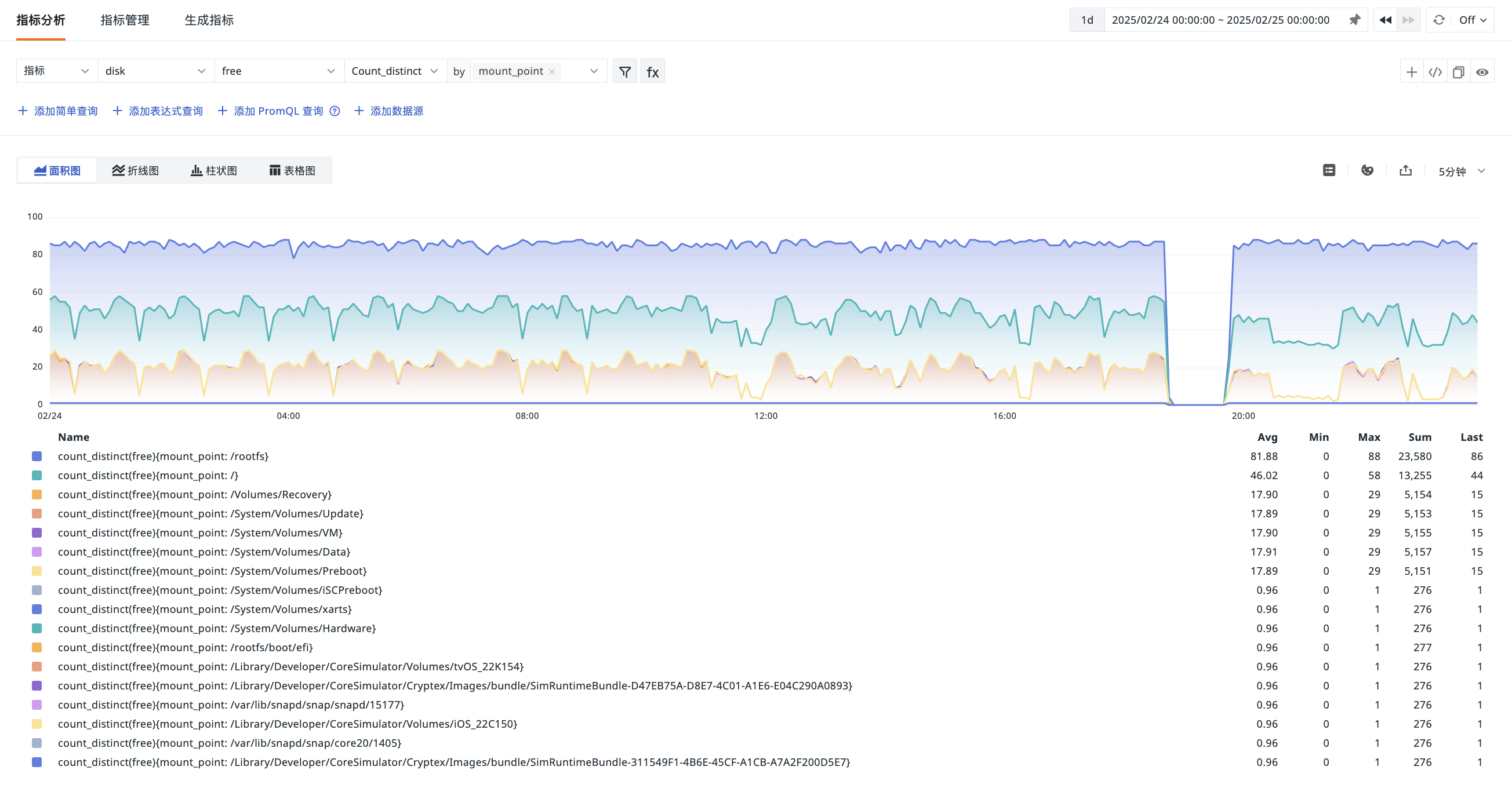
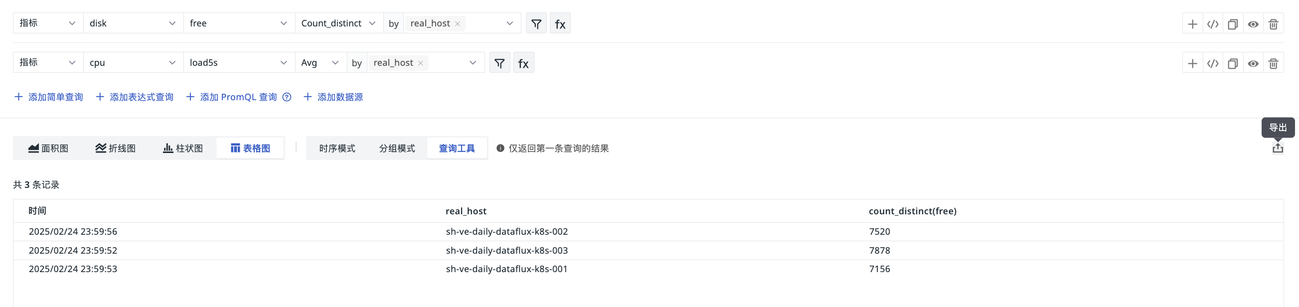
Table Chart
The table chart supports "Time Series Mode," "Grouping Mode," and provides a "Query Tool" for efficient analysis. The results returned by the query tool are consistent with those in "Shortcut > Query Tool." In Time Series Mode, you can display query data by selecting different time intervals.

-
Under all three modes, query results return up to 2,000 records by default. To adjust the number of returned records, you can specify the
slimitparameter, with a maximum of 10,000 data records. -
In "Query Tool" mode, if you add multiple queries and enable status, it defaults to returning the result of the first query; up to 2,000 records can be exported.
For more data query instructions, refer to Chart Query and Query Tool.
Managing Queries
Time Interval
A time interval refers to the time length between data points in a time series chart. You can set the time interval to 10 seconds, 20 seconds, 30 seconds, 1 minute, 5 minutes, and 10 minutes via the time interval option in the top-right corner of the Explorer.
Note: The time widget affects the data display range for metrics analysis, so the available time intervals automatically adjust based on the selected time widget range. For example, if you choose to view metrics data for the past 15 minutes, you cannot select "1 hour" as the time interval.
Legends
Legends are auxiliary elements in charts used to differentiate data through various colors, points, and shapes. You can hide legends or adjust their position to the bottom or right side using the legend button in the top-right corner of the Explorer.
Colors
To better distinguish trends in different metrics using color, you can click the color settings button  in the top-right corner of the Explorer to customize legend colors.
Export
After completing metrics analysis and obtaining query results, you can click the export button to choose exporting the chart to a dashboard, note, or copying it to the clipboard.
If you use a table chart for visualization, in addition to the above export options, you can also choose to export the data as a CSV file.