Time Series Chart
Generally used to display the trend changes of data at equal time intervals, and can also be used to analyze the effects and influences between multiple sets of metric data.
Chart types include:
- Line chart (selected by default)
- Bar chart
- Area chart
Use Cases
- View the trend changes of application performance metric data within a certain time range, such as the trend of application "request count" in the last 15 minutes.
- View the trend changes of user access metric data within a certain time range, such as the occurrence of user access "error count" in different time ranges.
- View similar trend metrics within a fixed time range.
- View related events triggered when data fluctuations are abnormal.
Chart Query
Supports five query methods:
- Simple query
- Expression query
- DQL query
- Promql query
- Data source query
Each query preset has 5 options for the number of returned results, including 5, 10, 20, 50, 100; by default, 20 pieces of data are returned. You can also manually input a value, with a maximum of 100 pieces of data.
For more detailed descriptions of chart query conditions, please refer to Chart Query.
Chart Configuration
For more details, please refer to Chart Configuration.
Style
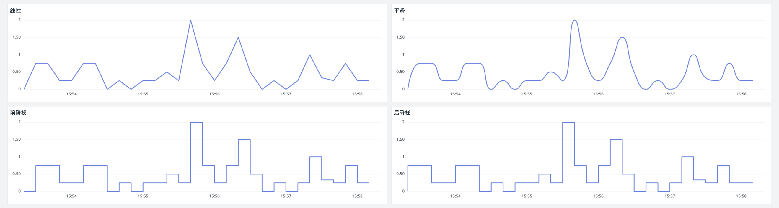
Line Chart
Four styles are available:
- Linear
- Smooth
- Step Before
- Step After
Area Chart
Two styles are available:
- Basic: Intuitively displays the trend of each data series, making it easy to observe the change trend of a single data series.
- Stacked: Suitable for multiple data series. Each data series is stacked sequentially, with the starting point of each series based on the end point of the previous series, making it easy to observe the cumulative effect of the overall data.
Connect Nulls
In time series charts, time points are automatically connected. If data for a certain time point is empty, a breakpoint will appear in the chart. By default, the system automatically connects the data before and after the breakpoint. By setting Connect Nulls, judgment errors regarding breakpoint data can be avoided.

Show Values
Applicable to Time Series Chart > Bar Chart.
When enabled, specific values will be displayed above the bars. Only the numerical value is displayed here, not the unit. If the number of decimal places is set to 0, 1, 2, or 3 in Basic Settings > Data Format, it will be displayed according to the set number of digits. If the number of decimal places is set to "Full Precision", two decimal places will be displayed by default. The display of the thousand separator will also follow this setting.

Time Interval
Refers to the calculation interval (interval) for querying data in the chart.
For example, when it is not possible to select or switch the time interval:
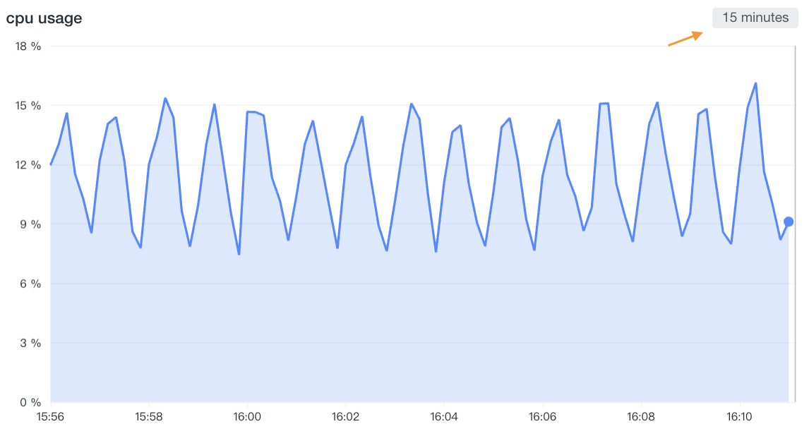
When enabled, the system dynamically adjusts the query based on the selected time range and aggregation time interval, and rounds the calculated time interval up.
At this point, the available time intervals will be listed based on the maximum number of points you entered:
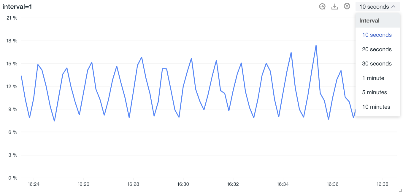
Execute the query according to the selected interval. When it conflicts with the "Maximum Returned Points", the interval will be adjusted preferentially according to "Time Range / By Maximum Points". Includes 10 seconds, 20 seconds, 30 seconds, 1 minute, 5 minutes, 10 minutes, 30 minutes, 1 hour, 6 hours, 12 hours, 1 day, 7 days, and 30 days.
Time Interval Logic Supplementary Explanation
The system has 18 built-in commonly used time interval options, including:
- 10ms, 50ms, 100ms, 500ms
- 1s, 10s, 20s, 30s
- 1m, 5m, 10m, 30m
- 1h, 6h, 12h
- 1d, 7d, 30d
When setting up the chart, the system will automatically recommend suitable time interval options based on the "Maximum Returned Points" configured in Chart > Advanced Configuration. If not set, the "Maximum Returned Points" defaults to 720.
For example, if you query data from the last 3 hours:
- If you choose
interval=10s, it will generate 1,080 data points, exceeding the default limit of 720 points, so it does not meet the requirement. - If you choose
interval=20s, there will only be 540 data points, which meets the requirement, and the system will automatically select this time interval for you. - If your chart queries metric data (
metric), the minimum time interval is 10s.
Maximum Returned Points
Refers to the maximum number of data points per series. You can input any integer between 2 and 1,000. If you do not customize it, the default maximum point limit is 720.
Note
- If the query range is too large and exceeds the maximum number of points, the system will recalculate the
intervalbased on the selected time interval and the maximum number of points, round it up, and return the data. - If the query returns too many results, the system will only show you the first 1,000 pieces of data.
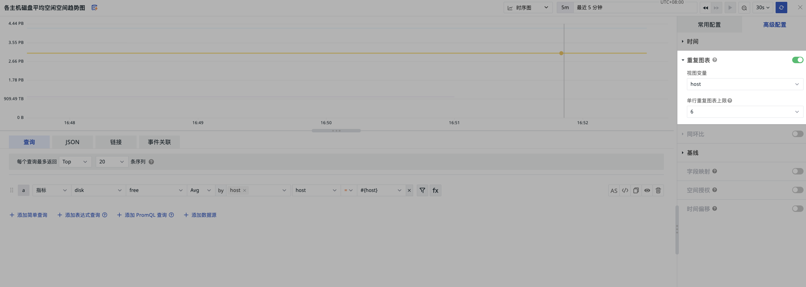
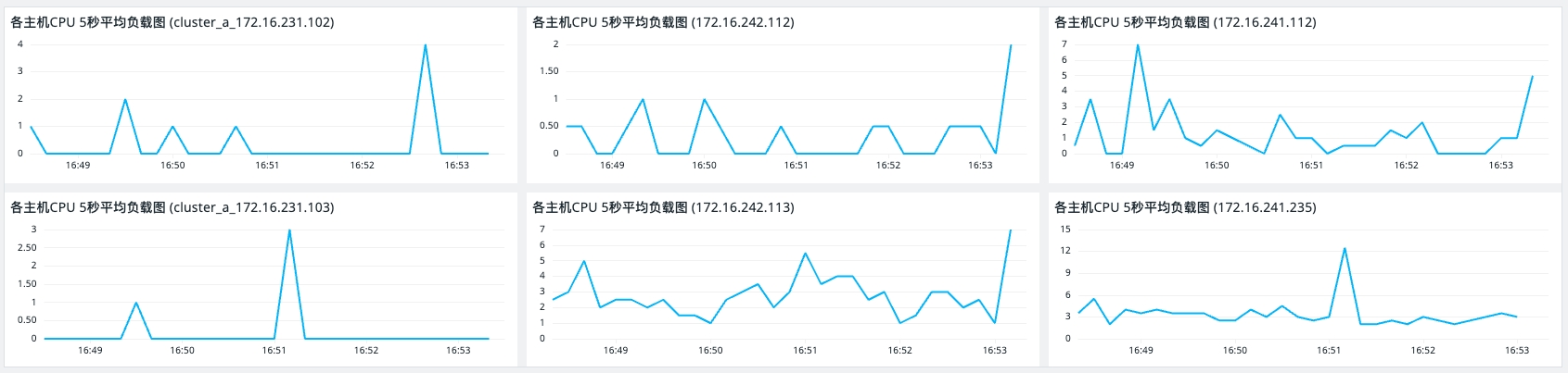
Repeat Chart
When enabled, the system generates independent charts with the same structure based on the various values of the selected view variable.
-
View Variable: Select the view variable of the current dashboard.
- When saving the chart, you must select a view variable; otherwise, you cannot successfully create a new chart.
-
Maximum Charts Per Row: Set the maximum number of charts that can be displayed per row. If exceeded, it will automatically wrap to the next line.
Example
As shown in the figure below, select host as the filter condition and set the maximum number of charts per row to 6:
Mixed Line and Bar Chart
Only supports bar charts.
Year-over-Year / Month-over-Month Comparison
Compares data with the data from the same period in the previous time unit. Displayed as off by default.
Comparison Dimension
When enabled, the comparison dimension supports the following options:
- Hour (compared with one hour ago)
- Day (compared with one day ago)
- Week (compared with one week ago)
- Month (compared with one month ago)
- Month-over-Month
Comparison Logic
- Default queried line chart: Drawn based on the selected
Start Time - End Time. - Comparison line chart for the same period: Drawn by pushing forward the same time range based on the selected comparison dimension.
Example
Take querying the CPU usage trend of Host A as an example:
-
Comparison dimension selected as "Hour":
- When querying "Last 1 hour" (3/2 10:00 - 3/2 11:00), the comparison time period is (3/2 09:00 - 3/2 10:00).
- When querying "Today" (3/2 00:00 - 3/2 11:00), the comparison time period is (3/1 23:00 - 3/2 10:00).
-
Comparison dimension selected as "Day":
- When querying "Last 1 hour" (3/2 10:00 - 3/2 11:00), the comparison time period is (3/1 10:00 - 3/1 11:00).
- When querying "Today" (3/2 00:00 - 3/2 11:00), the comparison time period is (3/1 00:00 - 3/1 11:00).
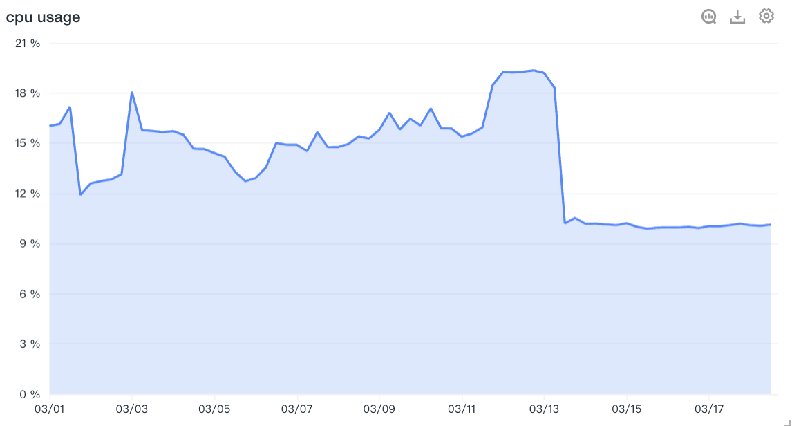
Chart Analysis
A time series chart is a two-dimensional graph indexed in chronological order, with the horizontal axis representing the time scale and the vertical axis representing the data scale. Based on the selected time range, the time series chart plots the trend changes of the target data during that period.
In a time series chart, a single query statement can return a maximum of 10 time series. If the result of the grouping (group by) condition exceeds 10, only the first 10 time series are displayed in order.
Timeline
In analysis mode, the timeline function of the time series chart allows you to preview how data changes over time through the timeline below the chart, and drag to select the time range to display. The timeline range is based on the selected time range, fixed to three query periods forward, and up to one query period backward (until the current time point).
For example, if the current time point is 11:33 and the time range selected is "Last 1 hour", then the timeline range is 10:33 - 11:33.
Similar Trend Metrics
"Similar Trend Metrics" refer to other metrics that, within a certain time range, have trend changes similar to the currently selected metric.
- On the time series chart, click on a data point, then click "View Similar Trend Metrics".
- In the new window, select a time range by dragging a box.
- Click "Start Search".
During the query, the system will use the box-selected time range as the benchmark to search for similar metric trends within the space.
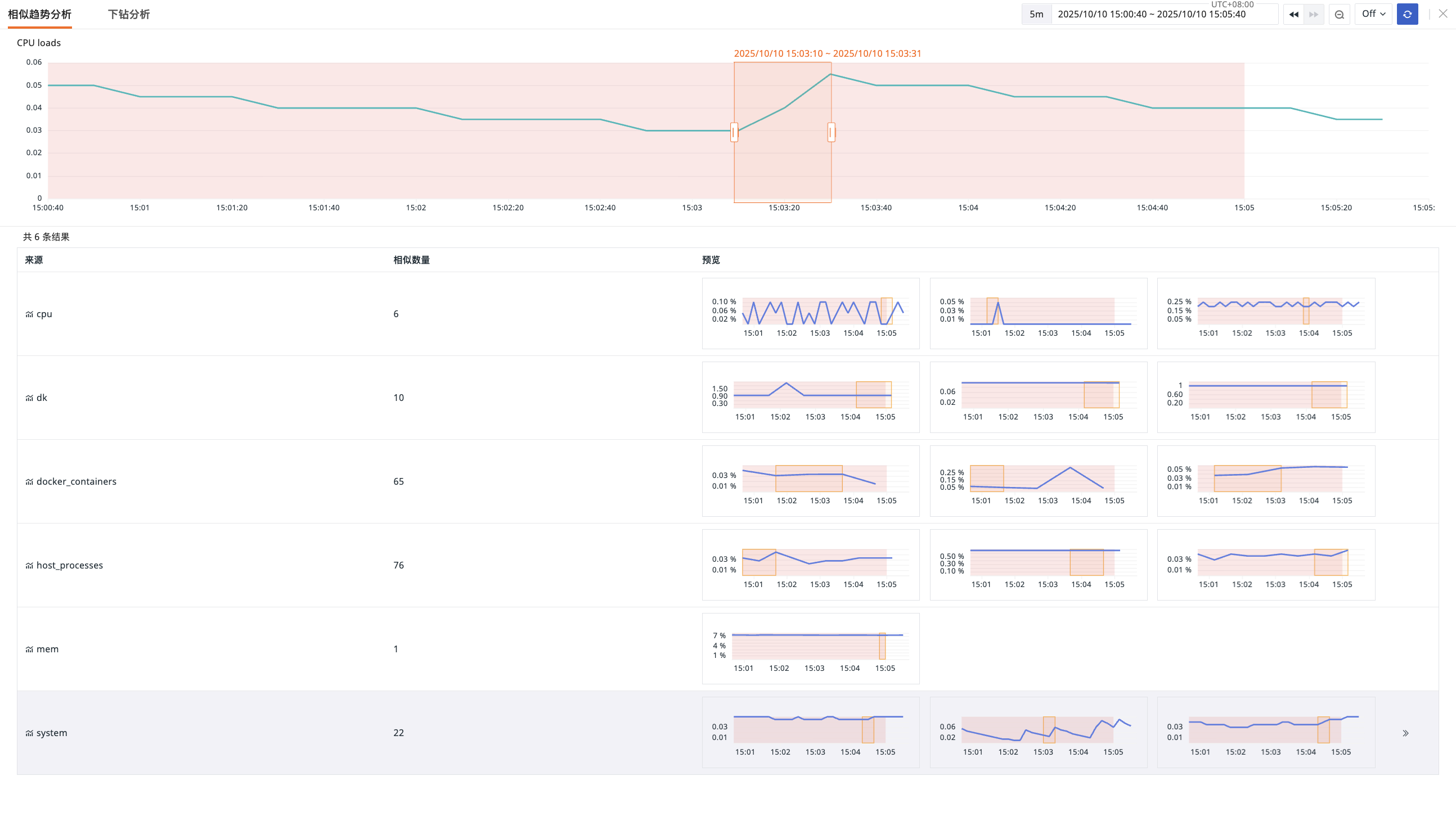
Similar Trend Results
Based on the selected absolute time range, the query result list contains the following:
| Description | |
|---|---|
| Source | The measurement where similar trend metrics exist |
| Similar Count | The number of charts with similar trends under the corresponding "Measurement" |
| Preview | Preview image of the similar trend chart |
Regarding similar trend results, please note:
- When querying a similar interval, the currently selected time range defaults to "Absolute Time" and will not change due to external factors or observer changes. If you need to change the time range, you need to readjust it.
- After entering the similar interval page, you can adjust the search time range by dragging the rectangle. Even if an area is already selected, you can still move or adjust the time range.
- After dragging to a new time range, you need to confirm or cancel the change.