Pie Chart
Generally used to display comparisons of data groups.
Chart types include:
- Pie Chart: Displays comparisons of data groups, more suitable for scenarios with fewer sample metrics
- Donut Chart: More suitable for reflecting the proportion of each part in multiple sample metrics
- Rose Chart: The size of the arc radius represents the size of the data, suitable for scenarios with too many classifications, and for comparing proportions and values of similar sizes
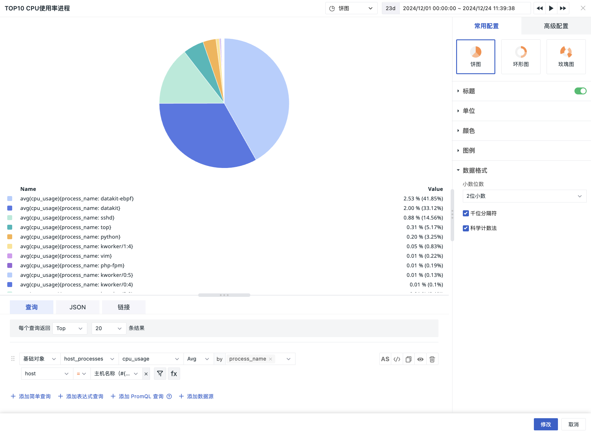
Chart Configuration
For more details, refer to Chart Configuration.
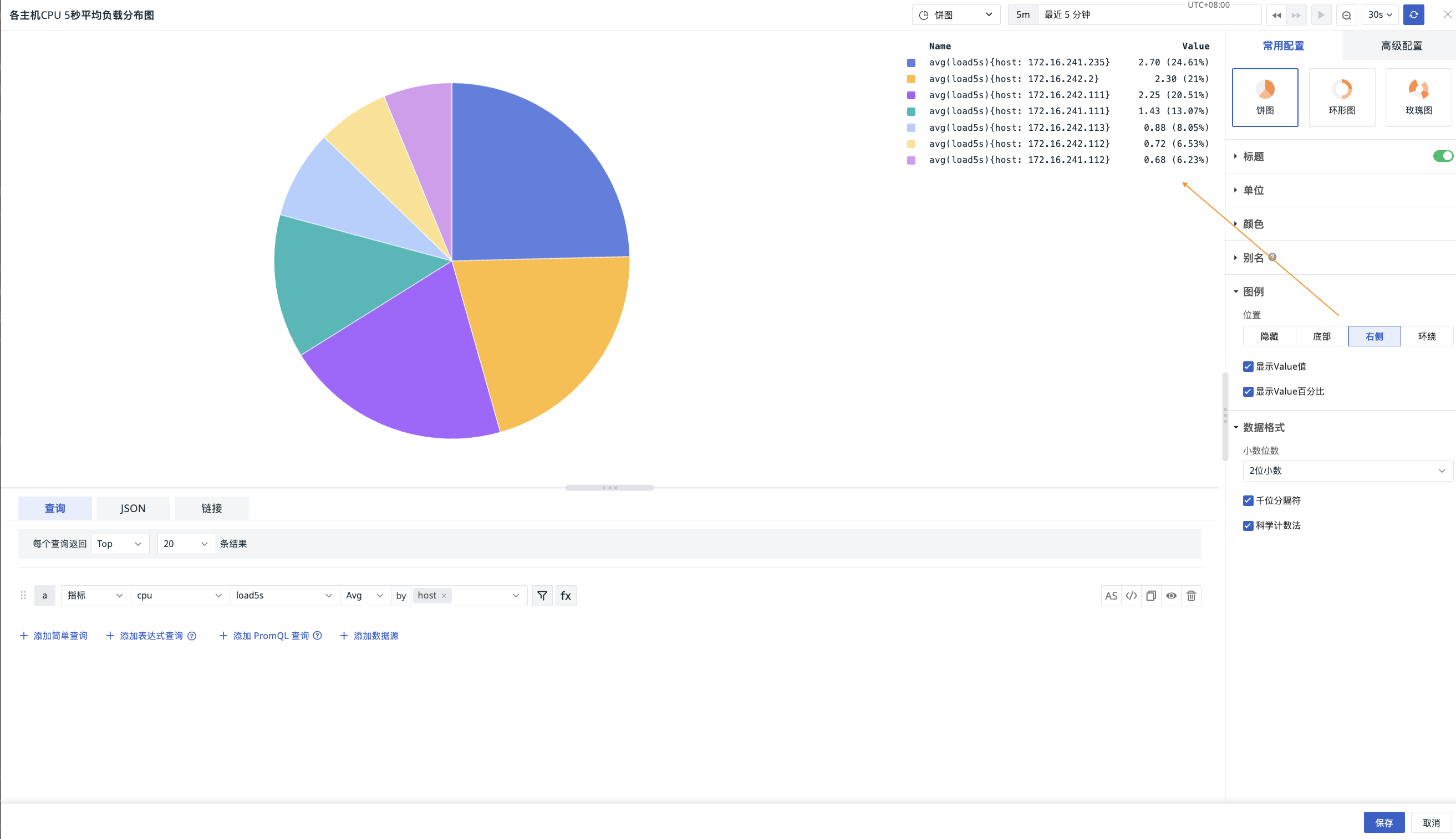
Legend
Supports selecting to hide, display at the bottom, right, or wrap around the legend. Clicking on a metric row in the legend can hide/show the corresponding metric.
When the legend is not hidden, you can choose whether to display the Value and Value percentage.
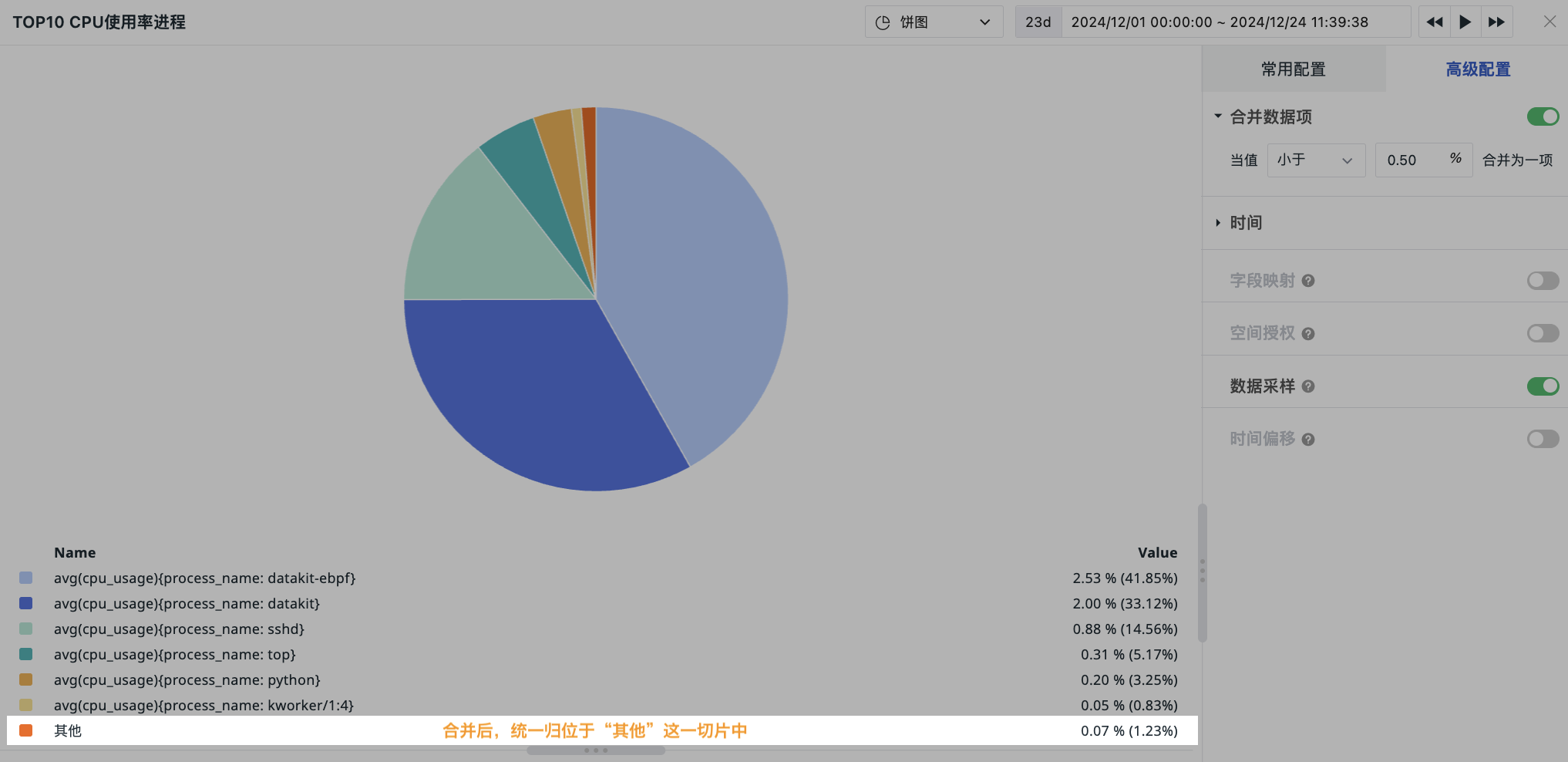
Merge Data Items
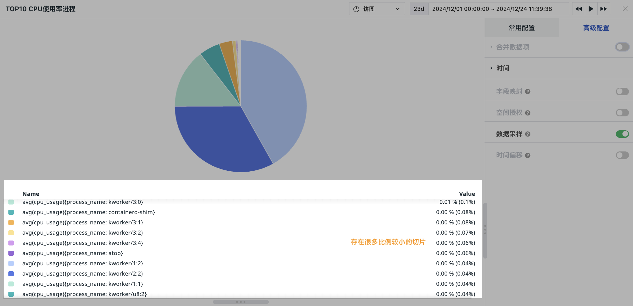
If there are too many small slices in the pie chart with low proportion, you can use merging to aggregate data into the "Other" slice, view slices with higher priority proportions, and improve the readability of the pie chart.
After configuring merging, the pie chart slice adds an "Other" slice, representing the aggregated display of merged data.
- Not merged:
- Merged: