Skip to content

Bubble


Overview

A bubble can be used to show the relationship between three variables, similar to a scatter. It is divided into horizontal and vertical axes, with the inclusion of variables indicating magnitude for comparison.
It indicates the general trend of the dependent variable with the independent variable, from which the trend can be selected to fit the empirical distribution with a suitable function, and then find the functional relationship between the variables. It can be used to observe the distribution and aggregation of data.
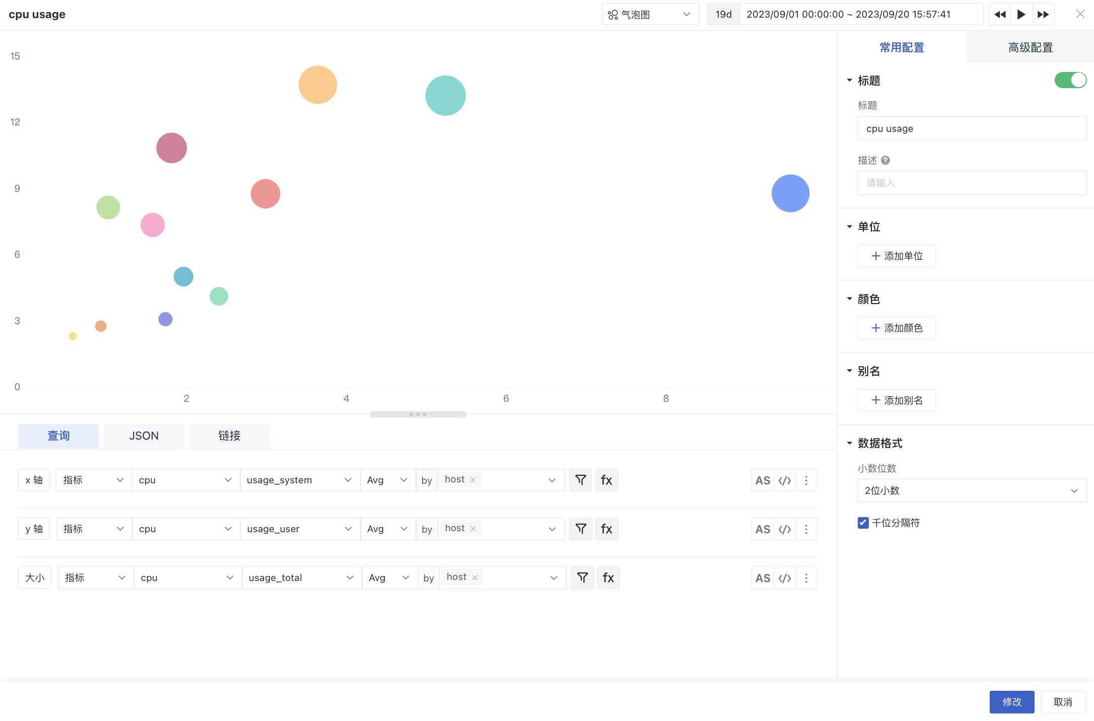
 For example, you can view the distribution and aggregation of total CPU usage, CPU system usage and CPU user usage across hosts.

Operations

Chart Query

Please click chart query for detailed explanation of the chart query conditions, and add x-axis, y-axis and size queries by default. There is no Add Query button. Measurements and metrics of the query can be different, but the by (grouping) Tag must be the same, and if one is modified, the other two are automatically modified in parallel.

Links can help you jump from the current chart to the target page, you can add internal links and external links to the platform and modify the corresponding variable values in the links through template variables to transfer the data information to complete the data linkage. Please click chart link to view the related settings.

Chart Style

Options Description
Chart Title It would be shown on the top left of the chart after setting the title name; it also supports hide.
Color It refers to the display color of the chart data, enabling you to manually input custom preset color. The format is aggregation function (metric) {"label": "label value"}, such as last(usage_idle){"host": "guance_01"}
Alias
  • You can add aliases to grouped queries. The name of the legend changes after adding aliases, making it easier to distinguish related metrics more intuitively.
  • You can input preset aliases in the format of aggregation function (metric) {"label": "label value"}, such as last(usage_idle){"host": "guance_01"}.
  • Chart Setting

    Basic Setting

    Options Description
    Unit 1. You can set units for query results.

    1)If the queried data has no unit, it will be displayed on the chart according to the set unit after setting the unit in the chart.

    2)If the query data comes with its own units, or if you set the units for the metrics in Metric Management, the units set in the chart will be displayed on the chart.

    3)If the query data has no units and no units are set in the chart, the chart Y-axis values are automatically calculated according to scientific notation; the original values are displayed on the chart in the format thousandths.

    Scientific counting instructions:
    Default query result value is automatically converted to units, display follows scientific notation K, M and B (1 thousand = 1K, 1 million = 1M, 1 billion = 1B), retaining two decimal points; RMB is automatically converted to units yuan, million, billion, retaining two decimal points.

    For example: The time interval of the unit is selected in ns, then according to the size of the data, the query results only automatically convert the unit effect as follows, and so on:
  • 1000000ns: chart query data results are displayed as 1ms
  • 1000000000ns: chart query data results are displayed as 1s
  • 10000000000ns: chart query data results are displayed as 1m

    2. You can preset units for the query results and manually input format as: aggregation function (metric), such as last(age_idle)
  • Advanced Setting

    Options Description
    Time slice When time slicing is turned on, the original data will be aggregated in segments at certain time intervals, and then the aggregated data set will be aggregated a second time to get the result value, which is turned off by default. For details, please refer to time slicing description.
    Lock time Support locking the time range of chart query data, not limited by the global time component. The time set by the user will appear in the upper right corner of the chart after successful setup, e.g. 【xx minutes】, 【xx hours】, 【xx days】. If the time interval is locked at 30 minutes, then when adjusting the time component, no matter what time range view is queried, only the last 30 minutes of data will be displayed.
    Time interval If the time slice is off, there is no time interval option; if the time slice is on, the time interval option is as follows:

  • Original interval: query and display data according to the time range of the time component by default.

  • Auto-alignment: When turned on, the query will be dynamically adjusted according to the selected time range and aggregation interval, rounded up according to the calculated time interval. (For example, if the automatic aggregation algorithm calculates the time interval to be 50 seconds, then the actual query will be launched according to the time interval of 1 minute) The system presets 1 ms, 10 ms, 50 ms, 100 ms, 500 ms, 1 second, 5 seconds, 15 seconds, 30 seconds, 1 minute, 5 minutes, 10 minutes, 30 minutes, 1 hour, 6 hours, 12 hours, 1 day, 1 week, 1 month, and many time interval.

  • Custom time interval: When 【Lock time】 is selected, according to the length of lock time, different optional time intervals will be automatically matched to query the displayed data. (For example, if you select 1 minute as the time interval, the query will actually be launched at 1 minute interval)
  • Field mapping The object mapping function with view variables is off by default, if object mapping is configured in the view variables:
  • When field mapping is enabled, the chart displays the 「grouped fields」 of the query and the corresponding 「mapped fields」, and the grouped fields without specified mapping are not displayed.
  • When field mapping is turned off, the chart is displayed normally, without the mapped fields
  • Chart Description Add description information to the chart, after setting the chart title will appear behind the 【i】 prompt, do not set it will not be displayed
    Workspace A list of authorized workspaces, which can be queried and displayed via charts after selection

    Example

    The following figure shows the distribution and aggregation of total CPU usage, CPU system usage and CPU user usage for different hosts for the last 15 minutes.

    Feedback

    Is this page helpful? ×