Overview Chart
The Overview Chart clearly displays the result value of a key metric or indicator and supports mixed line charts to help understand metric trends.
Use Cases
- Visually display data result values
- View a key data point, such as: RUM PV/UV
Chart Configuration
For more details, refer to Chart Configuration.
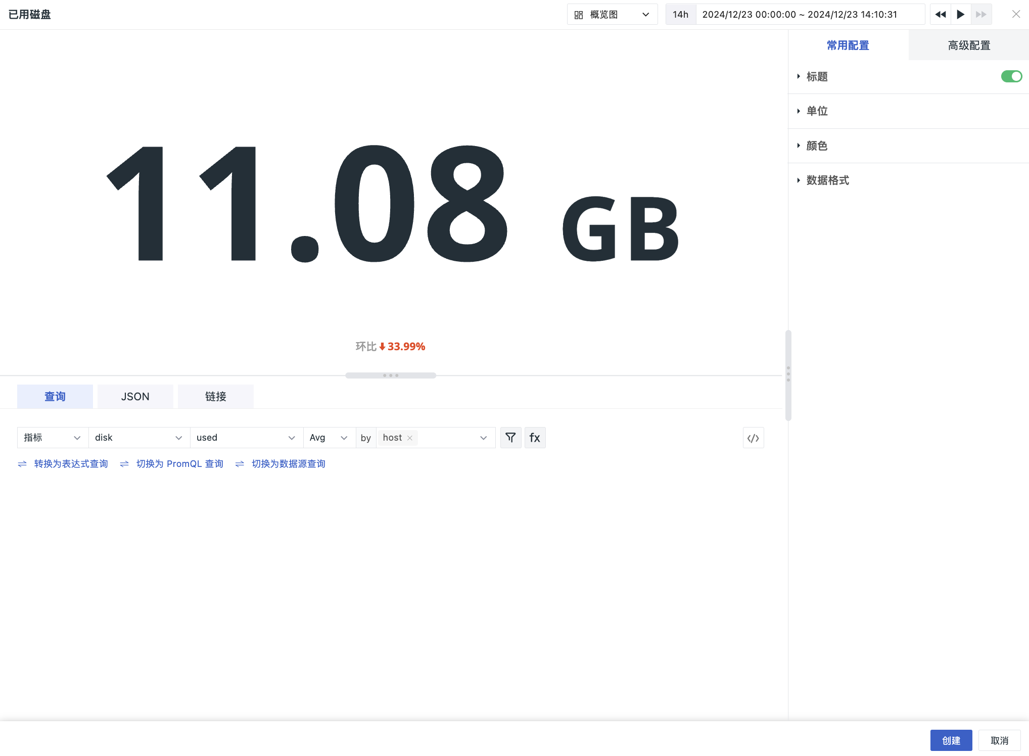
Same Period Comparison
Compare with data from the same period in the previous time cycle. It is disabled by default. If data is missing in the compared time range, it is directly displayed as N/A, for example: Week-over-week N/A.
Comparison Dimensions
After enabling, the comparison dimensions support the following options:
- Hour (compared to one hour ago)
- Day (compared to one day ago)
- Week (compared to one week ago)
- Month (compared to one month ago)
- Chain Ratio
Comparison Logic
Below the value in the Overview Chart, the increase/decrease percentage is displayed.
The percentage calculation result is: (Current query result - Comparison query result) / Comparison query result * 100%.
Examples
| Dimension | Query Logic | Current Query Time Range | Comparison Query Time Range | Percentage Display |
|---|---|---|---|---|
| Hour | Push back 1h | 【1h】3/2 10:00-3/2 11:00 | 3/2 09:00 - 3/2 10:00 | Compared to one hour ago xx% ⬆ |
| Today/Yesterday/Last week/This week/This month/Last month | No comparison | None | ||
| Day | Push back 24h | 【1h】3/2 10:00-3/2 11:00 | 3/1 10:00 - 3/1 11:00 | Day-over-day xx% ⬆ |
| 【Today】3/2 00:00:00 - Current time | 3/1 00:00:00 - 23:59:59 | Day-over-day xx% ⬆ | ||
| Last week/This week/This month/Last month | No comparison | None | ||
| Week | Push back 7d | 【1h】3/2 10:00 - 3/2 11:00 (Wednesday) | 2/23 10:00 - 2/23 11:00 (Last Wednesday) | Week-over-week xx% ⬆ |
| 【Today】3/2 00:00 - 3/2 11:00 (Wednesday) | 2/23 00:00:00-23:59:59 (Last Wednesday all day) | Week-over-week xx% ⬆ | ||
| 【This week】2/28 00:00 - Current time (Monday to Wednesday) | 2/21 00:00:00 - 2/27 23:59:59 (Last entire week) | Week-over-week xx% ⬆ | ||
| This month/Last month | No comparison | None | ||
| Month | Push back 1mo | 【3d】3/2 10:00 - 3/5 10:00 | 2/2 10:00 - 2/5 10:00 | Month-over-month xx% ⬆ |
| 【Today】3/2 00:00:00 - Current time | 2/2 00:00:00 - 23:59:59 (Last month 2nd all day) | Month-over-month xx% ⬆ | ||
| 【This month】3/1 00:00:00-Current time | 2/1 00:00:00 - 2/28 23:59:59 (Last entire month) | Month-over-month xx% ⬆ | ||
| 【3d】3/26 10:00 - 3/29 10:00 | 2/26 10:00 - 2/28 23:59:59 (Because February does not have the 29th) | Month-over-month xx% ⬆ | ||
| Last week/This week | No comparison | None | ||
| 【1d】3/29 10:00 - 3/30 10:00 | No comparison (February does not have 29th, 30th) | None |
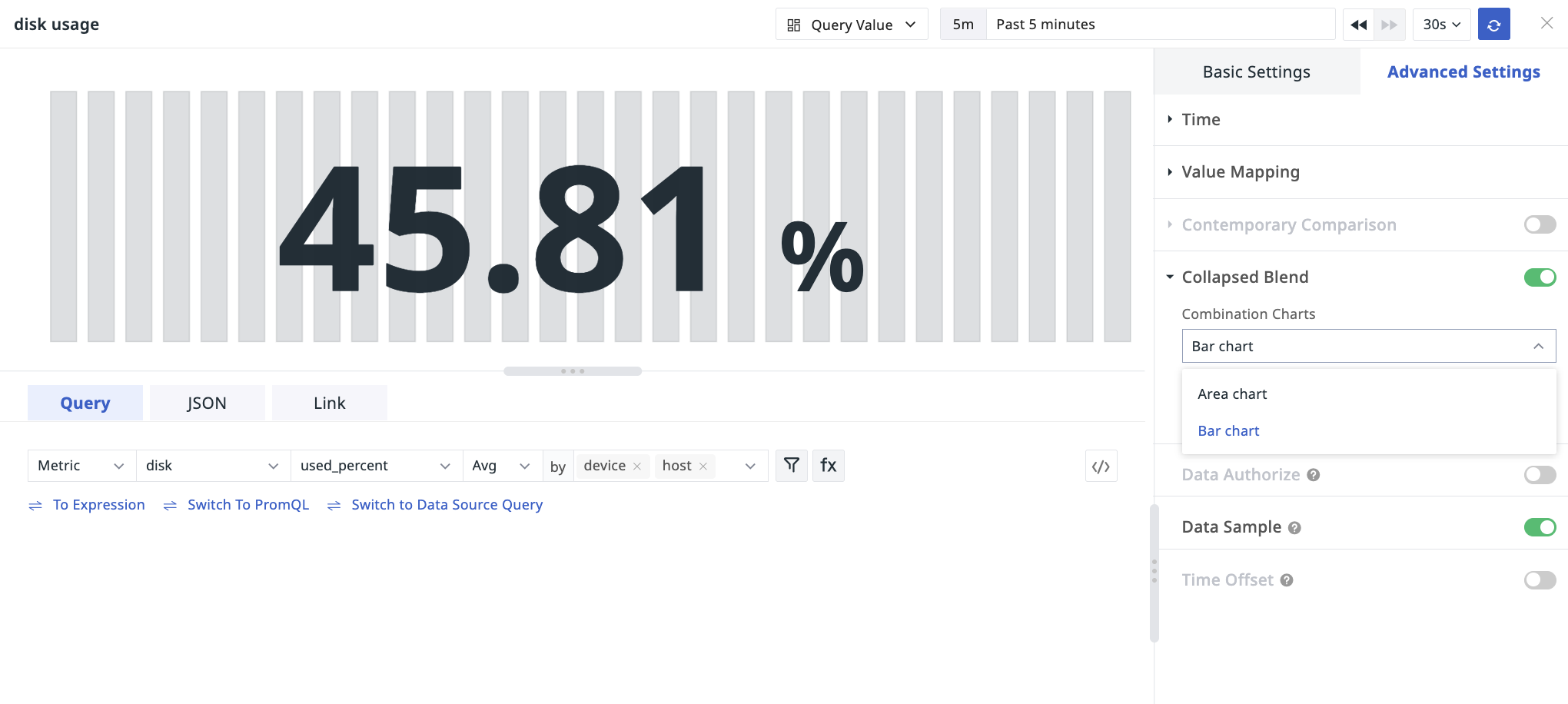
Mixed Chart
After enabling, you can choose an area chart or bar chart to display simultaneously on the current chart, helping to query both the current metric value and its trend.
You can also check to display the chart's coordinate axes as needed.