Command Panel
The command panel consists of command buttons, used to achieve interactive effects in views, supporting jumps, opening links, and executing commands.
Command Buttons
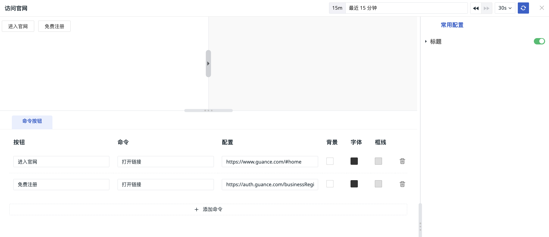
- Button: Add text content inside the button.
-
Command: Choose to open a link or execute a command.
-
Configuration:
-
If Open Link is selected, enter the URL link
-
If Execute Command is selected, enter the corresponding parameters
-
-
Colors:
- Background Color: The fill color of the button
- Font Color: The font color of the button
- Border Color: The border color of the button
Additional Notes
Through the Websocket connection mode, custom function scripts from the local Func can be synchronized to the workspace, and the corresponding functions can be called or results obtained in the command panel.
For more details, refer to Advanced Functions.