Beehive Plot
Display data situations under different groupings. The color depth of the color blocks represents the size of the data. It can be used to monitor assets and infrastructure.
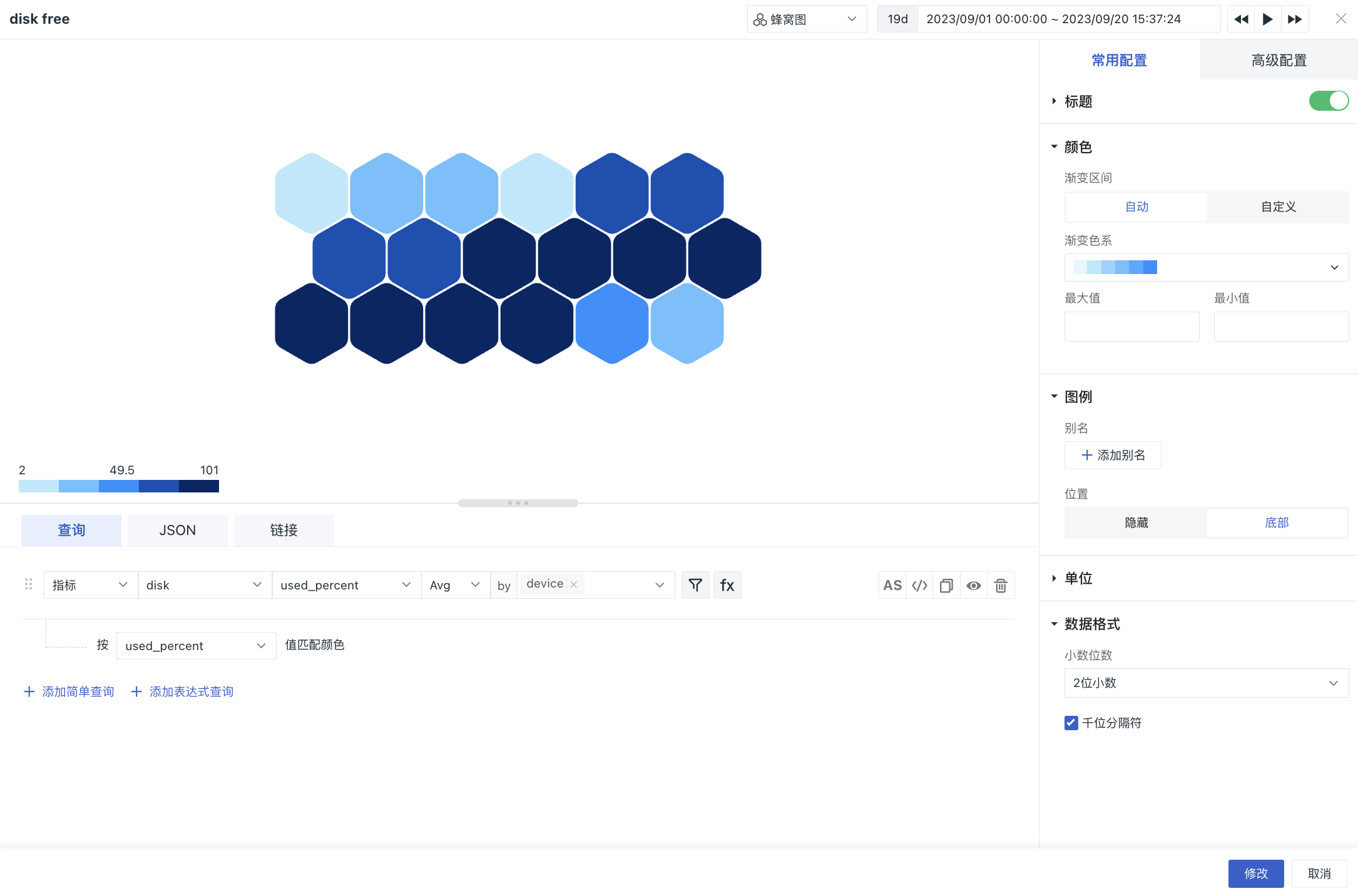
Chart Configuration
For more details, refer to Chart Configuration.