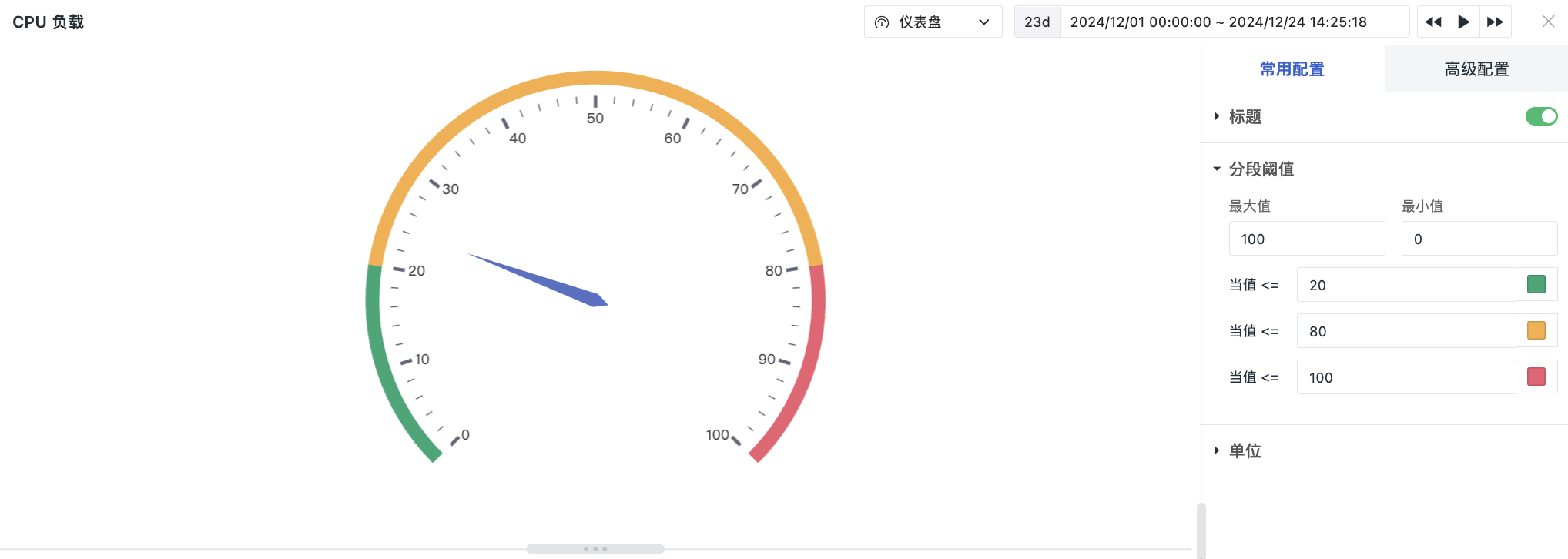
Dashboard
Can clearly display the range where the metric data values are located, suitable for cutting through messy data to highlight key points.
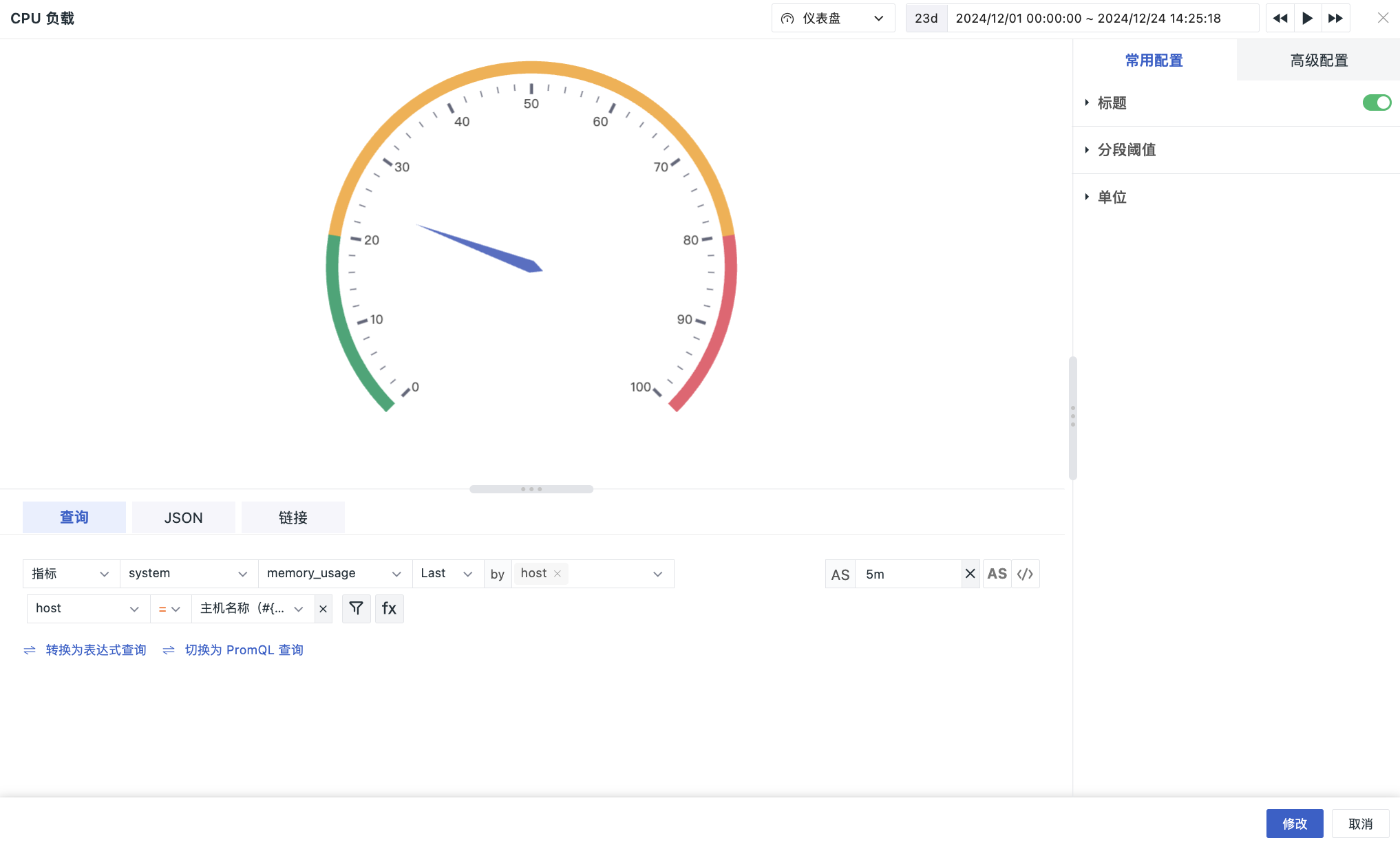
Chart Query
Supports Simple Query, Expression Query, PromQL Query.
Note
- Single chart query only supports one query statement, defaults to simple query. You can click to switch to expression query, and switching between them is supported. DQL queries also support switching;
- If transformation functions unsupported by expression queries are used in simple queries, these functions will not be carried over when switching to expression queries.
For more detailed descriptions of chart query conditions, please refer to Chart Query.
Chart Configuration
For more details, please refer to Chart Configuration.
Segment Threshold
Set segment threshold values and dial colors for numerical values. Also set colors for corresponding thresholds.