Skip to content

Sankey Diagram

A Sankey diagram is a special type of flow diagram used to display the flow of data or energy. For example, it can show the flow of users from one page to another, or the energy transfer between different parts of a system. With a Sankey diagram, you can quickly understand the flow and distribution of data.
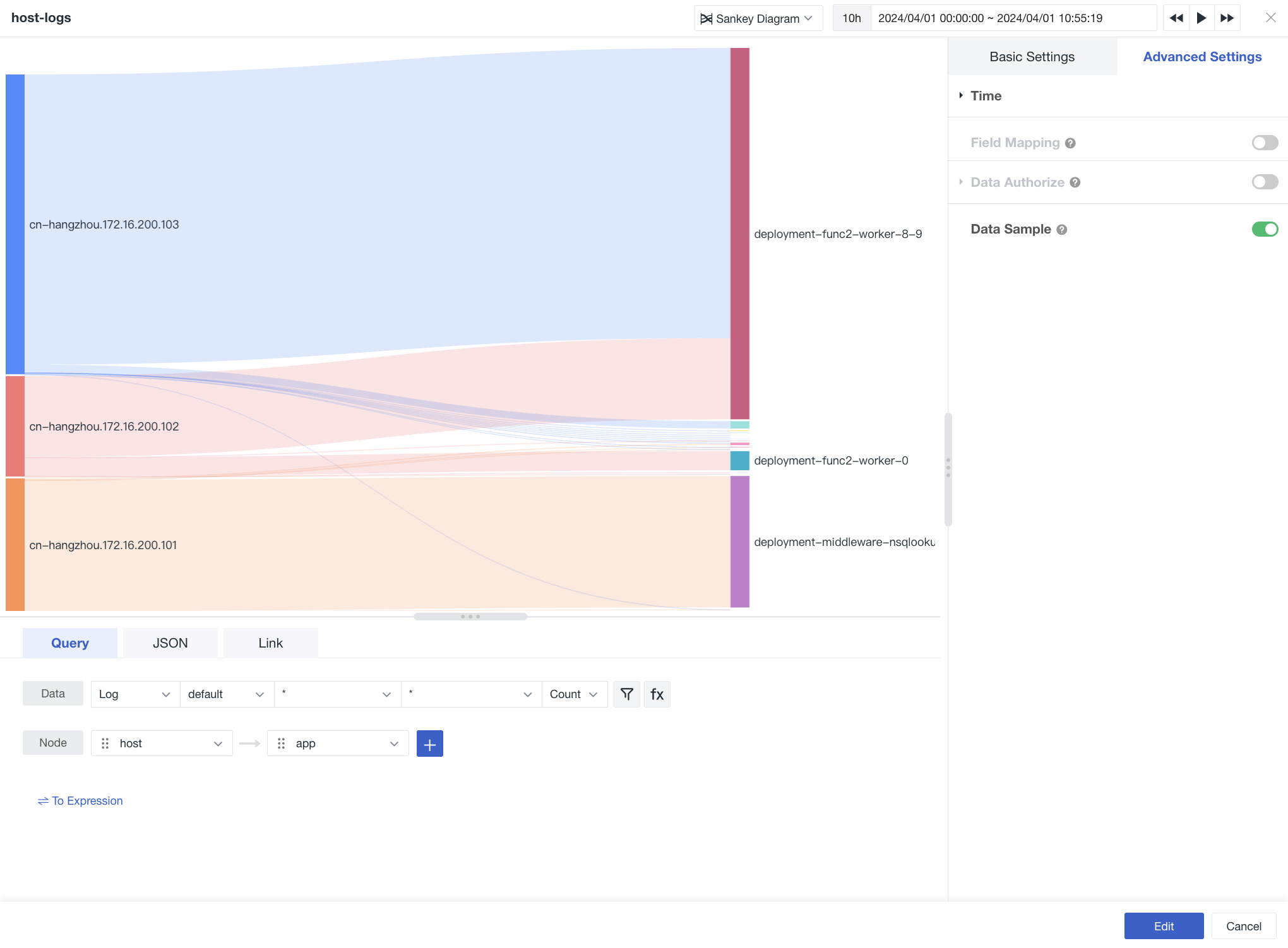
Chart Query

  • Data: Query data such as metrics, logs, events, etc.
  • Node: Two options are displayed by default, you can select them from the drop-down list or enter to create custom; Up to 4 nodes can be added; You can drag to adjust the order of the nodes.

Basic Settings

Options Description
Chart Title Set the title for the chart, after setting, it will be displayed on the top left of the chart, and it supports hiding
Description Add a description to the chart, after setting, an "i" prompt will appear behind the chart title, if not set, it will not display.
Unit Default unit display:
  • If the queried data is metric data, and you have set units for the metrics in Metric Management, it will be displayed in the units of the metrics by default;
  • If there is no relevant unit configuration in Metric Management, it will be displayed in thousandths comma-separated value carry-over method.
    After configuring the unit:
    It will prefer to display the unit you have custom configured, metric data supports two options for numerical values:

    Scientific Counting Explanation
    Default carry-over: Units are in ten thousand, million, such as 10000 displayed as 1 ten thousand, 1000000 displayed as 1 million. Keep two decimal places;
    Short difference system: Units are in K, M, B. That is, in Chinese context, it represents thousand, million, billion, trillion and so on. For example, 1000 is 1k, 10000 is 10k, 1000000 is 1 million; Keep two decimal places.
  • Color You can set the font color and background color for the chart.
    Data Format You can choose the "Decimal Places" and "Thousand Separators".
  • Thousands separator is turned on by default, if turned off, it will display the original value, without separators. For more details, see Data Thousand Format.
  • Advanced Settings

    Options Description
    Lock Time That is, fix the time range of the current chart query data, not subject to the restrictions of the global time component. After successful setting, the user-defined time, such as "xx minutes", "xx hours", "xx days", will appear in the upper right corner of the chart.
    Time Slicing After turning on time slicing, the original data will be segmented and aggregated at certain intervals, and then the aggregated data set will be aggregated again to get the result value, which is turned off by default.

    If time slicing is turned off, there is no time interval option; If time slicing is turned on, the time interval options are as follows:
  • Auto Alignment: After turning on, it will dynamically adjust the query according to the selected time range and aggregation time interval, and round up the calculated time interval.
     The system has preset a variety of time intervals: 1 millisecond, 10 milliseconds, 50 milliseconds, 100 milliseconds, 500 milliseconds, 1 second, 5 seconds, 15 seconds, 30 seconds, 1 minute, 5 minutes, 10 minutes, 30 minutes, 1 hour, 6 hours, 12 hours, 1 day, 1 week, 1 month;
  • Custom Time Interval: When selecting "Lock Time", according to the length of the locked time, automatically match different optional time interval queries to display data. (For example: If the time interval is selected as 1 minute, then it will actually query at 1 minute intervals)


    For more details, see Time Slicing Explanation.
  • Field Mapping Cooperate with the object mapping function of the view variable, default is off, if object mapping is configured in view variable:
  • When field mapping is turned on, the chart displays the grouped field and corresponding mapped field queried, and the grouped fields that have not specified mapping do not display;
  • When field mapping is turned off, the chart displays normally, and does not display mapped fields.
  • Data Authorize The list of authorized workspaces, after selection, can query and display the data of this workspace through the chart.
    Data Sampling Only for Doris log data engine workspace; After turning on, it will sample query data other than "metrics", the sampling rate is not fixed, and will be dynamically adjusted according to the size of the data.

    Feedback

    Is this page helpful? ×