Table Chart
Table charts have the characteristic of visually displaying statistical information attributes while reflecting relationships between data.
Includes two chart types:
- Grouped Table Chart (selected by default)
- Time Series Table Chart
Chart Query
Supports adding multiple queries, but the grouping tags of all queries must be consistent. When modifying the grouping tag of any query, the grouping tags of other queries will automatically update in sync.
Metric Sorting
By default, sorting is based on the first query's metric, with a dropdown selection returning 5 to 200 entries (manual input allows a maximum of 2000).
- Clicking the table header toggles ascending or descending order, and the Top/Bottom settings in the query are automatically adjusted accordingly.
- When clicking to sort by another query's metric, the corresponding Top/Bottom settings are also updated to the currently selected metric.
For more details, refer to Chart Query.
Chart Configuration
For more details, refer to Chart Configuration.
Enable Pagination
Once pagination is enabled, you can select the number of entries displayed per page in the chart, including 10, 20, 50, and 100 entries.
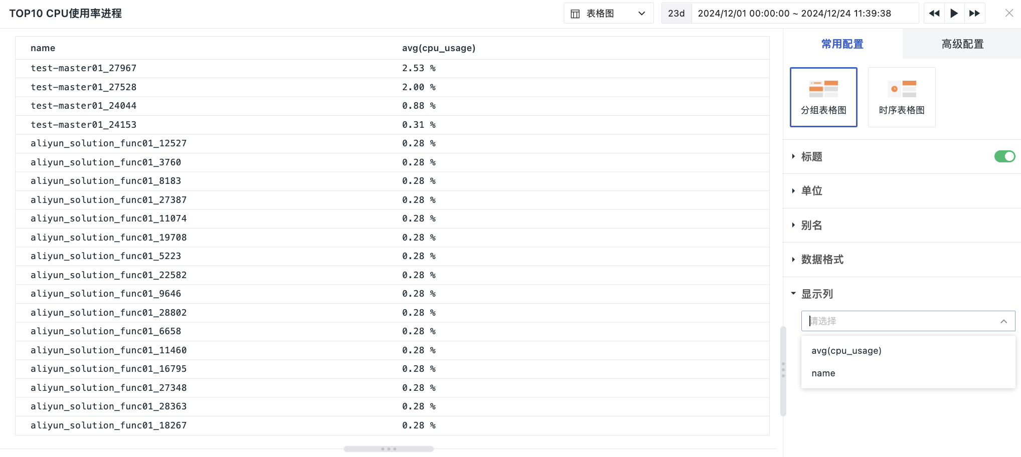
Display Columns
This allows you to choose which columns of the queried data to display. If there are many columns, you can manually input custom column names. The final query result values can be used as Value Variables for link navigation.
In the chart's edit mode, you can manually adjust column widths. After saving the chart, the list information will be displayed according to the set column widths. You can also drag to adjust the order of the display columns, and the list will be shown sequentially based on the configured order.