Visualization Charts
Guance provides over 30 standardized visualization chart types to meet diverse data presentation needs. Through advanced features like view variables and chart linking, data linkage between charts can be achieved, enabling the construction of personalized, professional monitoring views.
Adding Charts
-
Enter the dashboard page.
-
Start adding a chart.
-
Select the desired chart type.
-
Click Create to complete the addition.
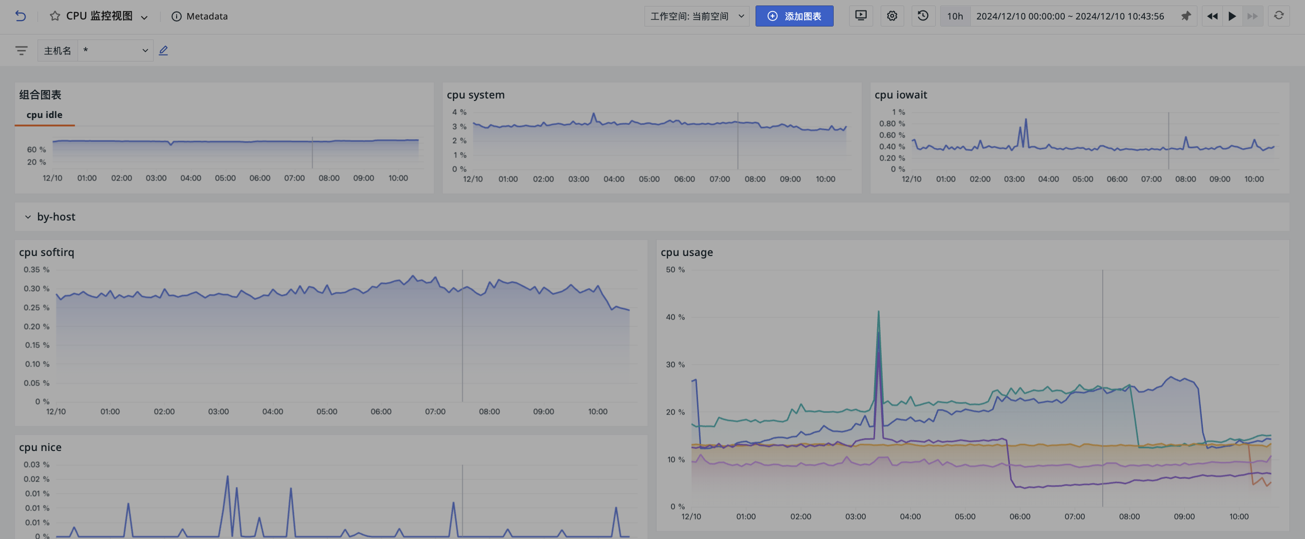
Chart Types
Trends and Comparisons
-
Time Series Chart: Used to display data trends over time.
- Time Series Line Chart
- Time Series Bar Chart
- Time Series Area Chart
-
Grouped Bar Chart: Used to show comparisons between items.
- Grouped Bar Chart
- Grouped Bar Chart (Horizontal)
-
Top List: Used to display the ranking of grouped data over a period of time.
-
Overview Chart: Used to display a key numerical value or metric.
Proportions and Composition
-
Pie Chart: Used to show proportional relationships of data.
- Pie Chart
- Donut Chart
- Rose Chart
-
Treemap: Used to show the proportion of different categories, making efficient use of space and capable of displaying more data compared to pie charts.
-
Funnel Chart: Used to show conversion rates in business processes.
-
Sankey Diagram: A special type of flow diagram used to display the flow of data or energy.
Relationships and Distributions
-
Scatter Plot: Presents data as points, used to show the relationship and degree of influence between two variables.
-
Bubble Chart: Used to show the relationship and degree of influence among three variables, with bubble size representing the third variable.
-
Cellular Map: Used to display the distribution of multiple data groups, with color intensity of cells indicating data magnitude.
-
Topology Map: Used to show relationships and relative positions between different entities.
-
Histogram: Also known as a mass distribution chart, it uses a series of columns of varying heights to represent data distribution.
-
Heatmap: Uses color intensity changes to represent data density or intensity, typically using gradients to represent different value ranges.
Tables and Lists
-
- Grouped Table Chart: Displays data metrics for different categories or groups.
- Time Series Table Chart: Displays data trends over time.
-
Data List: Displays time series data lists from sources like logs, APM, infrastructure, etc., allowing customization of the data range and displayed columns.
-
Dashboard List: A navigation-type Panel that displays dashboard links according to grouping rules, supporting click-to-jump.
Monitoring and Alerting
-
SLO: Requires direct selection of a pre-configured SLO monitor to display related performance data.
-
Gauge Chart: Used to show the progress or completion status of a metric.
-
Alert Statistics Chart: Displays unrecovered alert events in a list format for quick identification and response to urgent system issues.
-
Monitor Summary: Automatically queries monitor events from the last 2 days and displays the status of the most recently triggered event for each monitor.
Geographic Space
-
China Map: Used to show distribution across different geographic locations within China, with color intensity indicating data magnitude.
-
World Map: Used to show data distribution across different geographic locations worldwide, using color to represent data magnitude.
Multimedia and Embedding
-
Text: Used to add prompts, descriptions, and various content in Markdown format, such as text, images, and hyperlinks.
-
Picture: Displays images in a dashboard, supporting addition via image URLs and providing multiple display options like fill, fit, stretch, and center.
-
Video: Allows displaying video content in a dashboard by adding a video URL, enhancing information delivery.
-
Command Panel: Consists of command buttons, allowing users to execute specific commands or jump to specified links by clicking.
-
IFrame: Used to embed external pages within a dashboard, supporting both https and http links.
Chart Settings
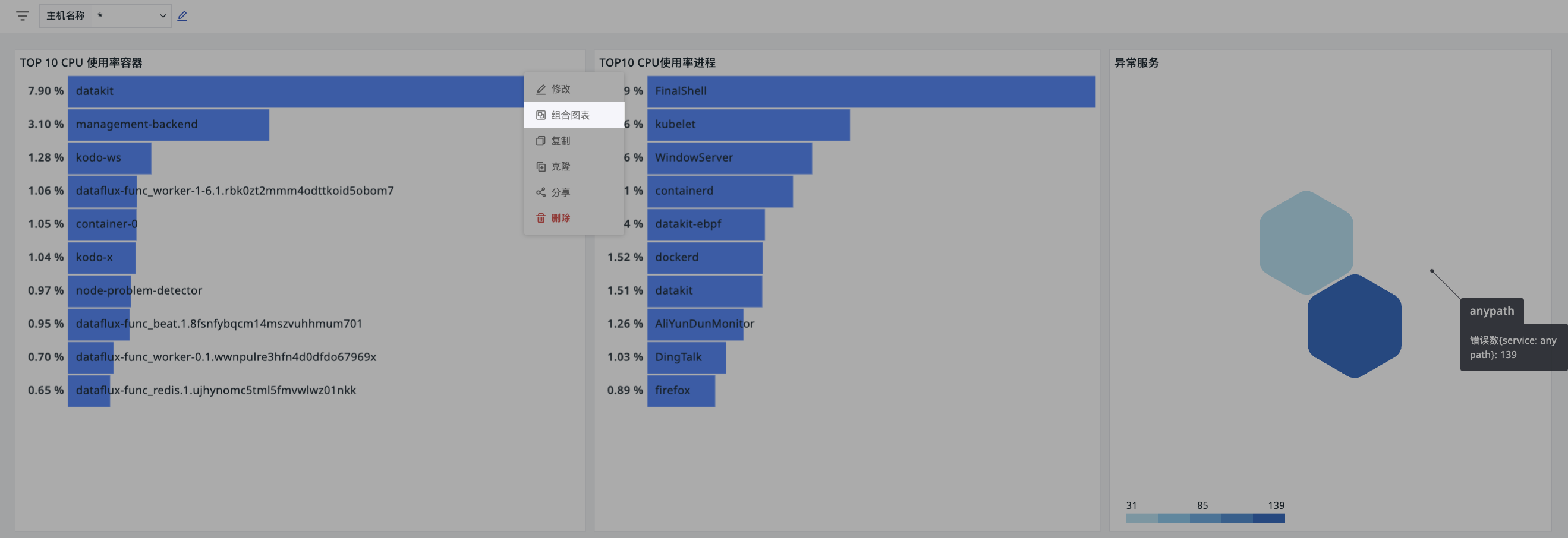
On the dashboard page, click the Options button in the upper right corner of a chart to perform the following external settings:
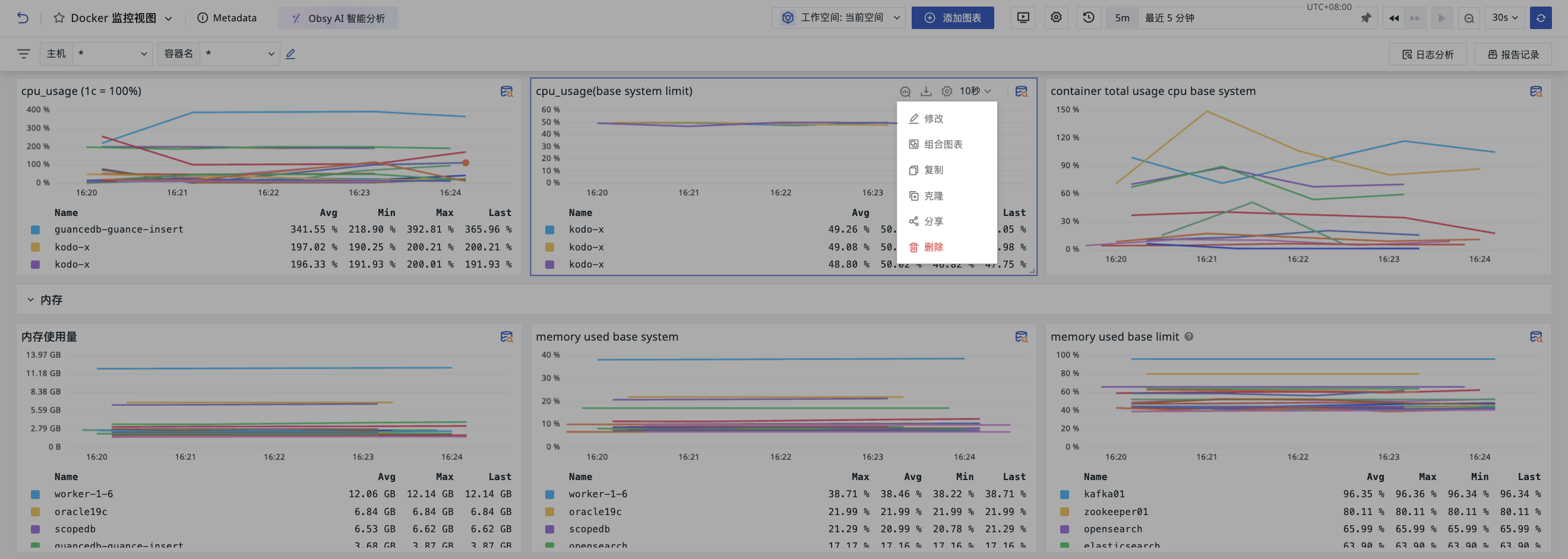
- Modify: Edit chart configuration.
- Combine Charts.
- Copy: Copies all configurations of this chart; can be used in the current or other dashboards/notes.
- Clone: Directly clones this chart to the current dashboard.
- Delete: Deletes the current chart.
- Share: Share the current chart externally.
Time Interval
The time interval displayed externally on a chart is affected by the settings under Chart Edit > Advanced Settings > Time Interval.
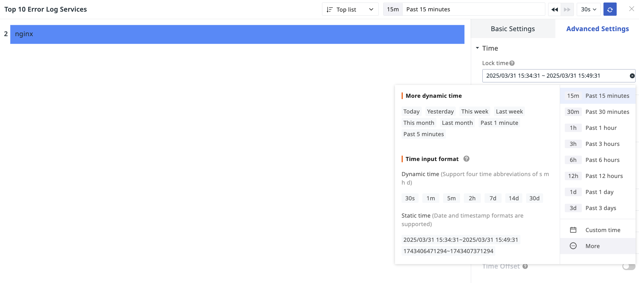
Lock Time
Enter the chart editing page, select the desired time range for data query in the Time Widget, and save. The locked time will be displayed externally on the chart.
Auto Align
Adjusts the timeline to align data collected at different time points or frequencies to the same time baseline.
In charts like Time Series Charts, if the time interval is set to Auto Align, after saving, the time interval option will be displayed externally on the chart.
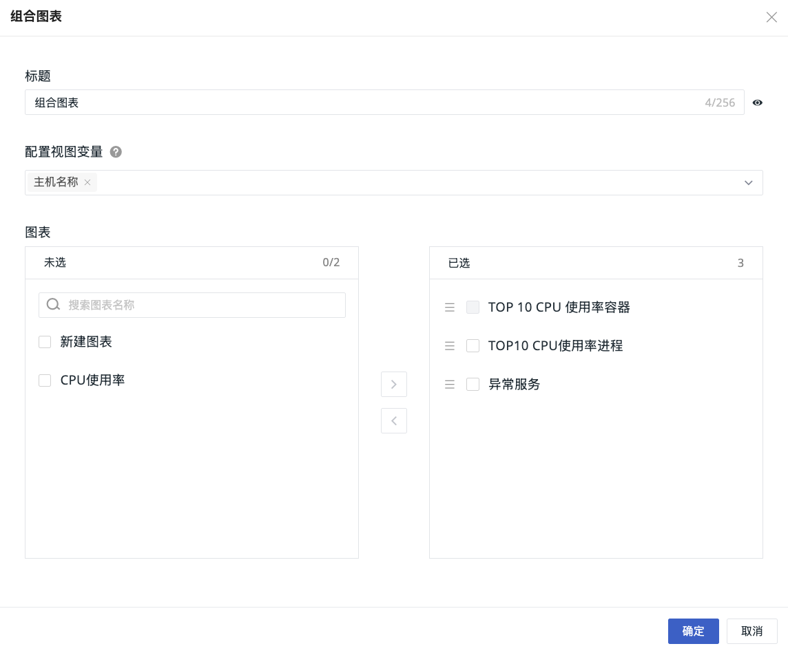
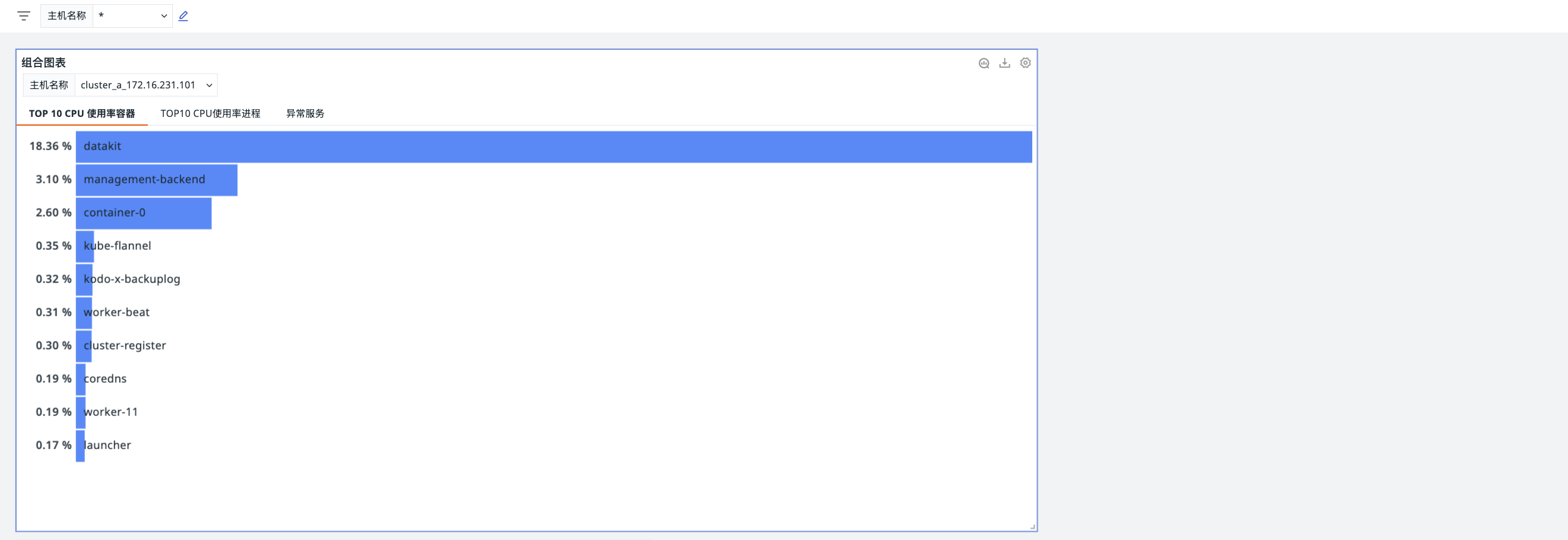
Combine Charts
Combine multiple charts into a unified view. Dashboard view variables can be applied to achieve flexible filtering and combined comparisons.
- Click Modify to enter the chart combination configuration page.
- Define the title for the current combined chart.
- Configure variables for this combined chart.
- Select charts.
- Confirm.
Share
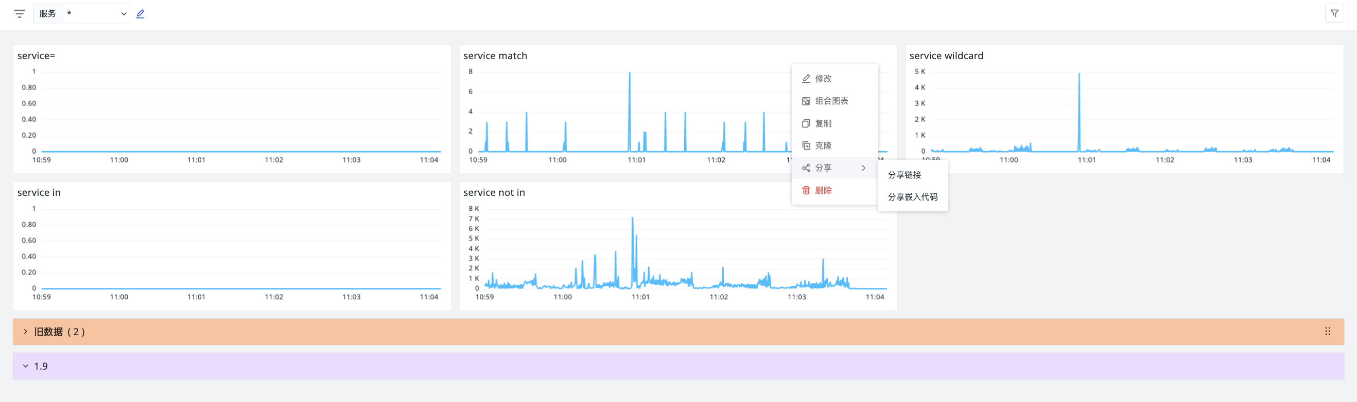
Two methods are available for sharing charts:
Shared charts are stored in Management > Share Management > Shared Charts. You can view them there, or directly click "Shared Chart List" at the top of the share interface.
Share Link
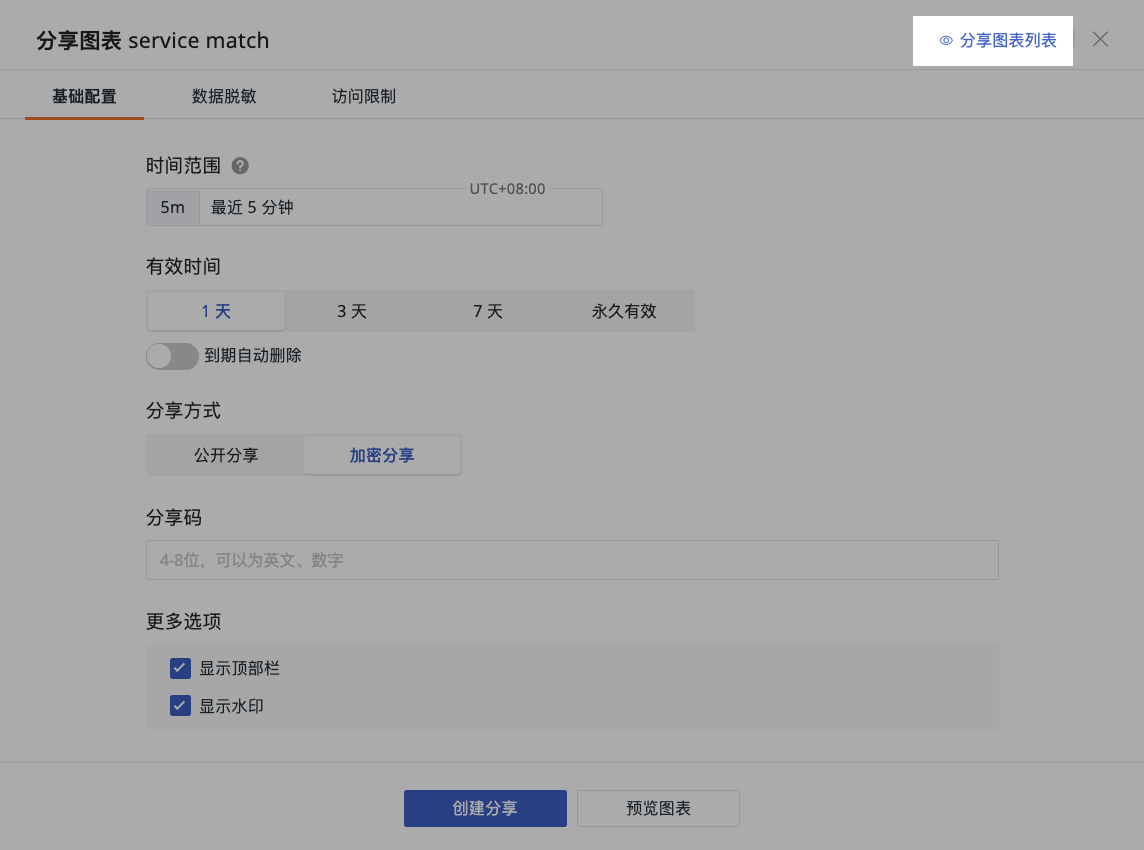
Share the chart externally via a chart link. Three types of configurations are required:
1. Basic Configuration
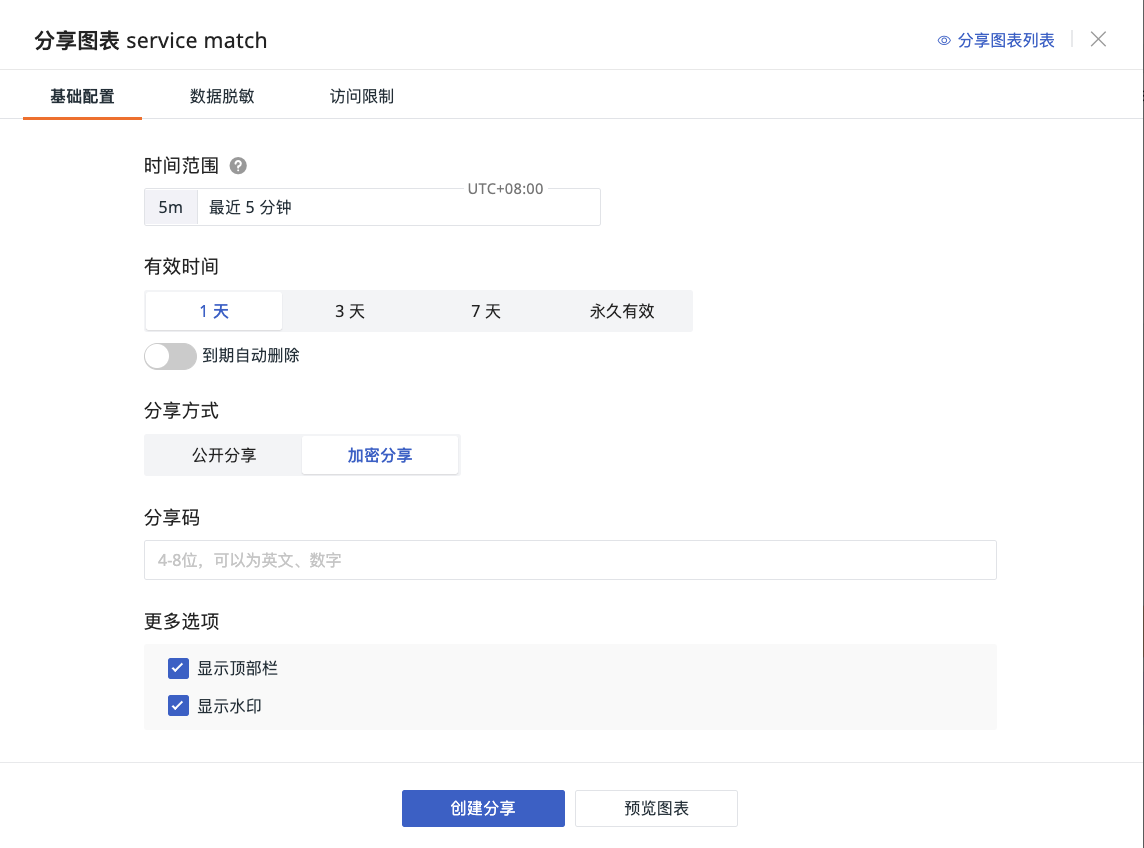
- Time Range: The system defaults to the time of the current dashboard chart. This defines the time interval viewers can see after the chart is shared.
- Select Validity Period: Options include 1 day, 3 days, 7 days, Permanent.
- Can set the shared chart to be automatically deleted upon expiration.
- Select Sharing Method:
- Public Share
- Encrypted Share: Define a share code. Viewers need to enter the code to see the chart.
- More Options: Choose whether to show the top bar and watermark.
2. Data Masking
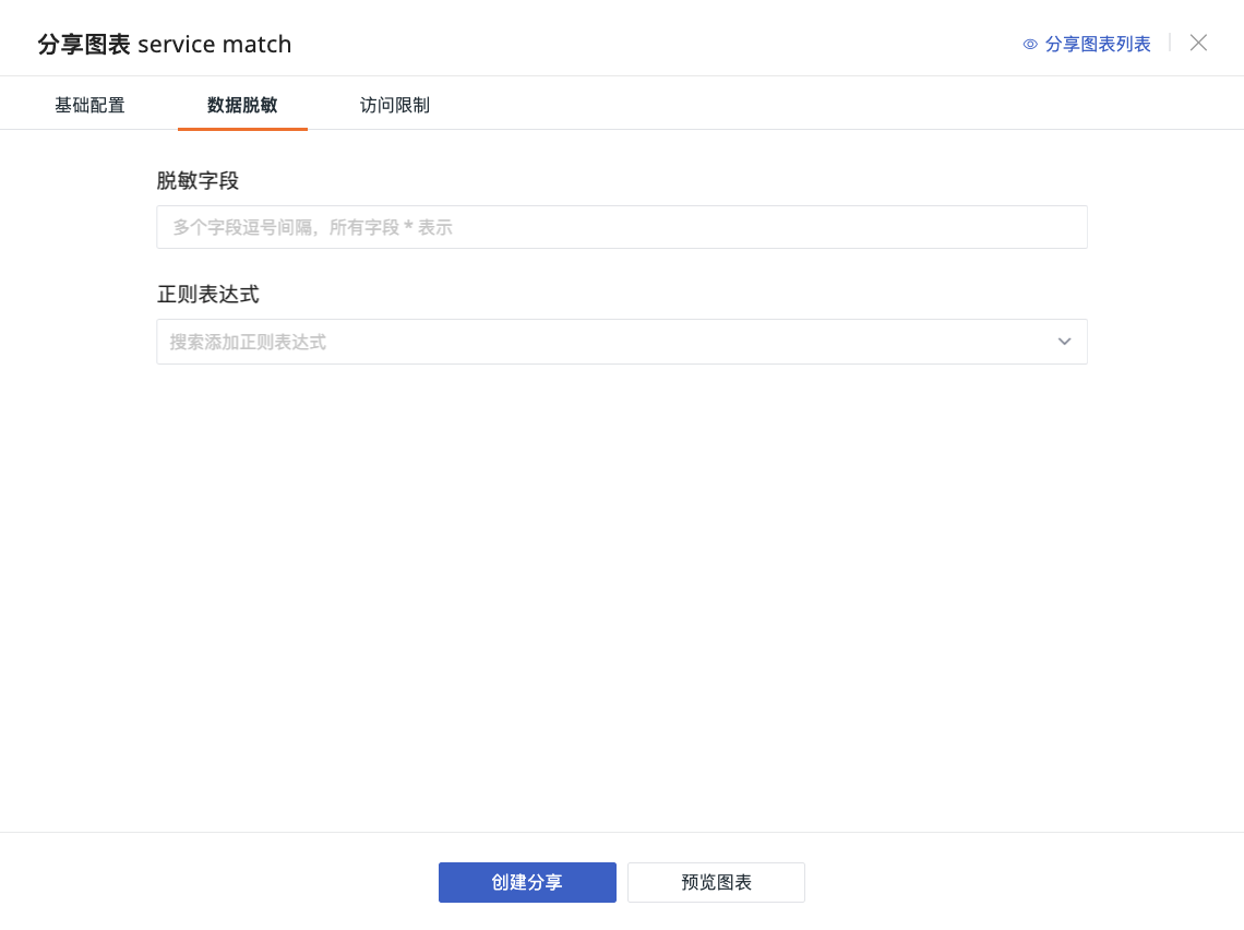
You can configure masking for field value content within the chart. Enter the masking field(s) and regular expression, click Preview. Content matched by the regex will be displayed as * in the current chart.
- Enter Masking Field(s) (supports multiple selection).
- Regular Expression: Implements masking through regex syntax.
For more operations, refer to Field Display Permissions.
3. Access Restrictions
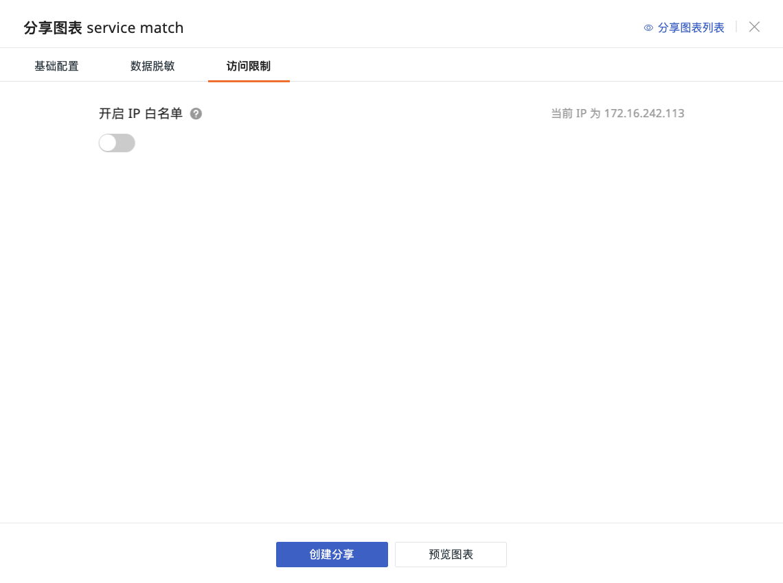
Choose whether to enable an IP whitelist for the currently shared chart. - Workspace IP Whitelist: Follows the workspace's IP whitelist configuration. Cannot be edited or modified under chart sharing. - Custom Input: Allows custom input of IP access whitelist. IPs not listed cannot view the chart.
For more details, refer to How to Configure IP Whitelist.
Share Embed Code
- Click Settings > Share.
- Select the chart query time.
- Get the embed code.
- The chart is now successfully shared.
The embed code is generated based on the chart's query time. For example, if the chart query time is the last 15 minutes, after embedding into another platform, the chart will display query results for the last 15 minutes.
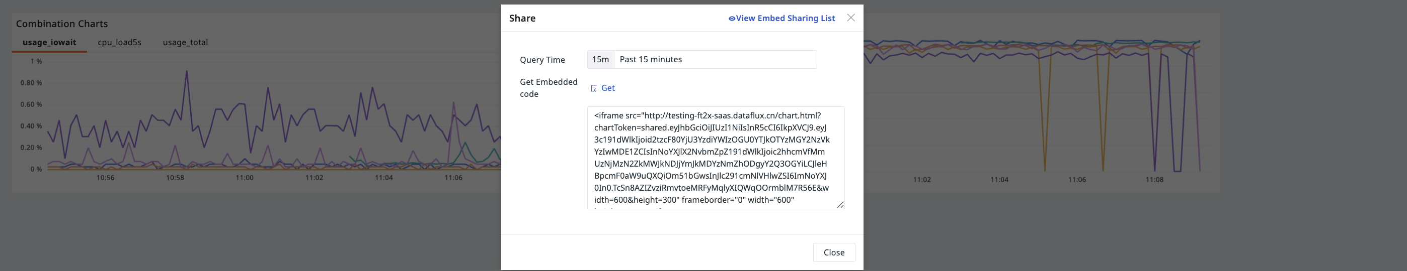
Note
- If a chart has locked time, the query time is fixed to the locked time and cannot be changed.
- The width and height for chart sharing default to the view dimensions but can be modified via the embed code.
- If a chart is associated with view variables, it is shared displaying the currently selected variable values.
Export Chart
Click to export the chart as a PNG image.
Specific chart types like Time Series Charts, Pie Charts, Top Lists, Bar Charts, Treemaps, Combined Charts (Table Charts), etc., can also be exported as CSV files to meet more data usage needs.
Analyze Chart
Click the Analyze chart icon on the right side of the chart or double-click the blank area above the chart to enlarge it for in-depth insight. In the opened window, you can:
- Switch styles on the right, including line chart, area chart, bar chart.
- Select the query time interval.
- Perform period-over-period comparison directly in the current window.
- Quickly view data information by hovering the mouse; select Timeline to view metric trends for a specific time range.
- When hovering over a specific time point, if other charts have
bygrouping conditions and share the same tags, the corresponding blocks in those charts will be highlighted simultaneously, facilitating correlation analysis. - Click the chart to view its DQL Query Statement.
Similar Trend Metrics
Identify other metrics with trends similar to the current metric, aiding correlation analysis.
Pin Timeline
On a Time Series Chart, at the target time point, click to expand the dropdown and select Pin Timeline. Once set, the pin mark will not change due to mouse movement, page scrolling, or switching between time series charts.
Related Analysis
Click on a data point to:
- Apply to View Variables.
- Apply to Filter.
- Copy Group Tags (copies all current grouping tags for later use in filters for queries).
- View related analysis, such as logs, containers, processes, traces, etc.
- If the chart query includes host (
host) information and the grouping condition isby host, view the host monitoring view. - Open in Metric Analysis with the query conditions directly imported.
Drill-down Analysis
Drill-down analysis allows decomposing aggregated data layer by layer to finer granularity, pinpointing the specific location of an issue. (❗️Drill-down analysis only supports simple queries.)
- Click to enter drill-down analysis.
- Select the target time region.
- Click Start Search to view the drill-down tags and corresponding time series chart results within that region.
Root Cause Analysis
Finds the fundamental cause of a problem through data correlation and reasoning. (❗️Root cause analysis only supports simple queries.)
Root cause analysis supports analysis for disk usage rate and memory usage rate.