Histogram
A histogram, also known as a mass distribution chart, is used to represent the distribution of data. It is a common statistical chart where the horizontal axis represents data intervals, and the vertical axis represents the distribution. The chart resembles a bar chart, with taller bars indicating a larger number of values falling within that interval.
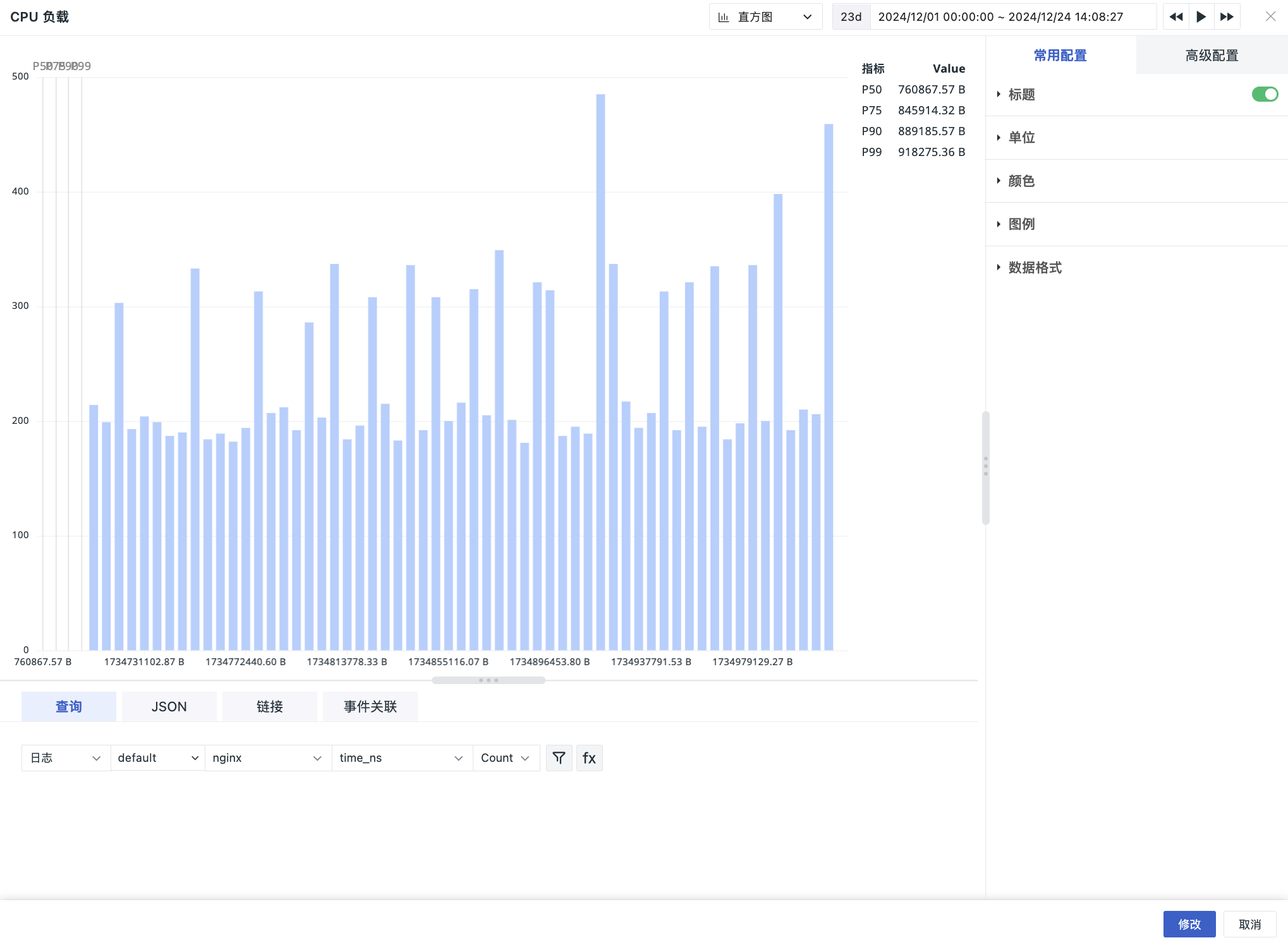
Chart Query
By default, simple queries are supported. After configuring the filter conditions (without configuring the by field at this point), the system performs global total statistics, aggregating the full dataset without grouping to calculate the total distribution of the target metric. In this case:
-
Horizontal axis: Interval divisions of the selected "attribute value/metric value".
-
Vertical axis: The total number of records that meet the interval conditions within each interval.
For example: T::RE(.*):(duration)
This represents the distribution of the number of spans across different duration intervals.
For more detailed explanations of chart query conditions, refer to Chart Query.
When the data source for the query is "Metrics", and the by field is added to the filter conditions, the system groups the data by the by field (e.g., by host), then calculates the distribution of the target metric for each group, and finally counts the number of groups falling into each interval. In this case:
-
Horizontal axis: The aggregated values of the
byfield. -
Vertical axis: The number of groups falling into the corresponding interval (i.e., the number of groups meeting the interval conditions).
For example: M::cpu:(avg(usage_user))[:::avg] BY host
This represents the distribution of the number of hosts across different CPU usage intervals, grouped by host.
Configuration Notes
After adding the by filter, the aggregation function is a fixed configuration item and cannot be modified or deleted.
Chart Configuration
For more details, refer to Chart Configuration.
Y Axis
You can switch between Linear and Log scaling modes and define the corresponding maximum and minimum values.
X Axis
-
Customize the maximum and minimum values of the X axis to define the data display boundaries.
-
Set the number of buckets to adjust the granularity of data grouping.