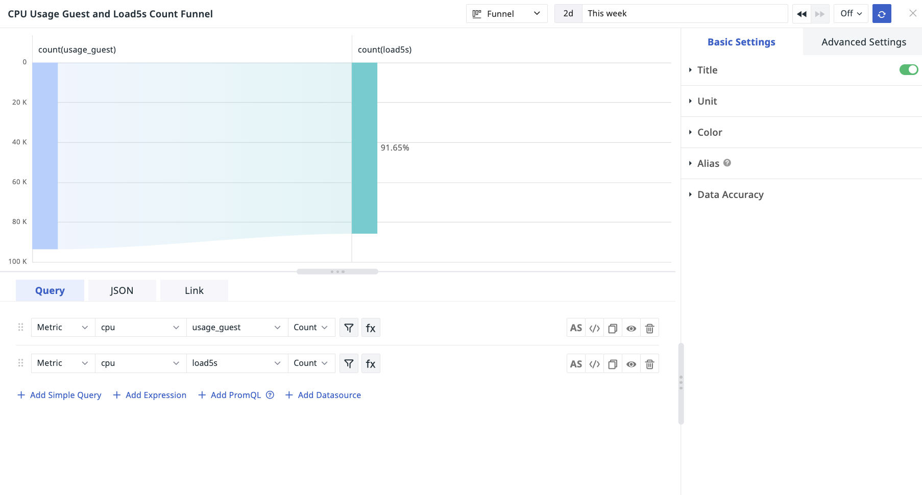
Skip to content

Funnel Chart


Introduction

Funnel diagrams are generally suitable for process analysis with normality, long cycle time and many links. By comparing the data of each link through funnel diagrams, we can visually compare the problems.

Use Case

Guance's funnel charts are used to compare data at each step in the process. For example, the funnel chart is suitable for website business process analysis, showing the final conversion rate of users from entering the website to achieving a purchase, and the conversion rate of each step.

Chart Query

Chart query supports 「simple query」, 「expression query」 and 「DQL query」, please click chart-query for detailed explanation of chart query conditions. The set of metrics and metrics of the query can be different, but the by (grouping) Tag must be the same, modify one, the other queries are automatically modified synchronously.

Chart Linking

Links can help you jump from the current chart to the target page, support adding internal links and external links to the platform, and support modifying the corresponding variable values in the links through template variables to transfer the data information to complete the data linkage. Please click chart-link to view the related settings.

Chart Style

Options Description
Chart Title Set the title for the chart, after setting, it will be displayed on the top left of the chart, and it supports hiding
Color Set the chart data display color, support custom manual input preset color, input format: aggregation function (metric) {"label": "label value"}, such as last(usage_idle){"host": "guance_01"}
Alias
  • Supports adding aliases to grouped queries. After adding aliases, the name of the legend changes, making it easier to distinguish related metrics more intuitively.
  • Support custom manual input of preset aliases, input format: aggregation function(metric){"tag": "tag value"}, such as last(usage_idle){"host": "guance_01"}
  • Chart Setup

    Basic Settings

    Options Description
    Unit 1. Support setting units for query results.
    1)If the queried data has no unit, after setting the unit in the chart, it will be displayed on the chart according to the set unit
    2)If the query data comes with its own units, or if you are in [Metric Management] (../../metrics/dictionary.md), and you set the units for the metrics in the chart, the units set in the chart will be displayed on the chart.
    3)If the query data has no units and no units are set in the chart, the chart Y-axis values are automatically calculated according to scientific notation; the original values are displayed on the chart in the format [thousandths] (chart-query.md#thousand).
    Scientific counting instructions
    Default query result value is automatically converted to units, display follows 「scientific notation K, M, B」 (1 thousand = 1K, 1 million = 1M, 1 billion = 1B), retaining two decimal points; RMB is automatically converted to units 「yuan, million, billion」, retaining two decimal points
    For example, if the unit of time interval is selected as ns, then according to the size of the data, the query result will only automatically convert the unit effect as follows, and so on:
  • 1000000ns:Chart query data results in 1ms
  • 1000000000ns:The chart query data result shows 1s
  • 10000000000ns:The chart query data result shows 1m

    2.Support for query results preset units, manual input format: aggregation function (metric), such as last(age_idle)
  • Advanced Settings

    Options Description
    Time slice When time slicing is turned on, the original data will be aggregated in segments at certain time intervals, and then the aggregated data set will be aggregated a second time to get the result value, which is turned off by default. For details, please refer to time slicing description
    Lock time Support locking the time range of chart query data, not limited by the global time component. The time set by the user will appear in the upper right corner of the chart after successful setup, e.g. 【xx minutes】, 【xx hours】, 【xx days】. If the time interval is locked at 30 minutes, then when adjusting the time component, no matter what time range view is queried, only the last 30 minutes of data will be displayed.
    Time interval If the time slice is off, there is no time interval option, if the time slice is on, the time interval option is as follows:
  • Original interval: default query to display data according to the time range of the time component
  • Auto-alignment: When turned on, the query will be dynamically adjusted according to the selected time range and aggregation interval, rounded upwards according to the calculated time interval in close proximity.(For example, if the auto-aggregation algorithm calculates the time interval to be 50 seconds, then the actual query will be launched at an interval of 1 minute) )The system is preset with 1 ms, 10 ms, 50 ms, 100 ms, 500 ms, 1 sec, 5 sec, 15 sec, 30 sec, 1 min, 5 min, 10 min, 30 min, 1 hr, 6 hr, 12 hr, 1 day, 1 week, 1 month, and many other time intervals.
  • Custom time interval: When [Lock time] is selected, according to the length of lock time, different optional time intervals will be automatically matched to query the displayed data. (For example, if you select 1 minute as the time interval, the query will actually be launched at 1 minute interval)
  • Chart Description Add description information to the chart, after setting the chart title will appear behind the 【i】 prompt, do not set it will not be displayed
    Workspace A list of authorized workspaces, which can be queried and displayed via charts after selection

    Example diagram

    The following figure shows an example of total CPU usage, system usage and user usage.

    Note: The maximum number of query criteria for the funnel chart is 4.

    Feedback

    Is this page helpful? ×