Dimension Analysis
Perform multi-dimensional aggregation queries and statistical analysis on data, intuitively displaying the distribution characteristics and trends of data across different dimensions and time.
In data chart analysis mode, the supported chart types include:
- Top List: Suitable for viewing the ranking distribution of data
- Time Series: Suitable for observing the trend of data over time
- Pie Chart: Suitable for displaying the proportional relationship of data
- Treemap: Suitable for displaying the hierarchical structure and proportion of data
- Grouped Table Chart: Suitable for displaying detailed information of multi-dimensional data
Data Display
-
Data Points: Data points refer to the coordinate points where data values are located. The line chart and area chart in the time series will automatically aggregate into data points based on the selected time range, with the number of data points not exceeding 360; the number of data points in the bar chart does not exceed 60.
-
Data Range: The data range refers to the value range of each data point. Based on the coordinate point of the current data point, the interval range is pushed forward to the coordinate point of the previous data point, and the data value within this range is taken.
Manage Charts
You can manage the chart analysis mode through the following operations:
- Below the chart, support filtering queries based on fields;
- In Time Series mode:
- You can choose between area chart, line chart, or bar chart;
- Click the icon to select the display position of the legend (hidden, bottom, or right);
- Click the
 icon to customize the color of the legend.
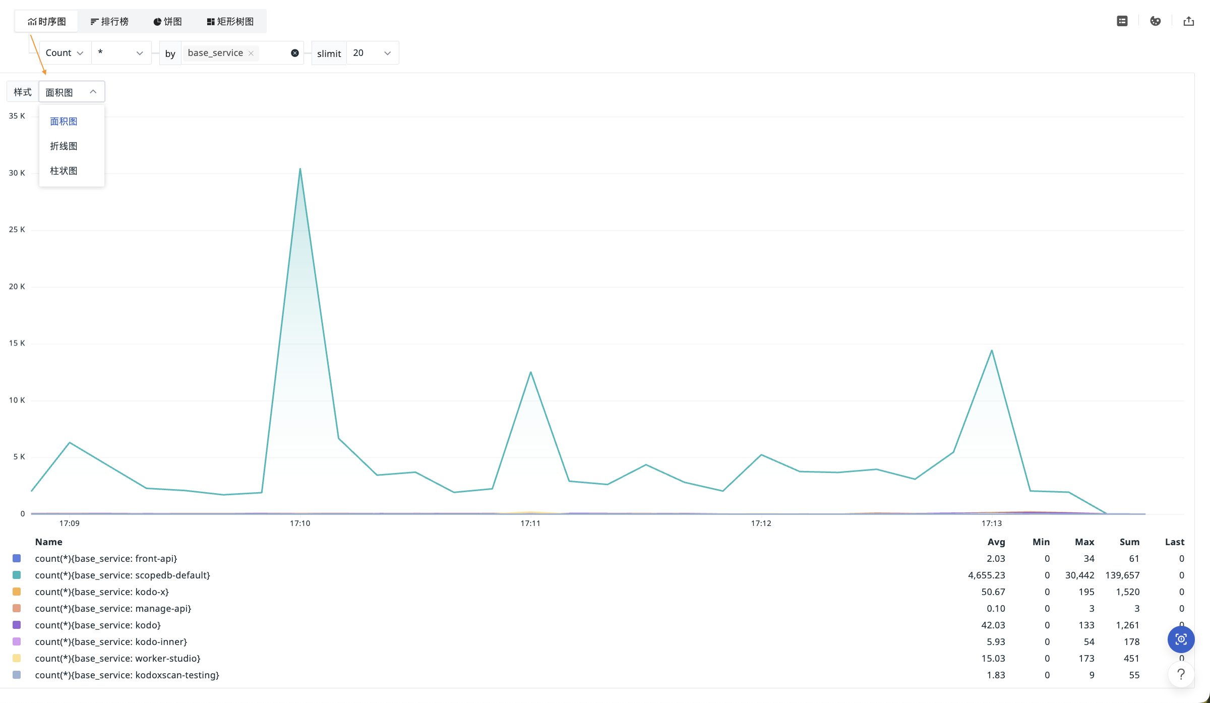
-
For displayed clustered data:
- In Time Series mode, you can choose
slimitas 5, 10, 20, 50, 100, 200; - In Top List, Pie Chart, or Treemap mode, you can choose
limit tothe maximum or minimum value as 5, 10, 20, 50, 100, 200.
- In Time Series mode, you can choose
-
Click the icon to export the chart as a CSV file, export to notes or dashboards, or copy the chart.