Changelog (2021)
This document records the update content descriptions for each release of Guance, including DataKit, Guance best practices, Guance integration documentation, and Guance.
December 30, 2021
Optimized Binding of Built-in Views
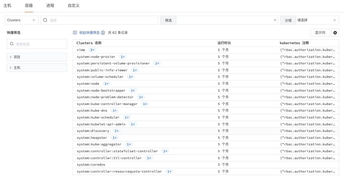
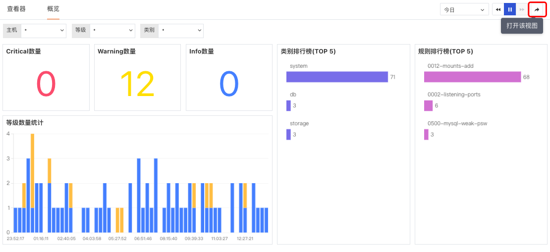
"Guance" supports associating and binding built-in views with different fields such as link services, applications, log sources, and projects. Based on the bound fields, the bound built-in views (system views, user views) can be viewed on the corresponding Explorer detail pages. Supported Explorers include scenario custom Explorers, infrastructure, logs, links, user access, security checks, availability, and other Explorers.
Optimized Log Explorer
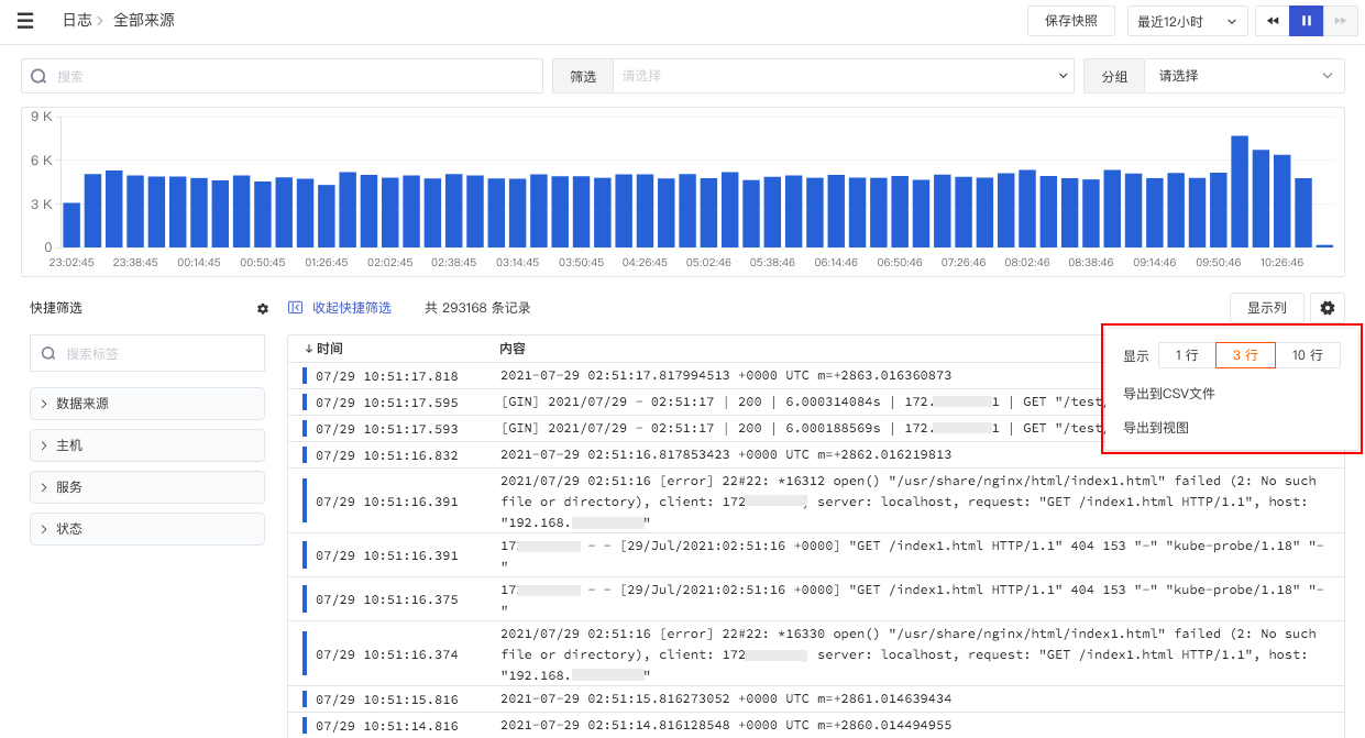
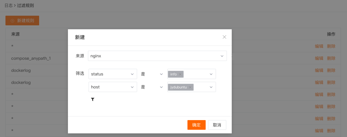
- In the Log Explorer, the left-side source list is expanded by default upon first login and can be manually collapsed. The Explorer will remember the last state by default.
- In the Log Explorer, clicking the settings button on the left allows manual addition of filter fields for quick filtering.
- In the log data list, you can use "mouse hover" over the log content to expand and view the entire log content. Clicking the "Copy" button copies the entire log content to the clipboard. When expanded, if possible, the system will format the log as JSON; if not possible, it will display the log content normally.
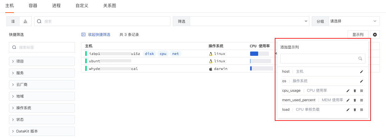
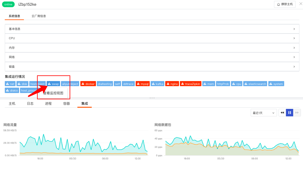
Optimized Associated Display on Explorer Detail Pages
Optimized associated display on the detail pages of logs, infrastructure, links, and security check Explorers, including associated query displays for hosts, metrics, links, containers, logs, Pods, etc. Two types of associated display are supported: fixed display and non-fixed display (requires containing associated fields to display associated queries).
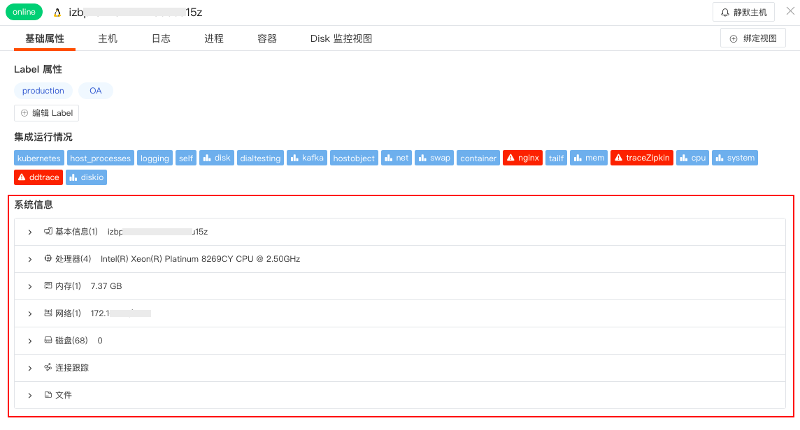
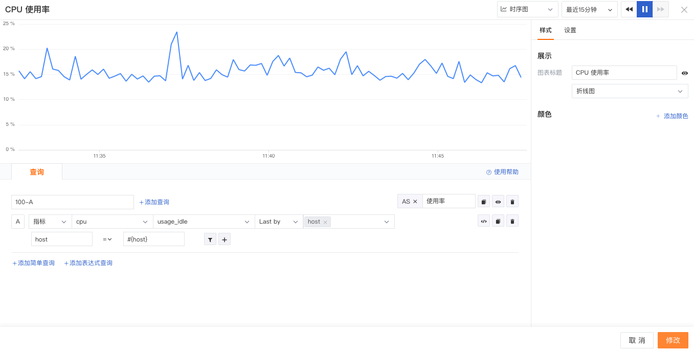
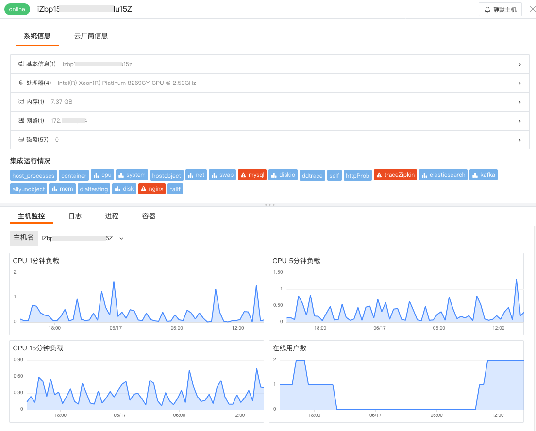
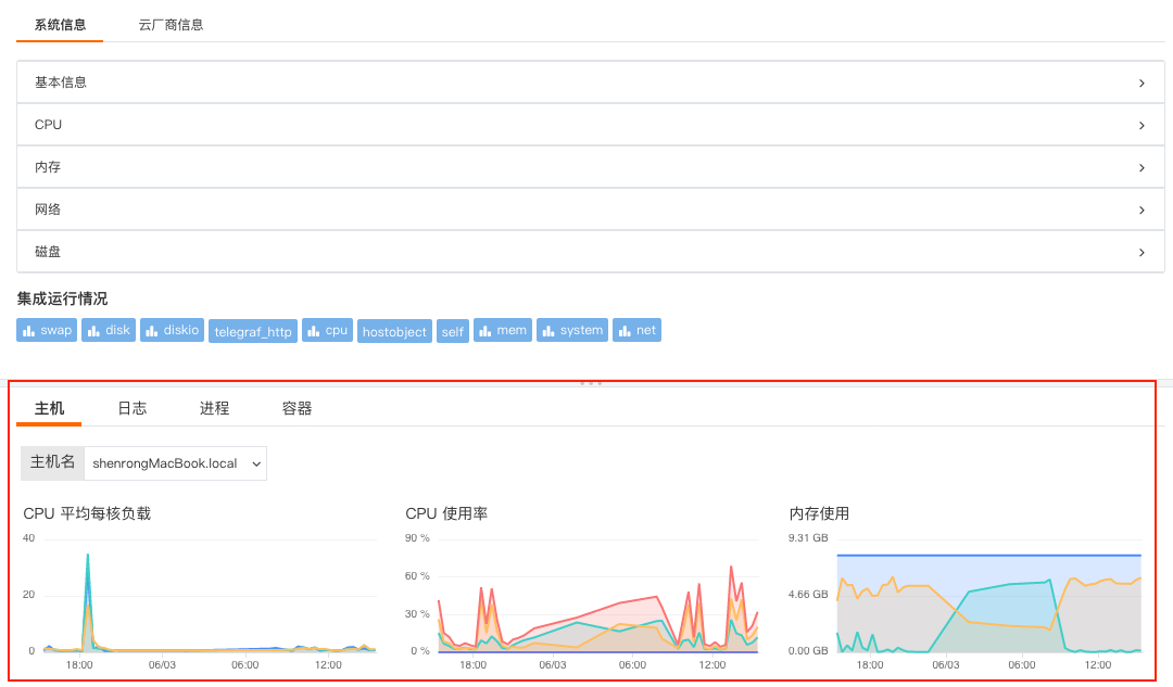
Taking the association of hosts on the Log Explorer detail page as an example, the associated field is "host". To view related hosts in the log details, the field "host" must be matched; otherwise, the page for related hosts cannot be viewed in the log details. After field matching, under the associated hosts, you can view basic host information and metric performance status.
- Attribute View: Includes basic host information and integration operation status. If cloud host collection is enabled, cloud vendor information can also be viewed.
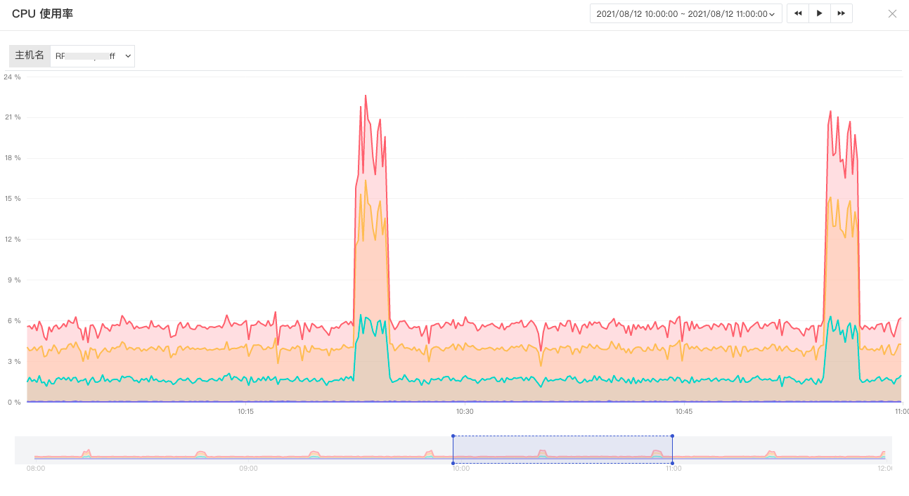
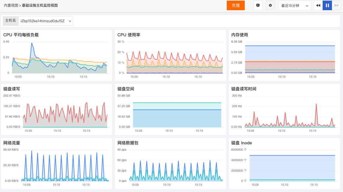
- Metric View: You can view performance metric views such as CPU and memory for related hosts within the default 15 minutes. Click "Open this view" to go to the built-in view. You can customize and modify the host view by cloning and save it as a user view. User views can be viewed on the log detail page through binding.
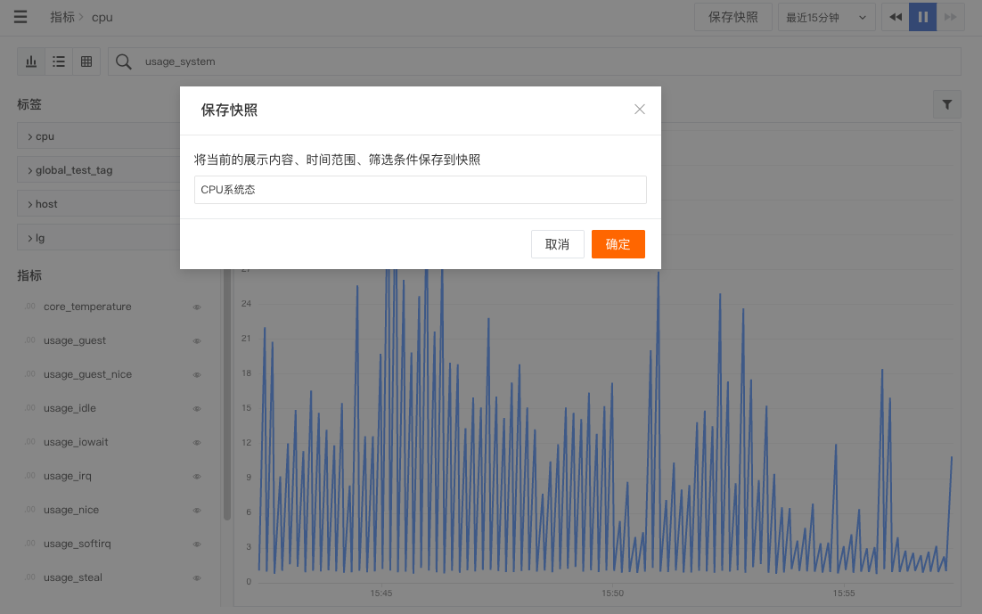
Optimized Snapshot Sharing
Snapshot sharing supports hiding the top bar of the shared page. In the snapshot list, click the share button to access advanced settings in the pop-up dialog, including "Hide top bar".
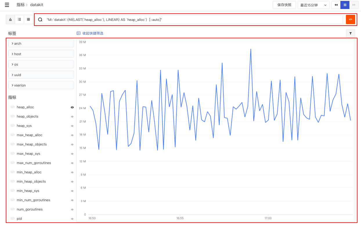
Optimized Chart Query Results to Display Thousands Separator
Guance dashboard chart query results support automatic addition of thousands separators for data display. If a unit is set, the data format is displayed according to the set unit. After setting, you can preview the effect.
Other Optimized Features
- Optimized host network topology map query performance. Added target domain name display on network topology map nodes. That is, if the target host is not in the current workspace but the target domain name exists and the target domain name's port is less than 10000, the target domain name will be displayed in the topology map.
- Optimized scenario dashboard and note Explorer favorite pinning logic:
- Unfavorited dashboards are sorted in reverse order of creation time.
- Favorited dashboards are sorted in reverse order of favorite time.
- Favorited dashboards are displayed above unfavorited dashboards.
- Optimized view variable cascade query logic. When two variables are linked for query, if the previous one selects
*, the linked variable is not filtered, and all value values are displayed. - Optimized the collapsed left navigation bar by adding a help documentation link to the navigation bar.
December 16, 2021
Added Time Series Chart Similarity Metric Query
In the analysis mode of time series charts, selecting "Chart Query" as the trend line/bar for metric queries allows you to "View similar trend metrics". By selecting an absolute time range, you can query for similar metric trends within the space.
Added Statistical Display of Associated Data on Explorer Detail Pages
Added statistical display of data volume for related logs, links, containers, etc., on Explorer detail pages. Supports directly displaying statistical quantities of related data in the Tab titles on Explorer detail pages, including infrastructure, logs, APM, user access, security checks, and other Explorers.
Added Explorer Chart Export Function
Guance supports exporting any chart from the "Guance" workspace Explorer to dashboards, notes, or the clipboard.
Added Explorer Search Match Matching
Guance supports using field filtering in the Explorer search bar, such as the format "host:cc*", for wildcard searches. This can be used for filtering log data from hosts with consistent naming prefixes. Additionally, a "delete icon" has been added to the right side of the Explorer search bar, supporting one-click deletion of entered text.
Optimized Log Explorer and Log-Related Data Queries
- "Guance" allows viewing all container data related to the host associated with a log within the last ten minutes via the "Containers" section below the log detail page.
- Related link and container data on the log detail page support filtering by "trace_id" or "host".
- Content display on the log detail page supports both Json and text viewing modes, automatically displayed based on the message type.
- Through the approximate text Explorer, you can view details of logs associated after Pattern clustering.
- Removed color from mouse hover tooltips in the Log Explorer.
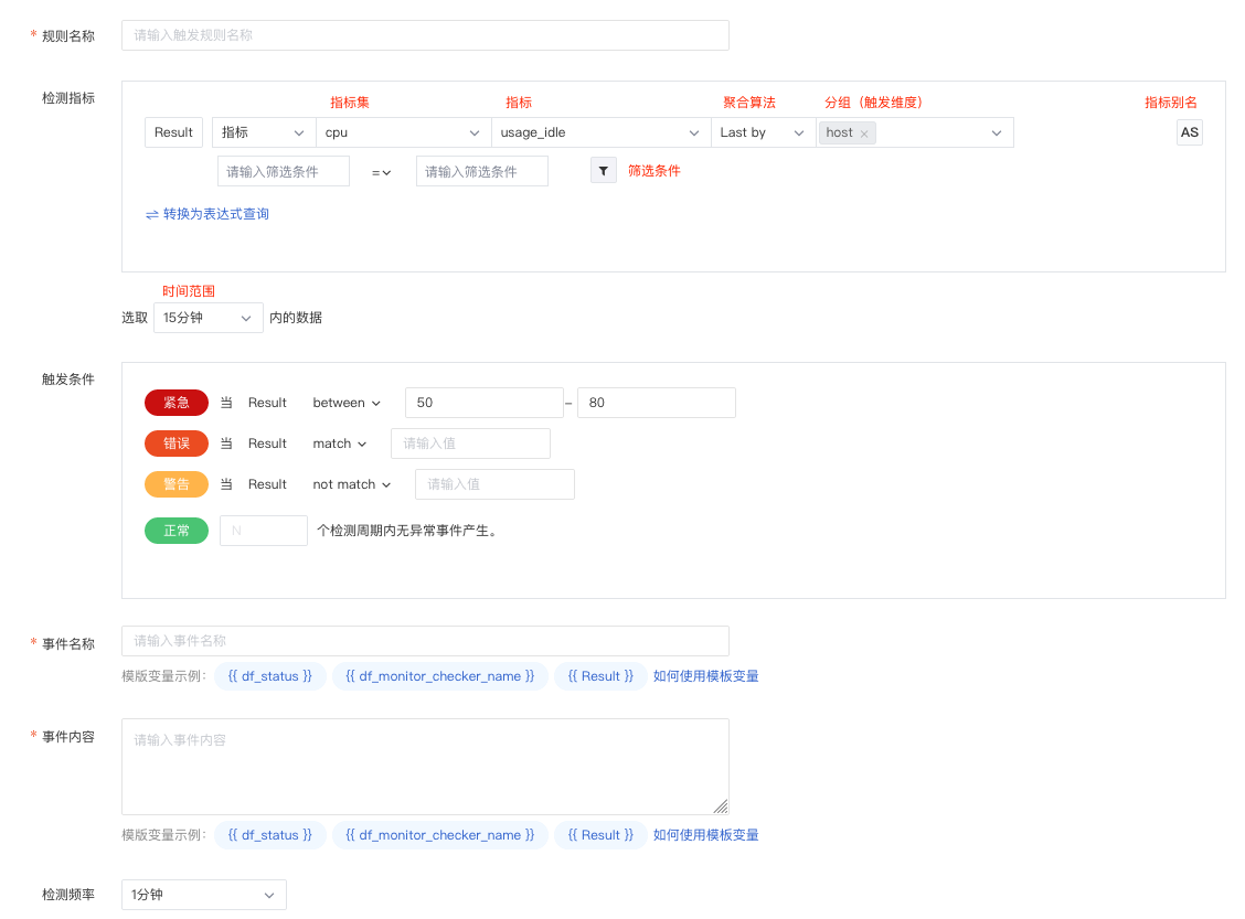
Optimized Mute Strategy, Supports Setting Mutes for Monitor Rules
Guance supports users managing all mute rules in the current space through "Mute Management" in the "Monitoring" feature. "Guance" provides three types of mutes: host mute, monitor mute, and group mute, supporting mute management for different hosts, monitors, and groups, preventing muted objects from sending alert notifications to any alert notification target during the mute period.
Optimized Monitor Management
Duplicate monitors in the monitor list can affect users' ability to quickly locate monitoring targets. "Guance" supports choosing whether to create duplicate monitors from templates. Additionally, users can use the newly added "Batch Management" tool to custom export/delete monitors.
Optimized View Variable Query Display
- Dashboard view variables now have default values. Supports previewing all variables of the current view variable and selecting the initial variable to view by default on the dashboard.
- Supports adjusting the order of view variables by dragging with mouse hover (hover).
- Removed the "Settings" button for view variables. Functions like "Sort", "Hide", and "Delete" can now be used directly in the view variable list.
Optimized Dashboard and Note Chart Lock Time Settings
Guance supports adding a "More" option in the dashboard and note chart lock time settings to customize the locked time range. After this optimization, the lock time component functions are consistent with the chart component.
Optimized Help Center Page Entry
In the Guance Help Center, you can quickly view product documentation, product updates, blogs, live stream recordings, and other information. You can also join our Guance official service group by scanning a QR code.
December 2, 2021
Added Owner Member Role
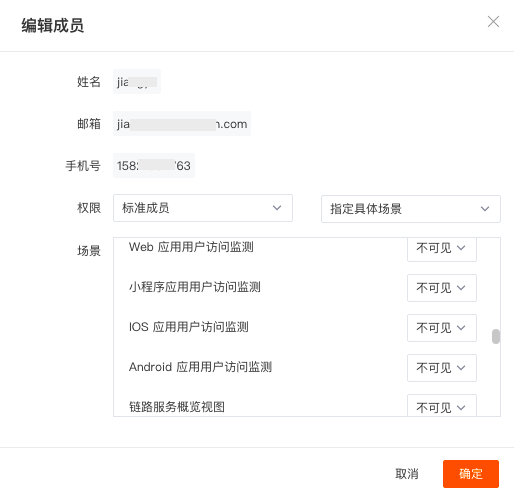
Guance added the Owner role for the current workspace. Currently, four workspace member permissions are supported: "Owner", "Administrator", "Standard Member", and "Read-only Member", each with constraints on management permissions, configuration permissions, operation permissions, and browsing permissions for different member categories. The "Owner" role has the highest operational permissions, can designate current space "Administrators", and perform any management, configuration, operations, and data browsing. In the Guance workspace, go to "Management" - "Member Management" - "Modify" to edit and update member permissions.
Scenarios Added Custom Explorer
"Guance" provides a quickly buildable Explorer based on log data ranges in Scenarios. Supports workspace members collaboratively building custom scenario-based Explorers to meet customized viewing needs. Completed "Explorers" can be exported and shared with others, sharing Explorer templates.
Added Export User Views to Dashboard
"Guance" supports exporting created user views as a JSON file in "Built-in Views". The JSON file can be used for importing into scenarios or built-in views in different workspaces.
Optimized Host Network, Added Network Flow Data View List
"Guance" supports displaying different visual charts based on selected protocols in the "Network" section of the infrastructure "Hosts" detail page and allows customizing the display fields of the network flow data list.
By clicking "View Network Flow Data", you can view network flow data from the last 2 days by default, including time, source IP/port, target IP/port, source host, transmission direction, protocol, bytes sent, etc. Supports customizing display fields or adding filter conditions to filter all string-type keyword fields.
Added Sourcemap Function
When applications are released in production environments, to prevent code leakage and other security issues, files are typically transformed, compressed, etc., during the packaging process. While these measures ensure code security, they also cause the collected error stack information to be obfuscated, making it impossible to directly locate problems and hindering subsequent bug troubleshooting.
To solve the above problems, "Guance" provides a sourcemap function for web applications, supporting the restoration of obfuscated code, facilitating source code location during error troubleshooting, and helping users solve problems faster.
Added Host-Associated Security Check Data Analysis
"Guance" supports viewing security check data related to the host within the last day, and performing keyword searches, multi-tag filtering, and data sorting on this security check data.
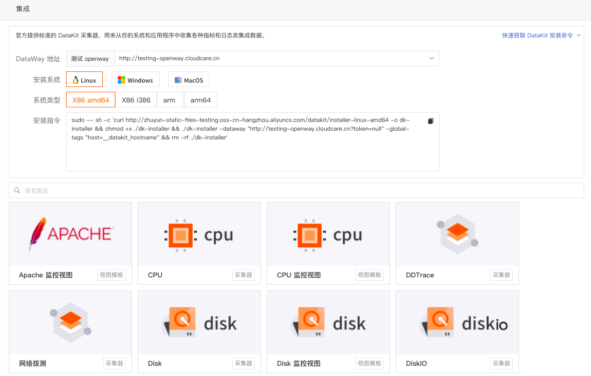
Added DataKit Collector Kubernetes Installation Guide
"Guance" supports adding a guide for installing the DataKit collector in Kubernetes clusters in the workspace "Integration" - "DataKit".
Optimized User Access Monitoring Associated Link Query
"Guance" supports adding attributes to the current filter or copying (copying the tag to the local clipboard) on the link detail page and the user access page performance detail page (User Access Monitoring view Explorer).
Optimized Registration and Upgrade Process
Guance added the option to directly select and activate the Guance billing platform during account registration. Also optimized the process for upgrading to the Agile Plan after logging into the workspace.
Billing Price Reduction Adjustment
Guance adopts the latest technology to optimize data storage costs, leading to a billing price reduction adjustment. Added a tiered billing model based on data storage policies, including three billing items: log data, APM Trace, and user access PV.
Furthermore, to help enterprises obtain more comprehensive IT infrastructure, application systems, and other enterprise assets at more favorable prices, Guance introduces three package plans based on different stages of enterprise development: Startup Acceleration Pack, Growth Pack, and Enterprise Standard Pack, along with add-on traffic packs for enterprises to use according to their own needs and package combinations.
Other Optimized Features
- Monitor user access metric detection added LCP, FID, CLS, FCP related detection metrics. In the Guance workspace "Monitoring" - Monitors, click "+ Create Monitor", select "User Access Metric Detection" to enter the detection rule configuration page.
- The grouping in monitor simple queries has been changed to detection dimensions. Detection dimensions determine which dimension the detection rule triggers based on, i.e., the trigger object. "Guance" supports adding multiple detection dimensions; an alert is triggered if the metrics of any detection dimension meet the alert conditions.
- Optimized navigation menu display. When the navigation bar of the "Guance" console is collapsed, secondary menus display the navigation name of the function aligned to the left.
November 18, 2021
Added SSO Login
Guance supports users creating identity providers based on the workspace. During login, users enter their company email to obtain the corresponding SSO login link. Clicking the SSO login link enables corresponding verification login. In the Guance workspace, go to "Management" - "SSO Management" - "Create Identity Provider" to set up SSO single sign-on for employees.
Added Dashboard and Note SLO Charts
Added SLO charts to scenario dashboards and notes. SLO charts can directly select configured monitoring SLOs to display SLO data. By selecting different SLO names, SLO data results are displayed synchronously.
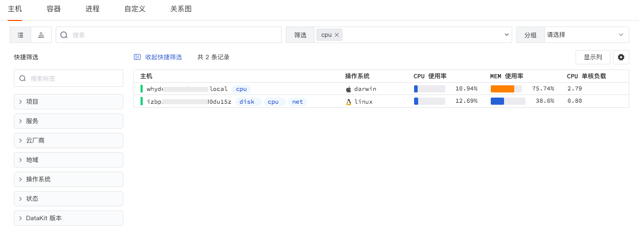
Added Infrastructure Grouping Custom Add Grouping Fields
In the Guance infrastructure Explorer, click the settings button to the right of the grouping to custom add grouping tags. After adding, you can choose to group and aggregate displays according to the added grouping tags. Note: Only administrators can add custom grouping tags.
Added SLO Notification Mute Configuration
If the same event is not very urgent but has a high notification frequency, you can reduce the notification frequency by setting notification mutes. After setting a notification mute, events will continue to be generated, but notifications will no longer be sent. The generated events will be stored in event management.
Optimized Chart Links
Guance supports adding built-in links and custom links to charts. Links allow jumping from the current chart to the target page, and modifying corresponding variable values in the link through template variables to transmit data information, completing data linkage. Chart links support opening in a new page, current page, or side-slide detail page to achieve linkage analysis.
Billing Price Reduction Adjustment
- Daily DataKit unit price reduced to 3 yuan per unit.
- Availability API testing adjusted to 1 yuan per 10,000 times.
Other Optimized Features
- Launched China Region 1 (Alibaba Cloud) Free new version: The Free Plan is divided into Alibaba Cloud login and AWS login. For Alibaba Cloud login, the data retention policy for time series is 30 days, others are 7 days. For AWS login, all data retention policies are 1 day.
- Optimized SLO deduction logic: Disabled monitors are not included in the deduction scope.
- Added dashboard tagging function: When creating/modifying dashboard views, you can add custom tags to dashboards to help with quick filtering.
- Optimized log highlighting: When searching logs in the search bar, the returned list only retains highlighted display of matched keywords.
- Optimized Explorer search: Added help documentation links to the Explorer search dropdown.
- Optimized text chart Markdown format: Added support for unordered and ordered lists, optimized display format.
November 4, 2021
Added Scenario Notes
Under Scenarios, you can create multiple notes for summary reports. Supports inserting real-time visual charts for data analysis and inserting text documents for explanations, combining charts and documents for data analysis and summary reports. Supports exporting data from infrastructure, logs, APM, user access, and other Explorers to notes for data analysis. Supports sharing notes with all workspace members, retaining abnormal data analysis to help trace back, locate, and solve problems.
Scenario Views Upgraded to Dashboards
Guance's scenario views have been upgraded to dashboards, with adjustments to dashboard functionality and layout. Under Scenarios, you can create multiple dashboards to build data insight scenarios. Supports searching dashboards by keywords, adding visual charts to dashboards for data analysis, and quickly filtering corresponding dashboards from "My Favorites", "Import Project", "My Creations", and "Frequently Viewed".
Explorer Added Export to Dashboard and Notes
Infrastructure, Log Monitoring, APM, Availability Monitoring, Security Check, and other Explorers added export to dashboard and notes.
Anomaly Detection Library Upgraded to Monitoring
The original "Anomaly Detection Library" has been upgraded to "Monitoring". Original names such as "Anomaly Detection Library" and "Detection Rules" have changed. Specific changes are as follows:
- Monitors (originally "Anomaly Detection Rules") provide "Threshold Detection", "Log Detection", and other monitoring methods, allowing users to custom configure detection rules and trigger conditions, and receive alert notifications promptly.
- Templates (originally "Built-in Detection Library"), "Guance" includes various out-of-the-box availability monitoring templates, supporting one-click creation of Docker, Elasticsearch, Host, and Redis monitoring. After successfully creating a template, corresponding official monitors are automatically added to the current workspace.
- Groups (originally "Custom Monitoring Library"), the group function supports you in custom creating meaningful monitor combinations for convenient group management of various monitors.
Added Monitoring SLO Function, Supports Export to Dashboard
"Monitoring" added SLO monitoring, supporting service quality scoring for system service providers (Provider) in the cloud era, comparing whether the corresponding SLI (Service Level Indicator) meets target needs. Additionally, "Guance" supports exporting SLO as views to dashboards for convenient SLO monitoring synchronization on dashboards.
Other Optimized Features
- Chart optimizations:
- Removed grouping selection from overview charts.
- Adjusted chart style selection for time series charts, pie charts, and bar charts.
- Added prompt information for time slices.
- Chart JSON supports editing, linking with queries/settings, and validation of input JSON; error prompts are displayed if errors exist.
- Style optimization in the analysis mode of time series charts.
- Billing added prompts. When selecting aliyun or aws as the settlement method, the billing list directly displays a jump link to the corresponding cloud service console to view billing information.
October 21, 2021
Added Host Network Distribution Map
Added host network distribution map, providing infrastructure network monitoring. In "Infrastructure" - "Hosts", click the small icon in the upper left corner to switch to viewing host network distribution. In the "Network Distribution Map", you can visually query network traffic between hosts in the current workspace, quickly analyzing TCP latency, TCP jitter, TCP retransmission count, TCP connection count, and TCP close count between different hosts.
Added User Access Monitoring Tracking Function
Added User Access Monitoring "Tracking" function. Supports users creating tracking tasks via "User Access Monitoring" to monitor custom link tracking trajectories in real-time. By pre-setting link tracking trajectories, you can centrally filter link data, precisely query user access experience, and promptly discover vulnerabilities, anomalies, and risks.
Added Scenario Chart Json Format Query
When editing charts in "Scenarios", each correct chart query corresponds to a JSON text. Supports mutual parsing between JSON text and chart queries within the console, helping you gain insight into chart drawing details.
Optimized DCA Desktop Client Application
Optimized DCA desktop client UI display, added host status.
- online: Indicates normal data reporting; you can view DataKit operation status and configure collectors via DCA.
- unknown: Indicates remote management configuration is not enabled, or not within the same LAN.
- offline: Indicates the host has not reported data for over 10 minutes, or the host name was modified; the original host name will display as offline. For hosts not reporting data normally, if no data is reported for over 24 hours, the host record will be removed from the list.
Optimized Event Host Linkage Query and Detection Rule Query
Optimized the event module, supporting linkage queries for hosts associated with events. Allows real-time monitoring of logs, containers, processes, links, and inspection events related to the event within the selected time widget range. Supports one-click viewing of detection rules associated with events and querying other triggered events under the corresponding detection rule.
Adjusted Billing Method
- Based on node login method, select billing settlement method, including CloudCare account, Aliyun, AWS. Among them, CloudCare account settlement is the general method. Aliyun login nodes correspond to the optional Aliyun account settlement method (under development). AWS login nodes correspond to the optional AWS account settlement method (already launched).
- Removed Session count and Browser testing count billing dimensions. Removed Session count and Browser testing count statistics and views from "Billing", added security check count statistics chart.
Other Optimized Features
- Optimized scenario add chart function, removed the "Add Chart" button in "Edit" mode. All available chart types are selectable at the top of the scenario.
- Optimized scenario chart grouping function, supports deleting only the group while retaining original charts under the default group.
- Added "Region Ranking" switch for China map/world map, region ranking is off by default.
- Optimized Explorer query method, merged search and filter bars, supports keyword search, tag field filtering, and associated search based on tags, fields, and text.
September 28, 2021
Added Host Network Performance Monitoring
Host network performance monitoring supports viewing network traffic between host services, containers, and any tagged infrastructure. Supports viewing network traffic and data connection status from source hosts to targets based on IP/port, displayed visually in real-time, helping enterprises understand the network operation status of business systems in real-time, quickly analyze, trace, and locate fault issues, preventing or avoiding business problems caused by network performance degradation or interruption.
After successful collection, host network data is reported to the Guance console. In "Infrastructure" - "Hosts" detail page - "Network", you can view all network performance monitoring data information within the workspace.
Added Chart Linkage Query
In scenario views, supports viewing the DQL query statement of the chart, associated links, etc., by clicking the mouse, or linking queries for related logs, containers, processes, links, etc., under different grouping query tags. When a chart query contains host (host) information, supports viewing related host monitoring views. For example, clicking any chart in the view allows viewing the chart's DQL query statement, set links, and associated queries for related logs, containers, processes, links, host monitoring views, etc.
Added Chart Treemap
Treemap is used to visualize the proportional distribution of metric data under different groupings. Treemap color represents the grouping tag (Tag), area represents metric data. When multiple metric queries are added, you can choose the primary metric to display. Area size is displayed based on the selected metric data results, Top/Bottom, and count. For example, this chart visually displays host CPU usage ranking.
Added APM and User Access Monitoring Associated Query
Within APM link details, supports viewing associated (same trace_id) real user access experience data via the "Related view" above the page. This function not only helps you view proactive monitoring APM data but also helps quickly透视 real user access situations. More APM details can be found in the document Link Analysis.
Added Infrastructure Query Absolute Time Range
Infrastructure added "Hosts", "Containers", "Processes" query absolute time range. By default, displays host data from the last 24 hours, container data from the last ten minutes, and process data from the last ten minutes. The query range can be refreshed manually. Hovering the mouse over offline hosts displays host offline processing prompts.
Optimized Chart Period Comparison Function
Optimized chart period comparison function, supports comparing period data for time series charts, overview charts, etc. You can choose year-over-year (comparison of the same time point in adjacent time periods) or period-over-period (comparison of adjacent time periods). Based on the chart lock time, options like period-over-period, day-over-day, week-over-week, month-over-month, week-over-year, month-over-year, etc., can be selected.
Optimized Chart Query SLIMIT
Added SLIMIT by default for charts with grouped queries, used to limit the number of points or series returned by the time series chart query. One chart limits the return to 10,000 points, one query returns a maximum of 10 time series.
Cloud Testing Adjusted to Availability Monitoring
Cloud testing is divided into API testing and Browser testing. After adjustment to availability testing, API testing is retained. Other functions such as overview analysis, Explorer analysis, and self-built node functions remain unchanged. More details can be found in the document Availability Monitoring.
Billing Price Reduction Adjustment
- Log price adjusted from 1 yuan per 1 million logs to 0.5 yuan per 1 million logs.
- User Access Monitoring price removed Session billing dimension, adjusted to 0.3 yuan per 1,000 PVs.
September 9, 2021
DataFlux Renamed to "Guance"
DataFlux, as the cloud-era observability platform launched by CloudCare, has been officially renamed to "Guance" in this release to make it easier for enterprises and users to understand. The website is "guance.com".
We have also designed a new Logo for "Guance", based on the letters C and G forming a graphic similar to radar waves.
![]()
Added Log Approximate Text Explorer
"Guance" supports similarity calculation and analysis on the message field of raw log data. Based on the time range selected in the upper right corner, it fixes the current time period and obtains 10,000 log data entries within that period for approximate analysis. Logs with high similarity are aggregated, extracting and statistically analyzing common Pattern clusters to help quickly discover abnormal logs and locate problems.

Pattern Cluster Details
Clicking the Pattern cluster list slides out the current list of all Pattern clusters. The returned data list is sorted in reverse chronological order, supports displaying the most recent 50 log data entries, and can be displayed in 1 row, 3 rows, or 10 rows.

Added Container Jobs and Cron Jobs Explorers
"Guance" added container "Jobs" and "Cron Jobs" Explorers. In "Infrastructure" - "Containers", select the corresponding Explorer from the left object list to view the operation status and service capability related metrics of Jobs and Cron Jobs in Kubernetes, thereby achieving real-time monitoring of Kubernetes clusters and various deployed resources. Details can be found in the document Containers.

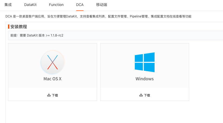
Added DCA Desktop Client Application
DCA, DataKit Control APP, is a desktop client application designed to conveniently manage installed and configured collectors. Supports viewing the integration list, configuration file management, Pipeline management, online viewing of integration configuration documentation, etc. You can remotely connect to DataKit via DCA, change collectors online, and updates take effect after saving.
In the "Guance" workspace, click "Integration" - "DCA" to download the installation package. After downloading, install it on your computer to remotely manage DataKit.
Added Mobile APP
DataFlux Mobile helps you view log data, scenario views, etc., from Guance on mobile devices anytime, anywhere, and receive all alert events notified to you via email, DingTalk robot, WeCom robot, Webhook, etc.
Within the Guance workspace, you can download the DataFlux Mobile APP via "Integration" - "Mobile".

Added Metric Tag Filtering Function, Optimized Three Viewing Modes for Metrics
The DataKit collector appends the tag host=<hostname where DataKit is located> to all collected data by default.
Tags are sets of properties identifying the object from which a data point is collected. Tags consist of tag names and tag values. In the "Metrics" page, you can select metric views corresponding to the tag values you want to view. As shown below: Filter hosts in the tag bar and view their usage_system, usage_total, usage_user, usage_iowait, etc., metric views.
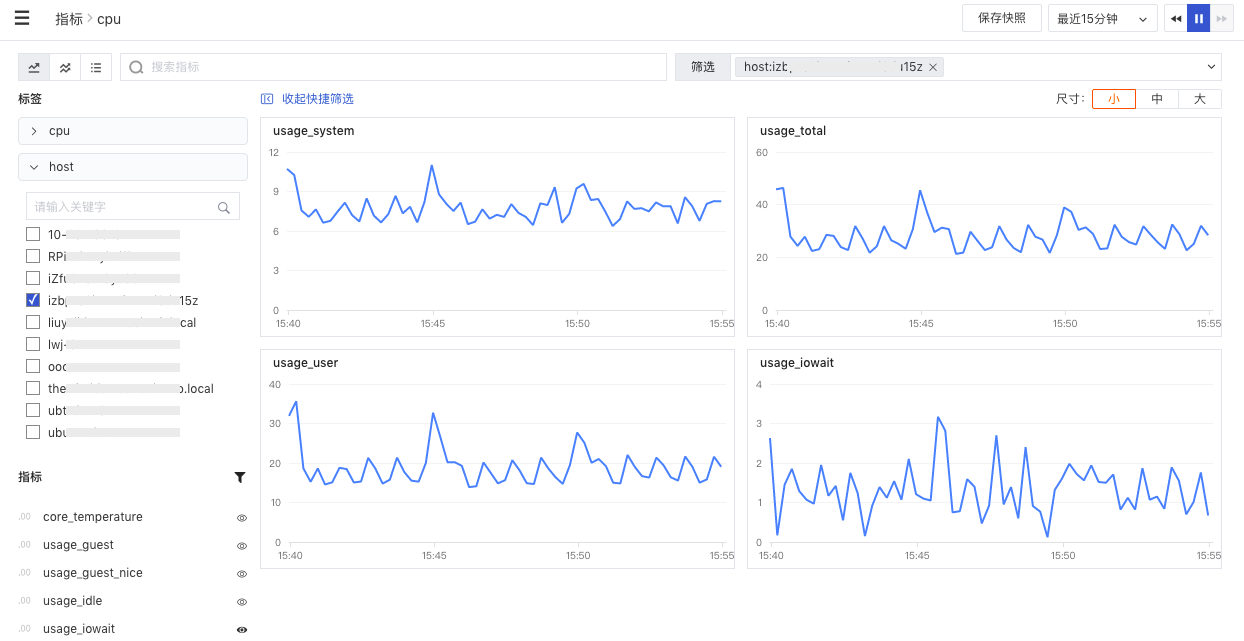
In the "Metrics" page left side, you can switch metric viewing modes, supporting three modes: Tile mode, Mixed mode, List mode. Tile mode is selected by default.
Optimized Anomaly Detection
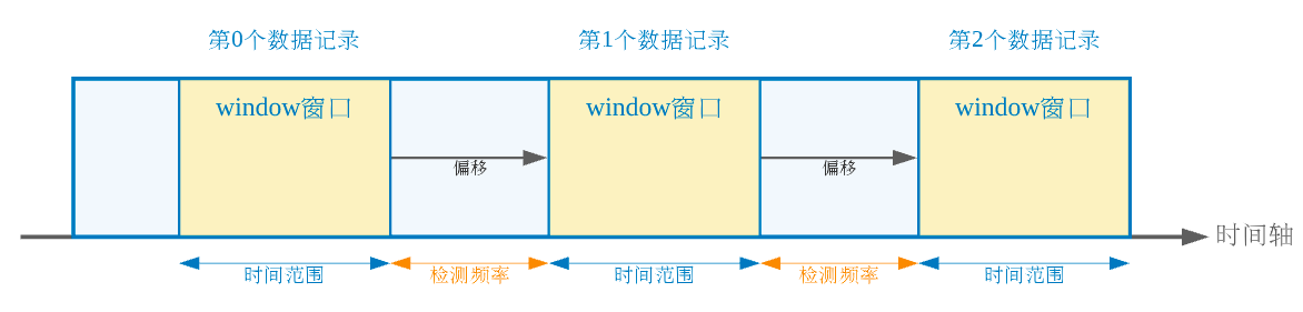
Added window function usage in anomaly detection rule queries and chart queries. That is, supports using the selected time interval as the window (record set), with the detection frequency as the offset, to re-execute statistical calculations for each record.
• When performing chart queries, supports adding window functions, i.e., using the selected time interval as the window (supports choosing 1 minute, 5 minutes, 15 minutes, 30 minutes, 1 hour, 3 hours), combined with aggregation functions to perform statistical calculations for each record. • When configuring anomaly detection rules, added window function as the drawing display area for query results, returning real-time anomaly detection metric data used to trigger alerts.
Added percent() function usage in aggregation functions for anomaly rule queries and chart queries. Supports adding the percent() function in aggregation functions, including p50 (median value), p75 (value at the 75% position), p90 (value at the 90% position), p99 (value at the 99% position).
Added label filtering usage in anomaly rule queries and chart queries. Supports selecting host label attributes for filtering display. Before selecting labels in queries, you need to set label attributes for hosts in "Infrastructure" - "Hosts".
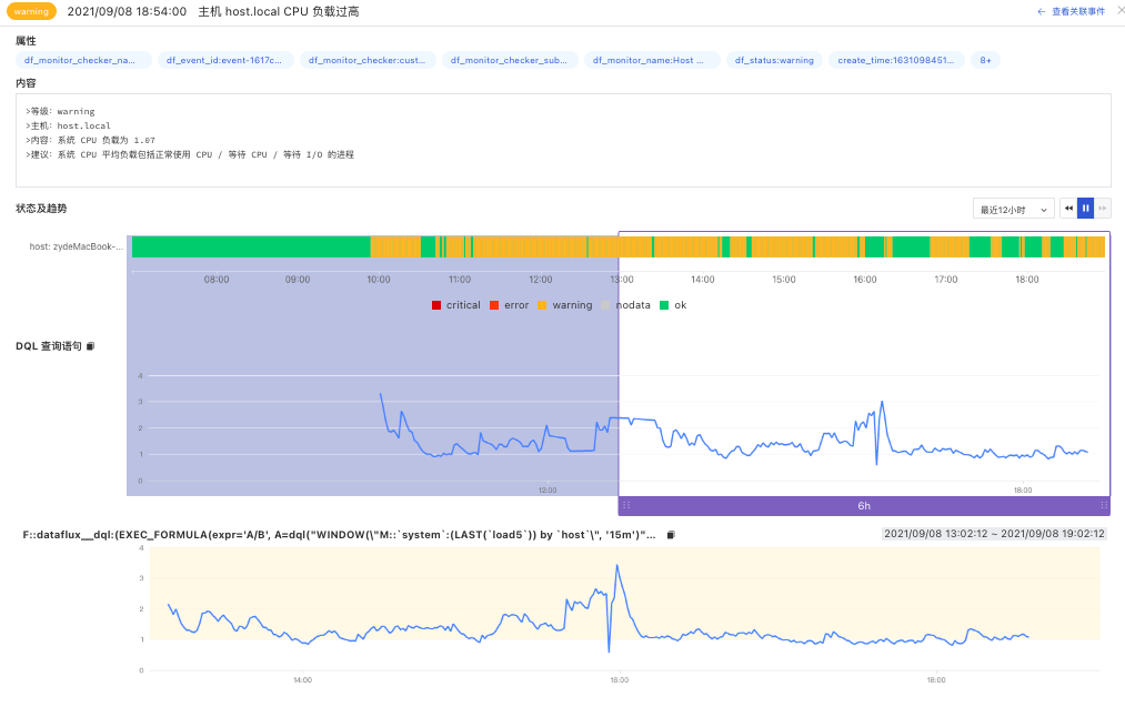
Optimized Unrecovered Event Display Style
In the unrecovered event list, you can preview the window function for the last 6 hours of the event: • The dotted border display effect represents the time period affected by the anomaly event. • When the detection library rule type is threshold, log, APM metric, user access metric detection, security check, abnormal process, or cloud testing detection, color blocks corresponding to different alert levels allow viewing related anomaly detection metric data, including critical, error, warning. • When the detection library rule type is mutation, range, or level, the chart "vertical line" quickly identifies the time point when the current event was triggered.
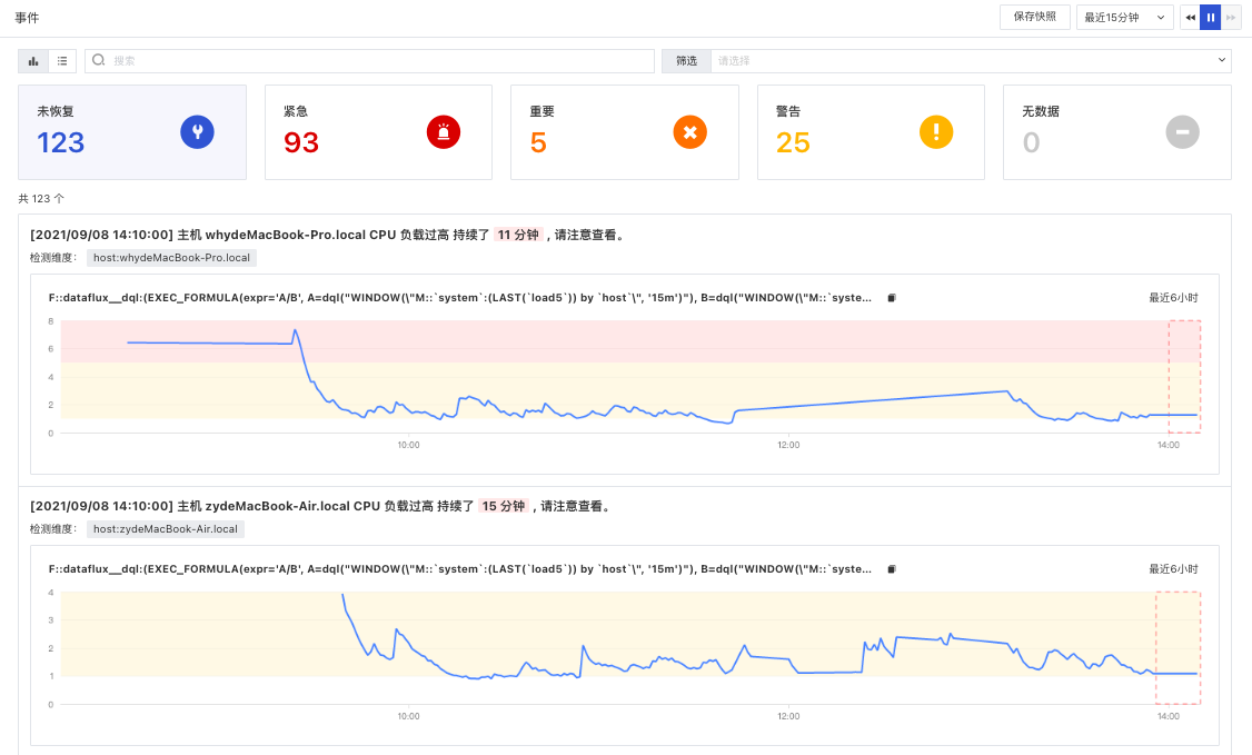
The event detail page supports viewing the status distribution, DQL function, and window function line chart of the anomaly event. • Status Distribution: Displays event statuses (critical, important, warning, data gap) within the selected time range (default last 6 hours). • DQL Query Statement: Real-time metric data returned based on the custom query statement of the anomaly detection rule, default displays real-time metric data for the last 6 hours. • Window Function: Based on the anomaly detection rule, uses the selected time range as the window (record set), with the detection frequency as the offset, re-executes statistical calculations for each record, returning real-time anomaly detection metric data used to trigger alerts. Default displays real-time anomaly detection metric data for the last 6 hours.
Optimized Scenario View Analysis
In preview mode, double-clicking a chart enlarges it to enter analysis mode for viewing. In edit mode, double-clicking a chart enters edit mode for adding, deleting, modifying, and querying the chart.
Optimized Infrastructure Binding Built-in Views
When selecting built-in views, duplicate view names are filtered. When system views and user views have duplicate names, user views are prioritized for display, meaning only user views can be selected. If a system view needs to be selected, the duplicate-named user view must be changed or deleted.
Optimized Billing Method, Added Cloud Testing Billing, Adjusted Data Expiration Policy
- Added PV count statistics: Session count and PV count are charged based on whichever actual cost is lower.
- Added cloud testing task count fee statistics: Opened cloud testing self-built node management, supports any space administrator creating new testing nodes globally. Cloud testing billing dimension will be charged based on the number of cloud testing task invocations in the current workspace. Free Plan workspaces can create up to 5 testing tasks and only support the use of "China Region" testing nodes. Agile Plan and above workspaces support creating more testing tasks and using more foreign testing nodes.
August 26, 2021
DataFlux Studio
Added Chart Query Label Filtering
DataFlux supports selecting host label attributes for filtering display. Before selecting labels in chart queries, label attributes need to be set for hosts in "Infrastructure" - "Hosts". As shown below, there are two hosts containing the "production" label attribute, so data from two hosts is displayed.
Added Infrastructure Container Cluster, Replicate Set, Node Explorers
DataFlux added container Cluster, Replicate Set, Node Explorers. Supports viewing the operation status and service capability related metrics of Cluster, Replicate Set, and Node in Kubernetes, thereby achieving real-time monitoring of Kubernetes clusters and various deployed resources.
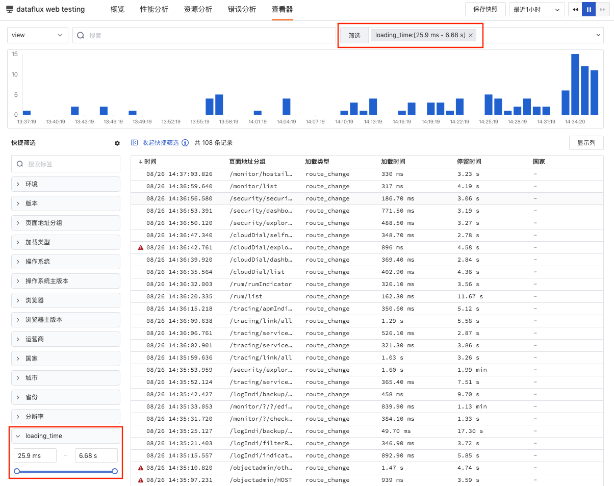
Added User Access Monitoring View Explorer Quick Filter
DataFlux supports custom adding filter fields by clicking the quick filter settings button in the View Explorer. After selecting the fields to add, click "Done".
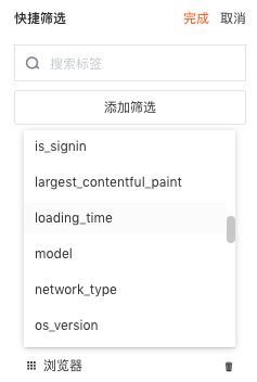
Note: If the added filter field represents time, supports filtering corresponding page content by selecting a time interval. For example, loading_time (page loading time).
Added Navigation Menu Help Entry, Added Multiple Explorer Data Collection Guide Entries
DataFlux added a help documentation entry in the navigation menu. Additionally, when no data is uploaded in an Explorer, DataFlux provides quick access to "How to start data collection" entries to help you promptly start real-time monitoring in different Explorers. Including how to enable log monitoring, how to enable cloud testing, how to collect host objects, etc.
Optimized Log Explorer
DataFlux optimized the Log Explorer, using different colors to highlight different parts of the log, allowing you to quickly grasp key log data information. Supports both light and dark theme colors.
| Log Content | Light Theme | Dark Theme |
|---|---|---|
| Date (time when the log occurred) | Yellow | Light Yellow |
| Keywords (HTTP protocol related, e.g., GET) | Green | Light Green |
| Text (quoted strings) | Blue | Light Blue |
| Default (text without any indication) | Black | Gray |
| Numbers (log status codes, etc., e.g., 404) | Purple | Light Purple |
Optimized Security Check Overview Statistics
DataFlux supports customizing views on the security check overview page. By clicking the "Jump" button, you can jump to the corresponding built-in view on the overview page for viewing, and edit, copy, and export that view.
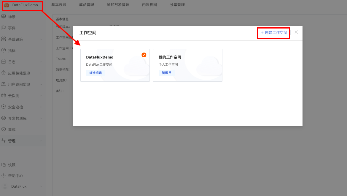
Optimized Workspace Switching
DataFlux supports switching to other workspaces or creating a new workspace by clicking the "Current Space" name.
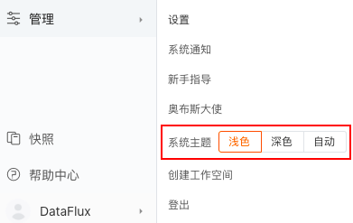
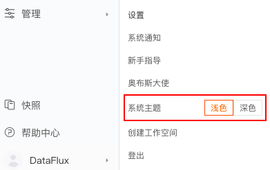
Optimized System Theme Color Switching
DataFlux added "Auto" option for system theme color, which automatically switches the theme color based on the computer's appearance settings.
Other Optimized Features
- Optimized APM "Service" details. On the service detail page, clicking the service's resource name directly jumps to "Links" to view corresponding resource link situations.
- Optimized User Access Monitoring View Explorer "Performance" details. Clicking error data (data with "Error" flag in the View list) in the performance details allows viewing details corresponding to the error.
- Optimized metric Explorer tag name and tag value display.
- Optimized time series chart X-axis time display. Default time range is last 15 minutes, X-axis segments are by minute interval; last 1 day, X-axis segments are by hour interval; last 7 days, X-axis segments are by day interval.
- Optimized expression queries. When performing chart queries, if an expression query contains multiple query statements, grouping tags must be consistent.
- Optimized host integration operation status. Added DataKit version information for the host installation in "Infrastructure" - "Hosts" - "Integration Operation Status".
- Optimized snapshot sharing. Supports sharing snapshots with "Anyone" who has the share link, or encrypted sharing with people who have both the link and the key.
August 12, 2021
DataFlux Studio
Added 3 Permission Roles, Optimized Scenario Viewing Permissions
DataFlux currently supports defining three workspace member permissions: "Administrator", "Standard Member", and "Read-only Member", each with constraints on management permissions, operation permissions, and browsing permissions for different member categories. "Administrators" can custom define the permission scope for members, e.g., limit accessible scenario views for read-only members, limit editable scenario views for standard members, etc.
In the DataFlux workspace, go to "Management" - "Member Management" - "Modify" to edit and update member permissions.
Added Infrastructure Host Detail View Connection Tracking and File, and Layout Optimization
DataFlux supports viewing host system information on the infrastructure host detail page, including host name, operating system, processor, memory, network, hard disk, as well as connection tracking count, file handle count, etc.
Added Scenario View Snapshot Save Function
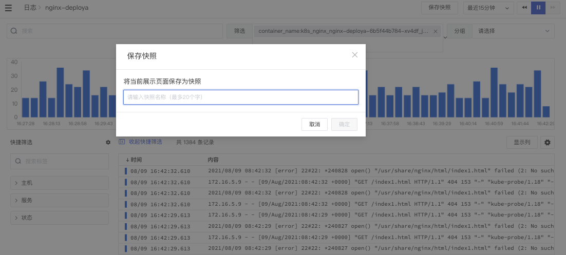
In the DataFlux workspace, enter "Scenarios" - "Node", click the "Settings" button in the top navigation bar, select "Save Snapshot" to save the data content currently displayed by the view as a snapshot.
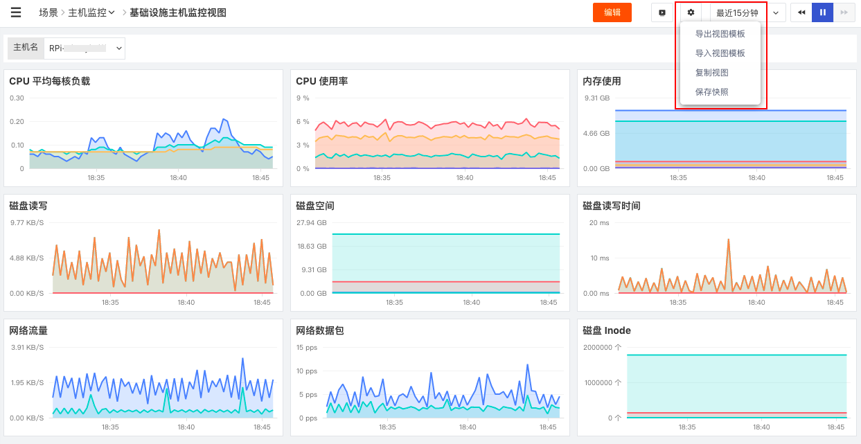
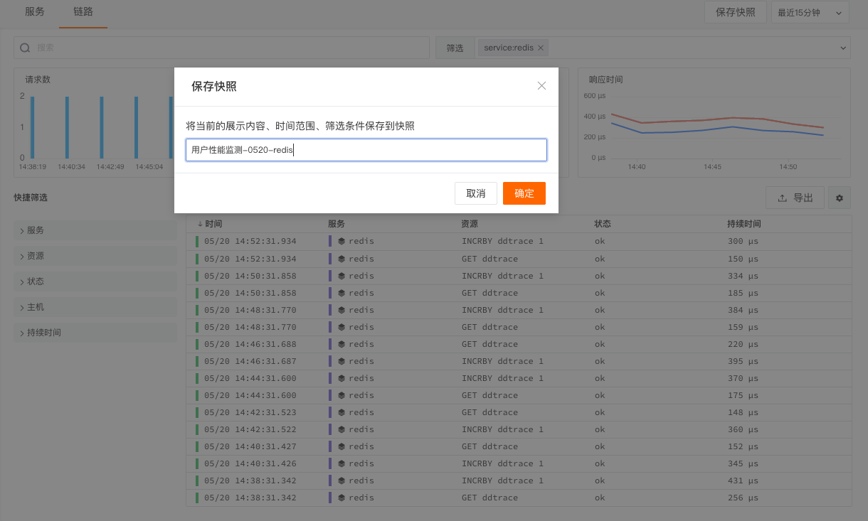
Additionally, DataFlux supports quickly saving snapshots via page function buttons and shortcuts (Ctrl+K). In scenario views and all Explorers, using the shortcut Ctrl+K quickly pops up the [Save Snapshot] dialog. Enter a name, click [OK] to add the current page as a new snapshot.
Note: When your background program has other shortcuts conflicting with Ctrl+K, you will not be able to use the "Save Snapshot" shortcut function.
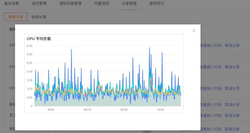
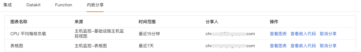
Added Chart and Snapshot Share Management
DataFlux supports unified management of shared charts and snapshots within the current space. For example, after completing chart sharing in "Scenario Views", you can view the current space's chart share list via "Management" - "Share Management" - "Chart Sharing", and perform chart viewing, view embedding code, and cancel sharing.
Added User Email Change, Phone Change Unbind Function
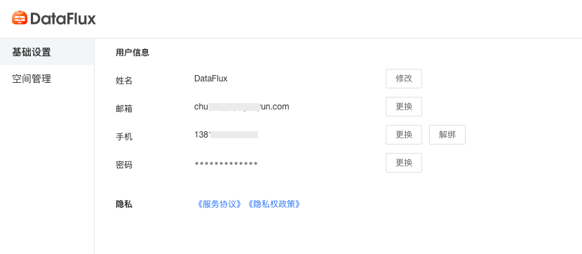
In the DataFlux workspace, click the lower left "Account" - "Settings" - "Basic Settings" to change or unbind phone and email.
Added Custom User Access Monitoring SDK Data Collection Content
DataFlux supports customizing User Access Monitoring SDK data collection content. By custom setting user identifiers, custom setting sessions, and custom adding additional data TAGs, it helps users locate and analyze data in specific scenarios by setting different types of identifiers.
Added Paid Plan Session, Task Scheduling, Trace Free Quota
DataFlux paid versions added a daily free quota of 1 million log data entries, 100 Session counts, 10,000 task scheduling counts, and 1 million Trace counts per DataKit.
Optimized Scenario Chart Analysis Mode
DataFlux supports previewing object data interaction changes within four times the query cycle via the timeline below the chart in the time series chart analysis mode, and selecting the time range displayed by the time series chart by dragging the timeline. For example: current time point is 14:00, time range selected is [10:00-11:00], then the timeline range is [08:00-12:00].
Note: A time series chart query statement returns a maximum of 10 time series, i.e., based on the grouping (group by) condition results, data exceeding 10 time series are displayed in order, showing only 10 time series.
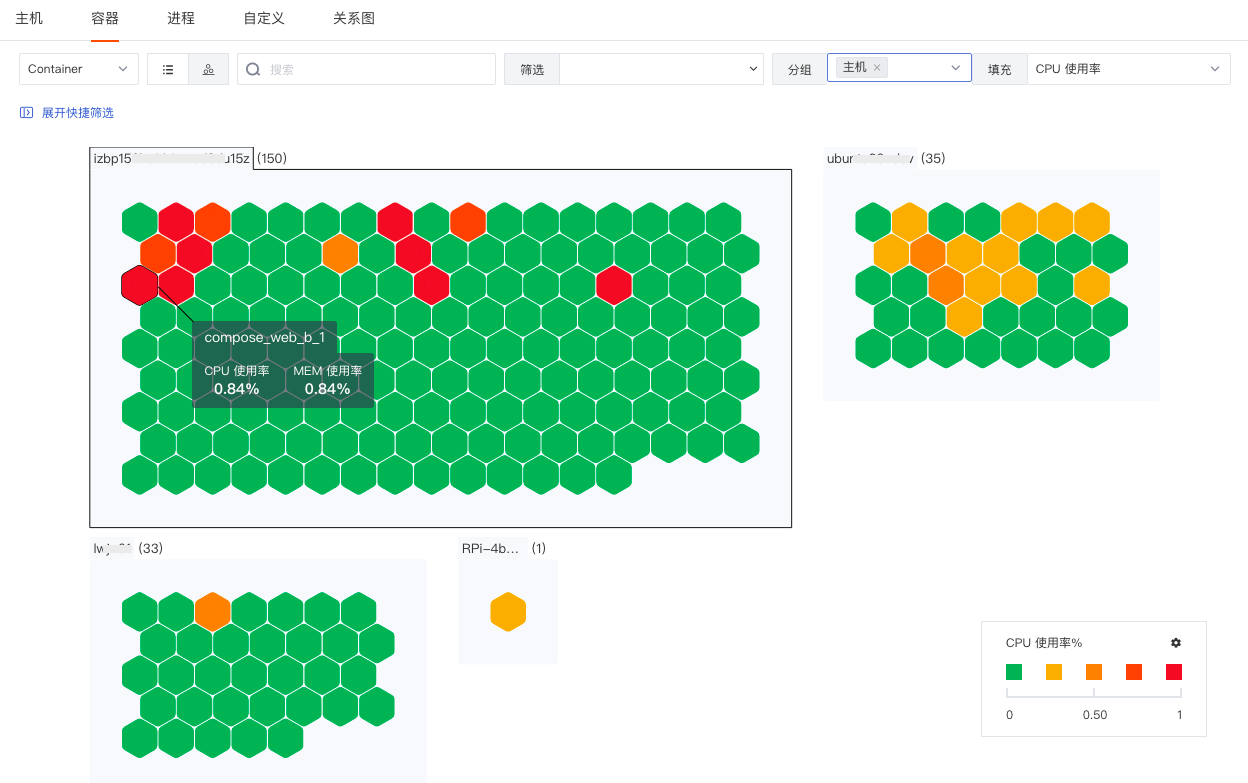
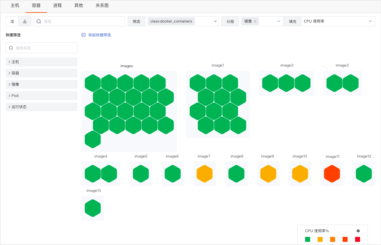
Optimized Infrastructure Host, Container Honeycomb Chart
Hovering the mouse over host or container objects allows viewing host/container name, CPU usage rate, and MEM usage rate.
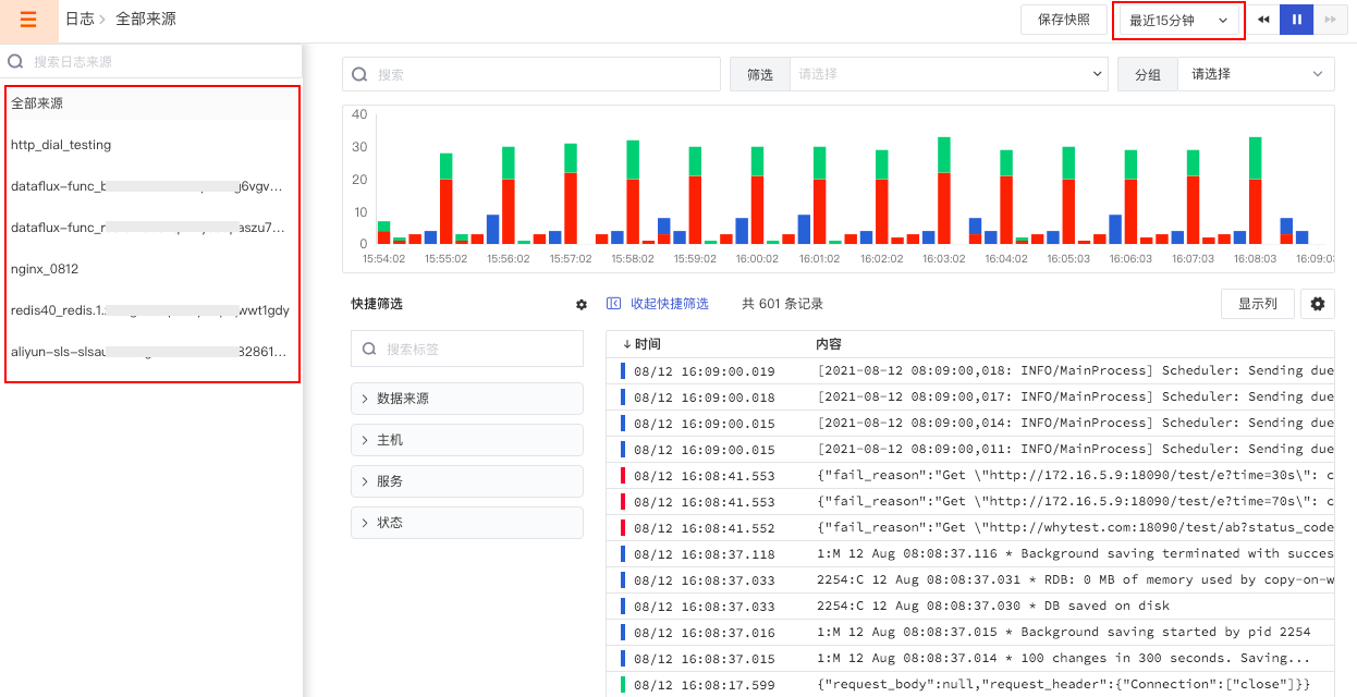
Optimized Log Source List Display Based on Explorer Time Range
DataFlux supports filtering the log source list by selecting the Explorer time range. For example, in the DataFlux workspace "Log Explorer", selecting 15 minutes in the upper right time range causes the left log list to display only log sources with data within the last 15 minutes.
Optimized System Theme Color Switching
DataFlux supports switching system theme colors, divided into light and dark themes. Click the lower left account, click the desired theme in "System Theme" to switch directly.
Other Optimized Features
- Webhook custom notification sending content type changed from text format to JSON format.
- Added 15-minute alert mute option for anomaly detection library alert settings, i.e., within a 15-minute time range, the same alert is not sent.
- Unrecovered event list page display style adjusted. Log alert event statistical display changed from table chart to time series chart.
August 4, 2021
DataFlux Studio
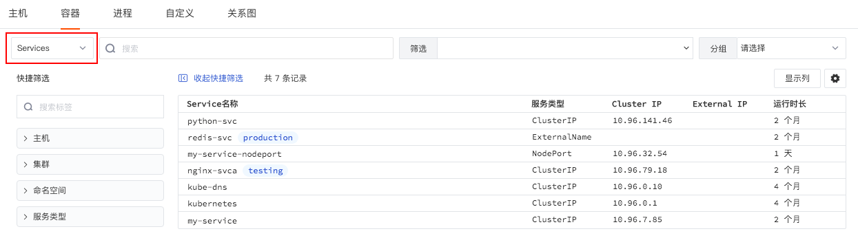
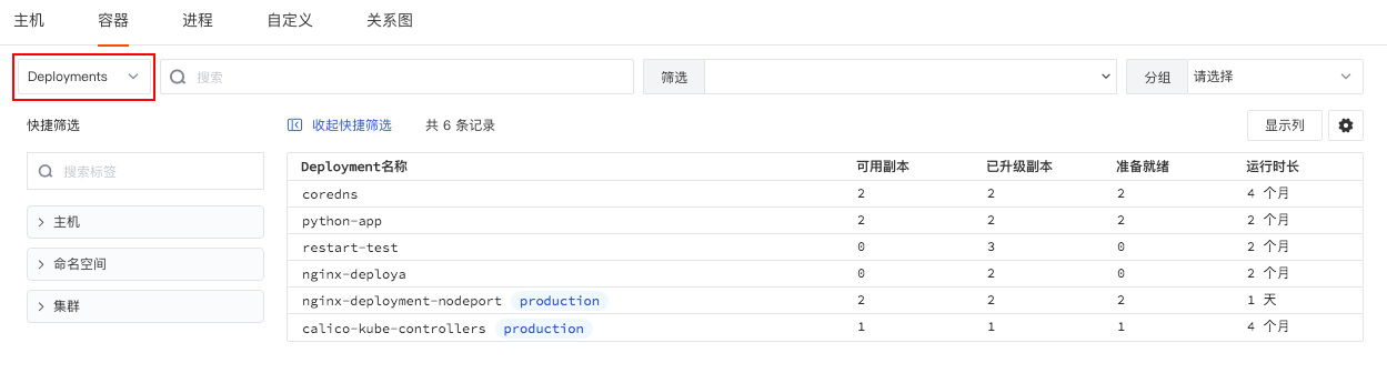
Added Container Services and Deployments Explorers
DataFlux supports comprehensively displaying container status from different dimensions through "Container", "Pod", "Services", "Deployments", and other Explorers.
In the workspace "Infrastructure" - "Containers", switch to "Services" via the data type filter bar in the upper left to view detailed information of all Services retained in the space, including Service name, service type, Cluster IP, External IP, uptime, etc.
Switch to "Deployments" to view detailed information of all Deployments retained in the space, including Deployment name, available replicas, upgraded replicas, ready status, uptime, etc.
July 29, 2021
DataFlux Studio
Added Infrastructure Global Label Function
DataFlux added an infrastructure global Label function, supporting users adding custom tags to infrastructure objects such as hosts, containers, processes, and displaying infrastructure objects with the same tags through added tag filtering.
In the infrastructure object list, click the object name to slide out the detail page and add tags "Label attributes" for the object.
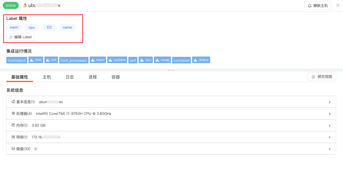
After adding custom tags, you can filter and display object lists with the same tags in the object list using the added tags.
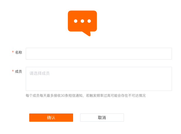
Added SMS Notification Target; Added Billing SMS Fee Statistics
DataFlux supports users managing alert notification targets. Currently supports adding DingTalk robot, WeCom robot, Lark robot, Webhook custom, email group, and SMS group.
Note:
- Members for SMS notifications need to be invited and joined to the workspace in "Management" - "Member Management" first before they can be selected.
- DataFlux Free Plan does not have SMS notifications. Other plans charge 10 yuan per 100 SMS notifications, billed daily.
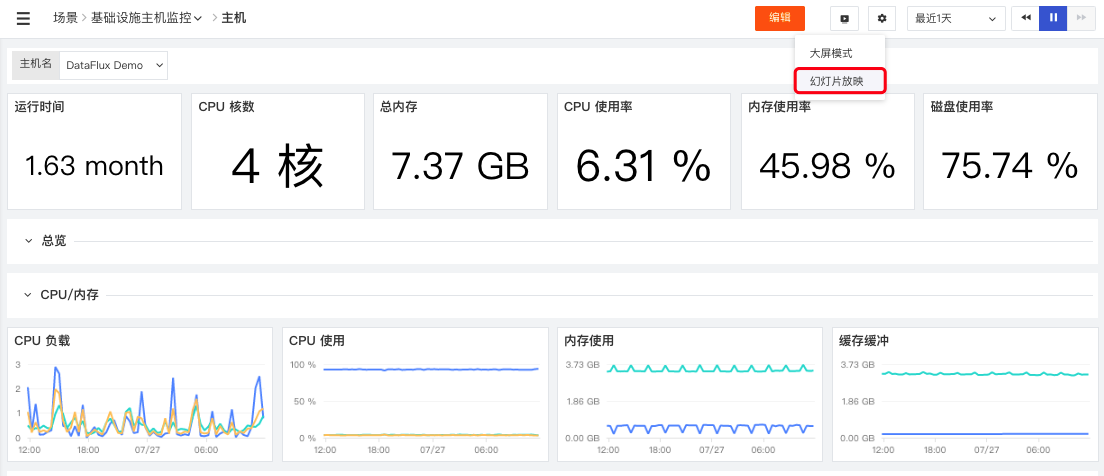
Added Scenario View Slideshow Mode
DataFlux added scenario view slideshow, supports browsing all node views under a specified scenario in slideshow mode, and customizing the slideshow time interval.
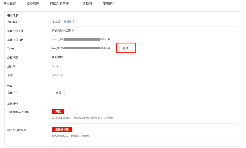
Added Workspace Token Change Function
DataFlux supports current space administrators changing the Token within the space and customizing the expiration time of the current Token. Go to "Management" - "Basic Settings" - "Change Token", select the expiration time and confirm "Change". DataFlux will automatically generate a new Token, and the old Token will expire within the specified time.
Note:
- After changing the Token, the original Token will expire within the specified time. If any agent uses this Token, data reporting will stop immediately. Please check integration configurations promptly.
- Changing the Token triggers "Operation Events" and "Notifications".
Added Metric DQL Query Mode
DataFlux supports switching "Search" to "DQL Query Mode" in the workspace "Metrics", then directly inputting DQL statements for queries. Queries can view corresponding tags and metrics on the left, and view visual charts returned by the query statement on the right.
Optimized Log Explorer Multi-line Display
DataFlux supports selecting log display as "1 line", "3 lines", or "10 lines" in the Log Explorer "Settings" to view complete log content.
Optimized APM Service and Link Switching View, Optimized Response Time Line Chart
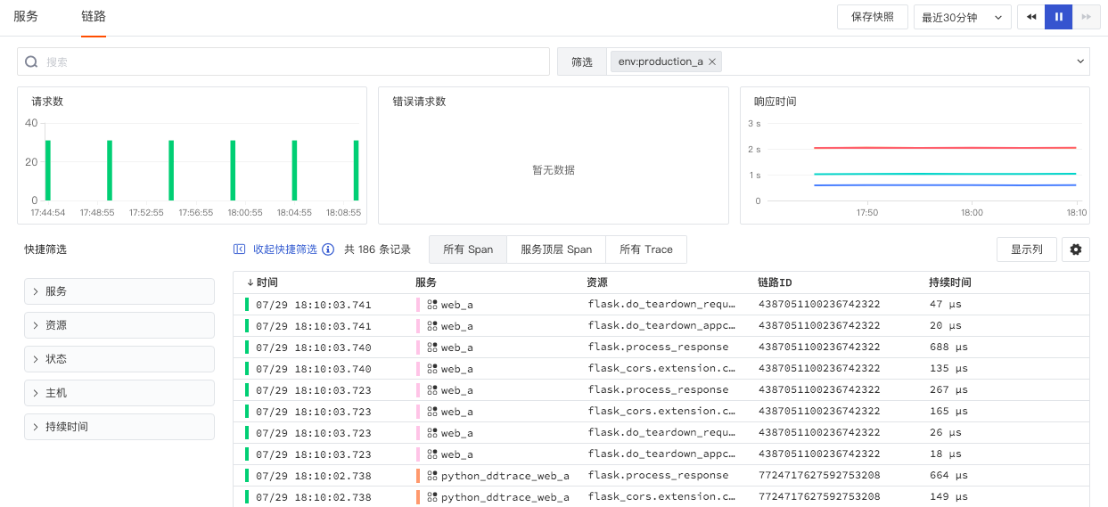
DataFlux supports retaining current filter conditions (including: environment, version) and time range by default when switching between "Service" and "Link" Explorers. For example: In APM "Service", select "Environment" as production_a, "Time Range" as Last 30 minutes.

Switch to APM "Link", filter conditions remain consistent with "Service".
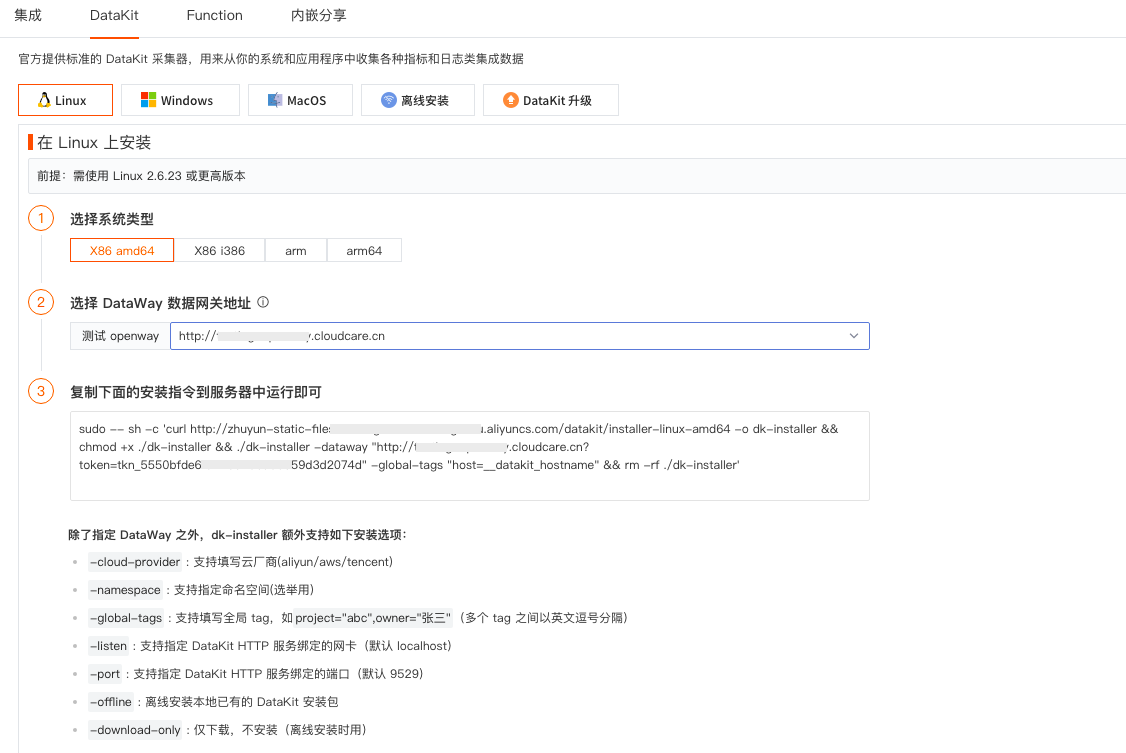
Optimized DataKit Collector Installation Guide
DataFlux supports custom installation options when installing DataKit, such as cloud vendor, namespace, global tag, etc. DataKit offline installation supports directly clicking to download offline installation packages for different operating systems.
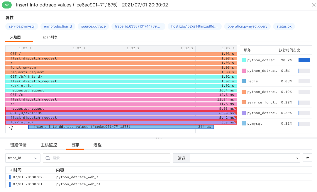
Optimized Flame Chart Synchronous, Asynchronous Call Display
DataFlux APM flame chart supports viewing data details of service synchronous and asynchronous call link performance. For example, the flame chart clearly shows which requests are asynchronous, when they start, when they end, and the total time taken.
Optimized Explorer Display Column Custom Field Alias
DataFlux supports custom aliases for fields displayed in Explorers. For example, in infrastructure host objects, users can modify field aliases in "Add Display Column". After modification, they can be viewed in the Explorer and details.
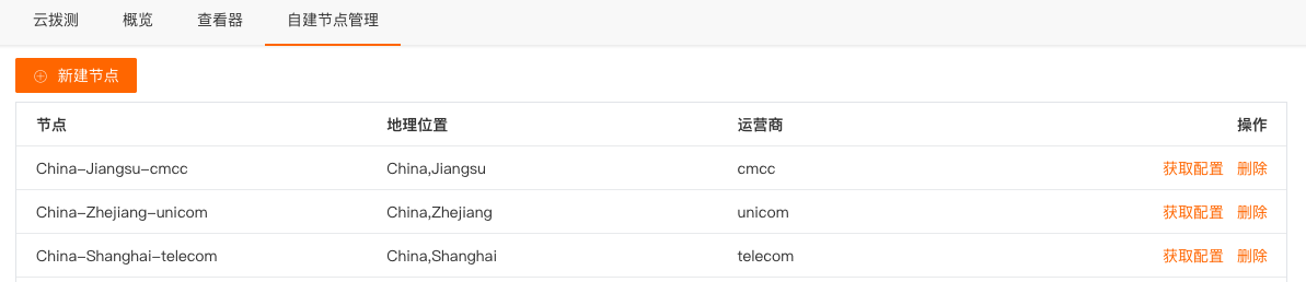
Optimized Cloud Testing Self-built Nodes
DataFlux cloud testing self-built nodes' geographical location split into two filter boxes: Country and Province (or City). If the Country filter box selects China, the latter filter box filters a list of provinces; if the Country selects non-China, the latter filter box filters a list of cities. The filter box displays 20 entries by default, supports fuzzy search.
Optimized DQL Query Functions
DataFlux DQL added exists, wildcard, with_labels, and other query functions.
July 15, 2021
DataFlux Studio
Added User Access Third-party Development Tool Access
DataFlux added mini-program access based on the uniapp development framework. By introducing the SDK file, it monitors mini-program performance metrics, error logs, and resource request data, and reports them to the DataFlux platform.
Added Data Gap Anomaly Detection
DataFlux added data gap anomaly detection, based on configuring a custom detection cycle to trigger events. Generated data gap events are uniformly stored in events.
After the data gap detection rule takes effect, the first detection of a data gap with continuous data gap does not generate a data gap alert event. If data is detected and a data gap occurs in the configured custom detection cycle, a data gap alert event is generated.

Added Elasticsearch, Redis, and Docker Built-in Detection Libraries
DataFlux currently supports Elasticsearch, Redis, Host, and Docker monitoring 4 built-in detection libraries. You can use them out-of-the-box without manual configuration. For more details, click the corresponding built-in detection library.
- Redis Detection Library: Includes abnormal increase in client connections waiting for blocking commands in Redis.
- Host Monitoring: Includes various data metrics such as host CPU, memory, disk, etc.
- Elasticsearch Detection Library: Includes ES JVM heap memory, thread pool, search query load anomalies, and other metrics.
- Docker Monitoring: Includes various data metrics such as container CPU, memory, etc.

Added APM "All Trace Explorer"
DataFlux provides three link filter view lists: "All Span", "Top Span", and "Traceid". Span represents a logical unit of work in a distributed system within a given time period. Multiple spans constitute a link trajectory (trace).
- All Span: Displays all collected Span data within the selected time range.
- Service Entry Span: Filters and displays all Span data that first entered within the selected time range.
- All Trace: Filters and displays all trace data containing the initial top-level span within the selected time range.
Added Link Detail View Topology Call Relationship Chart
DataFlux added a corresponding service topology call relationship chart on the APM detail page to view call relationships between various services.
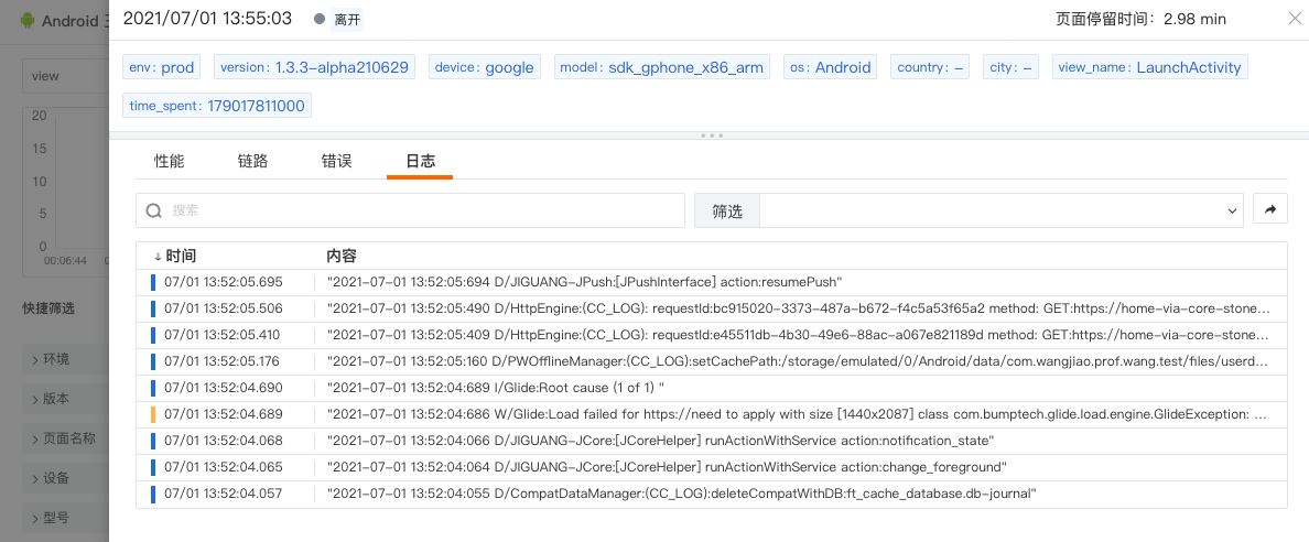
Added User Access Error Detail Page
DataFlux supports viewing user access error details on the user access detail page. You can view error data information, error type, and error occurrence time that appeared during this user access.
Clicking the error information jumps to the corresponding error detail page.
Added Security Check Overview Statistics
In "Security Check" - "Overview", you can view overview situations of security check events occurring on different hosts by filtering hosts, security check levels, and security check categories. This includes the number of security check events of different levels and visual chart analysis, and rankings of security check events by category and rule.
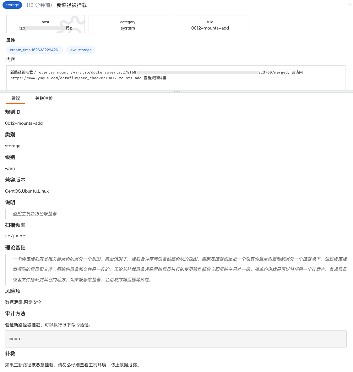
Added Security Check Event Handling Suggestions
In the Security Check Explorer, click the inspection event you want to view. In the slid-out detail page, you can view handling suggestions for this security check event, including the theoretical basis, risk items, audit methods, remediation measures, etc., of the security check event occurrence.
Added Secondary Navigation Bar
DataFlux added support for displaying secondary navigation via "mouse hover", thereby shortening the time users spend finding target data.
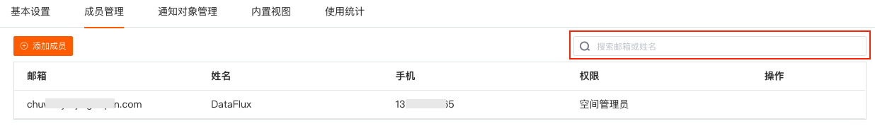
Added Member Management Search Function
DataFlux supports quickly matching current workspace members based on email or name through the search function in "Member Management".
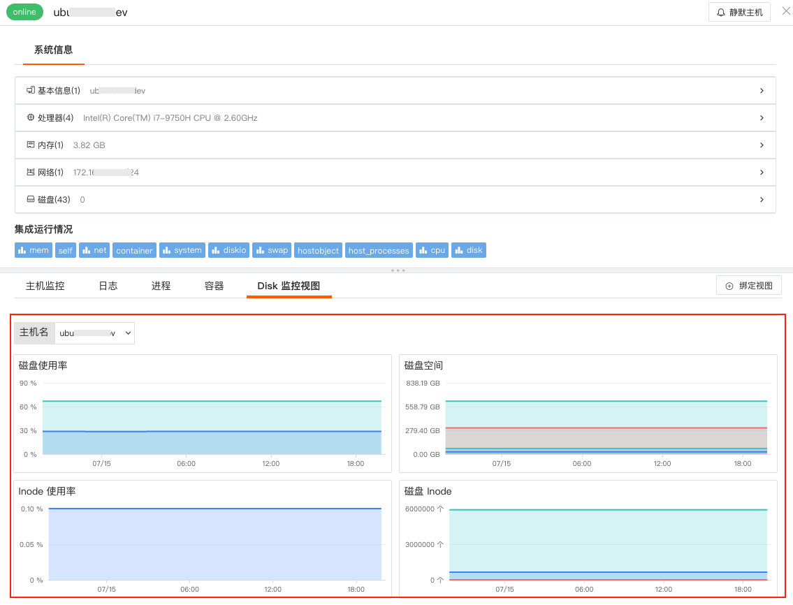
Added Binding Built-in Views to Infrastructure Objects
DataFlux supports current space administrators binding built-in views (system views, user views) to infrastructure object detail pages. As shown below, the built-in system view "Disk Monitoring View" is bound.
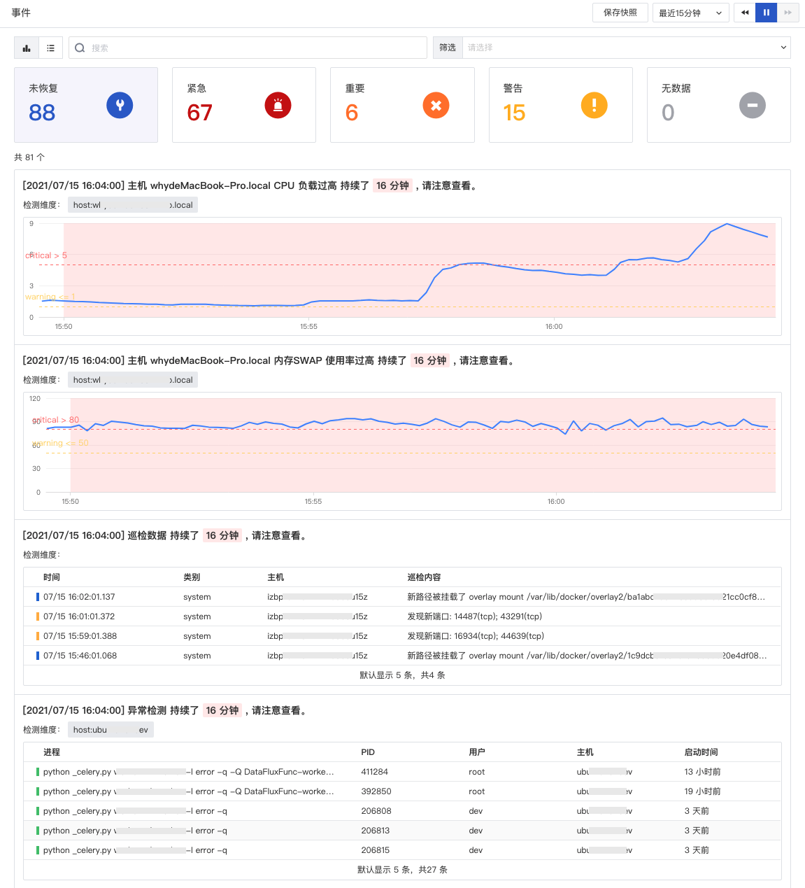
Optimized Event List Display by Detection Library Type
DataFlux supports displaying corresponding event information based on different detection library types in the event list.
- When the detection library rule type is threshold, mutation, range, level, APM metric, or user access metric detection, it displays the corresponding baseline and its information based on the configured trigger conditions, including critical, error, warning.
- When the detection library rule type is log, security check, abnormal process, or cloud testing detection, it queries all log data counted for the anomaly event.
As shown below, there are three different detection library types: threshold detection, security check detection, and process data detection.
Optimized Measurement Deletion
DataFlux supports administrators deleting measurements within the space. Go to "Management" - "Basic Settings", click "Delete Measurement", then input keywords to query and select the measurement name. Click "OK" to enter the deletion queue for deletion. Deleting a measurement generates system notification events, such as user created a delete measurement task, delete measurement task executed successfully, delete measurement task failed, etc.

Optimized Explorer Built-in View Query Time Range
Changed built-in view query time ranges, including infrastructure objects, links, log detail page "Host Monitoring" views, and link, log detail page "Process" views.
- When viewing link or log detail pages, "Host Monitoring" by default displays performance data of associated hosts within the selected time widget range.
- When viewing infrastructure object (host, container) detail pages, "Host Monitoring" by default displays host performance data from the last 24 hours.
- When viewing link detail pages, "Process" by default displays real-time process data within 10 minutes before and after the link occurrence time point.
- When viewing log detail pages, "Process" by default displays real-time process data within 10 minutes before and after the log generation time point.
Optimized Explorer Quick Filter Interaction
If the current field value is too long in quick filters of various DataFlux Explorers, the excess part is displayed with ···. Hovering the mouse over the current field value area expands the display to the right based on the field value length.
July 1, 2021
DataFlux Studio
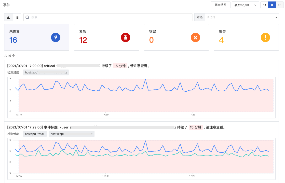
Added Unrecovered Event Statistics Explorer
DataFlux added an unrecovered event statistics Explorer. In the DataFlux workspace Events, by switching the Explorer in the upper left, you can view all continuously triggered unrecovered events within the space, and data volume statistics and alert information details of unrecovered events under different alert levels.
Added Chart Link Function
DataFlux added chart link function for time series charts, bar charts, overview charts, gauges, pie charts, top lists, scatter plots, bubble charts, maps, and honeycomb charts. Chart links help you jump from the current chart to the target page, supporting modifying corresponding variable values in the link through template variables to transmit data information, completing data linkage.
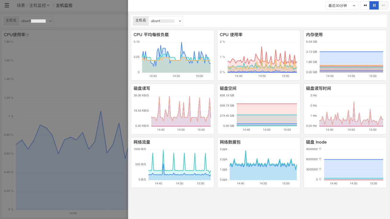
Chart links support obtaining template variables through queries, support adding platform internal links and external links, support three opening methods: new page, current page, and slide-out detail page, and support adding alias display for links.
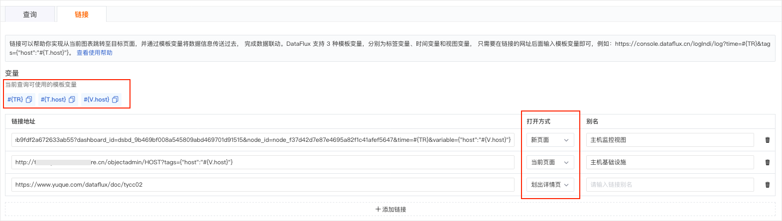
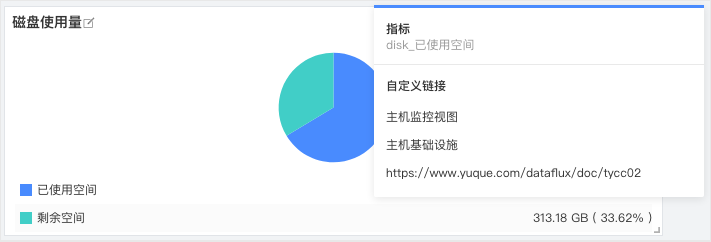
After adding the link, click the chart to view the clickable "Custom Link".
Added APM Binding Links and Built-in Views
DataFlux supports adding built-in views, including built-in views and linkable web addresses, in individual service details. In the service list, click "Settings" to add one or more jump link addresses or built-in views, and custom name them.
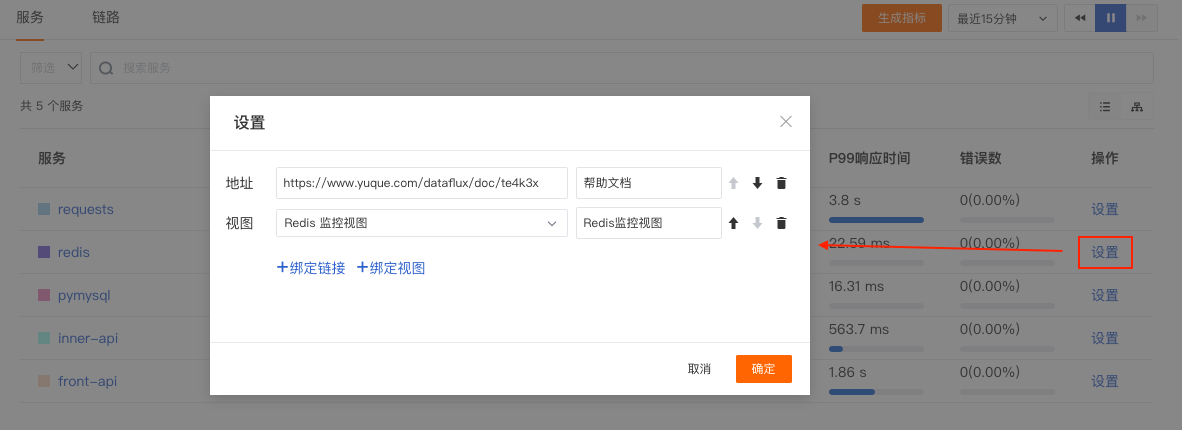
After adding built-in views, you can view the corresponding built-in pages by viewing service details.
Added User Access Monitoring Scenario PV/UV Overview Statistics
DataFlux added user access monitoring Web, iOS, Android, and mini-program scenario PV/UV overview statistics. Quickly compare PV/UV differences to understand actual visiting user numbers.
Added Notification Target: Lark Robot
DataFlux supports users managing alert notification targets. Currently supports adding email, DingTalk robot, WeCom robot, Lark robot, and Webhook custom.
Optimized Infrastructure Resource Catalog
Object data other than hosts, containers, and processes in infrastructure can be custom reported to "Infrastructure" - "Custom" for viewing and analysis via DataFlux Function. Supports binding built-in views to resource catalog data, manually adding tags for filtering.
Resource catalog data reporting requires installing and connecting DataKit and Function first, then reporting data to DataKit via Function, and finally DataKit reports data to the DataFlux workspace.
Optimized Anomaly Detection Library Detection Rules
DataFlux added anomaly event recovery alert configuration. Added filter condition support for regex pattern matching style adjustment, optimized =~ to match, added not match. Added trigger condition support for non-numeric data matching, added match, not match regex matching, added between.
Optimized Explorer Detail Page Associated Logs
DataFlux supports default filtering based on trace_id for associated log pages in the link slide-out detail page, viewing associated log details under the same trace_id condition.
Within link details, click "Logs" below the flame chart to view associated logs based on the host associated with the current link and link ID (trace_id field). You can also perform keyword searches and multi-tag filtering on logs. For more detailed log content, click the log content to jump to the log detail page, or click the jump button to open in the log page.
Explorer added log association page.
Optimized Explorer Search Style
Adjusted search styles for creating scenarios, metrics, APM, user access monitoring, anomaly detection library, host mute management, integration, management/built-in views, snapshots, etc.
Deployment Plan Supports Modifying Data Retention Duration
Basic information in workspace management added change data storage policy.
June 17, 2021
DataFlux Studio
Added Log Analysis Mode
DataFlux supports grouping massive raw data based on 1-3 tags through the log grouping function to reflect distribution characteristics and trends of grouped data over time. DataFlux supports three grouped data browsing methods: line chart, area chart, bar chart.
Added Log Filtering
Added log filtering function (log blacklist), supports setting filtering rules to filter out logs meeting conditions. That is, after configuring log filtering, log data meeting conditions is no longer reported to the DataFlux workspace, helping users save log data storage costs.
In "Logs" - "Filter Rules" - "Create Rule", select "Log Source", add one or more data filter conditions with the relationship and (and) to filter collected log data. Log data meeting filter conditions will not be reported to the console.
Added Save Metric Browse Snapshot, Added Snapshot Link Copy Function
DataFlux supports creating quickly accessible data copies for the metric Explorer, uniformly saved in the "Snapshots" directory. Added generating snapshot share links, supports sharing snapshot links with other members within the space, quickly reproducing instantly copied data copy information, restoring data to a specific time point and data display logic.
Added Container Pod Explorer
DataFlux added Pod Explorer in "Infrastructure" - "Containers". Switch to "Pod" via the filter in the upper left to view detailed information of all collected Pods, including Pod name, belonging Node, one or more contained containers, startup status, operation status, and associated metrics. Can switch to honeycomb chart for viewing.
Clicking a Pod in the honeycomb chart allows viewing its details, including Pod name, namespace, visual monitoring charts, etc.
Added Free Quota Alert Notification
Added Free Plan usage quota alert notification and quota exhausted notification function, supports sending emails and generating system notifications. Learn more about message notifications. System message notifications can be viewed in the DataFlux workspace "Account" - "Notifications".
Added Chart Sharing
DataFlux supports chart sharing, which can be used to insert charts into code on platforms outside DataFlux for visual data display and analysis. Shared charts change according to chart changes in DataFlux. Charts shared in DataFlux scenario views are uniformly stored in "Integration" - "Embedded Sharing".
Optimized Chart Queries and Chart Styles and Settings
Adjusted and optimized visual chart queries, styles, and settings layout in scenario views. Added chart title hiding, time slice settings, overview chart data precision settings, top list baseline settings, map/honeycomb chart color scheme fill settings, etc.
Optimized Integration, Added DataKit and Function Installation Guidance, Added Embedded Sharing
DataFlux supports viewing all supported collectors, DataKit installation commands, DataKit upgrade commands, Function installation commands, and embedded shared chart code in Integration.
In the DataFlux workspace, click the left "Integration" menu to view all currently supported collectors. Click a collector to view its configuration details.
In the DataFlux workspace, click "Integration" - "DataKit" to obtain DataKit installation commands, including Linux, Windows, MacOS three major operating systems and offline installation methods. If DataKit is already installed but not the latest version, you can obtain update scripts via "DataKit Upgrade" here.
In the DataFlux workspace, click "Integration" - "Function" to obtain Function installation commands.
Optimized Host Detail Page
In "Infrastructure" - "Hosts", click the host name in the list to slide out the detail page and view host basic information, processor, memory, network, hard disk, etc. Supports automatic data unit conversion, supports displaying different host monitoring views based on different operating systems.
June 3, 2021
DataFlux Studio
Added Browser Log Collection
DataFlux supports actively sending log data of different levels (corresponding source: browser_log metric type log data) to DataFlux via web browsers or javascript clients.
Added User Access Monitoring Session Explorer
DataFlux user access monitoring Explorer added viewing user access behavior monitoring data (session data) and session data details related to Web/mini-program/Android/iOS applications. In the workspace, open "User Access Monitoring" - "Select any application" - "Explorer", switch to the Session Explorer. The Session Explorer statistics entire session duration, page count, action count, error count, etc. Clicking a single session allows viewing detailed records of the entire session. By viewing and analyzing session data, you can understand real user access data from multiple dimensions, helping improve application performance experience.
Added Browser Testing, Cloud Testing Anomaly Detection Templates and Optimized Self-built Nodes
- Browser Testing
DataFlux added browser testing. In DataFlux "Cloud Testing", click "Create" - "Browser Testing" to create a Browser testing task, obtaining real-time user access experience data for web pages, including page loading time, resource loading time, etc.
- Anomaly Detection Templates
"Cloud Testing Data Detection" monitors cloud testing data within the workspace. By setting threshold (boundary) ranges for specified data volumes generated by testing tasks within a certain time period, alerts are triggered when data volumes reach threshold ranges. You can also custom alert levels; when specified data volumes reach different threshold ranges, different level alert events are triggered.
- Self-built Nodes
DataFlux cloud testing self-built nodes added "Node Code", used to obtain the Code for node information. Node Code does not support duplication within the current space.
Added Registration Welcome Page
DataFlux account registration login prompts a welcome page, where you can watch an introduction video about DataFlux. Scanning QR codes allows joining DataFlux WeChat and DingTalk service groups.
Added Free Plan Support for DataFlux Func, Adjusted Billing Items
All DataFlux versions fully support the DataFlux Func platform for custom functions. DataFlux Func is a Python-based, ServerLess-like script development, management, and execution platform. Simultaneously, to reduce user costs for using DataFlux, DataFlux adjusted the billing logic for APM and user access monitoring. After adjustment, APM counts trace numbers, and user access monitoring counts daily session numbers.
Optimized Generate Metrics
Added user performance monitoring, user access monitoring, security check generate metrics, optimized log generate metrics. Generate metrics can be configured through three steps: data filtering, data query, generate metrics, including configuring dimensions, aggregation time, defining aggregation frequency, measurement, and metric name to generate metrics. Examples below:
- APM
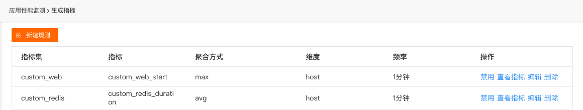
- User Access Monitoring
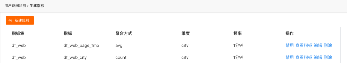
- Security Check
Optimized Built-in Views, Added Clone Function
Built-in views are divided into "System Views" and "User Views". Supports cloning from "System Views" to "User Views", and allows system views and user views to have duplicate names. Click "View" on a system view to jump to the system view details.
Click "Clone", open the clone view dialog, click OK to create the corresponding user view based on the current view template.
After creation, jump to the user view page created above.
If user views and system views have duplicate names, and system views are applied in Explorer detail views, such as "Infrastructure-Hosts-Host Details" host view, user views will replace system views in the host view display.
Optimized View Variables
DataFlux supports adding global variables to views. When you want to dynamically complete chart filtering in a view, you can choose to use view variables. After configuring view variables, you can select whether to enable "Default match all" via "Advanced Settings".
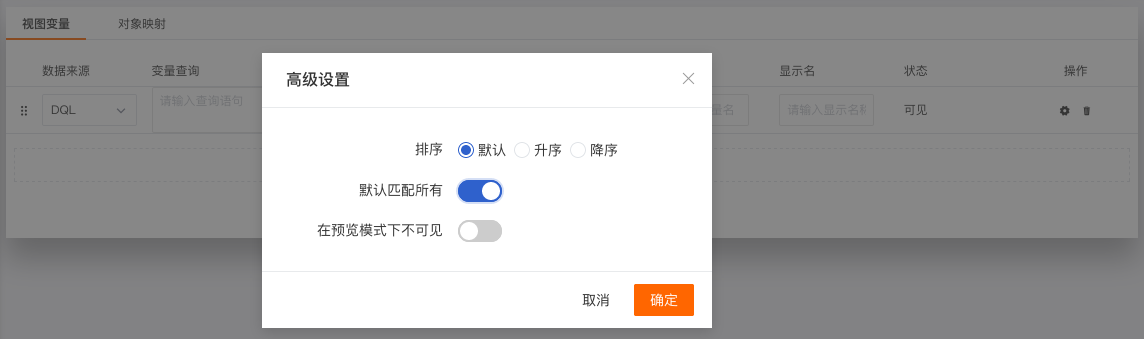
After enabling, you can view comprehensive views of all hosts via *, and manually select variables to filter and view.
Optimized Explorer
- When single-column information display is incomplete, mouse hover delays 1s before displaying full prompt information.
- When searching for key content in the Explorer, matched content in the list is highlighted.
- Detail page tags support copy function; host tags support [View Related Logs] [View Related Containers] [View Related Processes] [View Related Links] [View Related Inspections].
- Log, APM, user access monitoring, cloud testing, security check Explorer statistical charts changed to status statistics.
- Added help links for enabling user performance monitoring, user access monitoring, security check.
May 20, 2021
DataFlux Studio
Added Save Snapshot
DataFlux snapshots support creating snapshots for infrastructure, logs, events, APM, user access monitoring, cloud testing, and security check Explorers. Through snapshots, you can quickly view and analyze data and anomalies from different time periods and with different tags.
Added Infrastructure Host Integration Interaction
The "Integration Operation Status" of infrastructure hosts displays the operation status of collectors related to the host. There are two statuses: normally operating integrations and integrations with errors. Normally operating integrations are displayed as 'light blue' by default. Integrations with errors are displayed as 'red' by default and support clicking to view error information.
Simultaneously, by clicking integrations with built-in view symbols (as shown below), supports "View Monitoring View". Click to view the corresponding built-in view.
Added Self-built Nodes, Optimized Cloud Testing Node Display
"Cloud Testing" supports custom cloud testing data collection via the DataFlux Studio console. By creating new probe points, you can periodically monitor websites, domains, backend interfaces, etc., based on the HTTP protocol, analyzing site quality anytime, anywhere. DataFlux covers 16 nodes globally, classified by domestic, overseas, and self-built nodes for selection. Simultaneously, supports self-built testing nodes, fully ensuring service availability.
Added Process, APM, and User Access Monitoring Check Rules
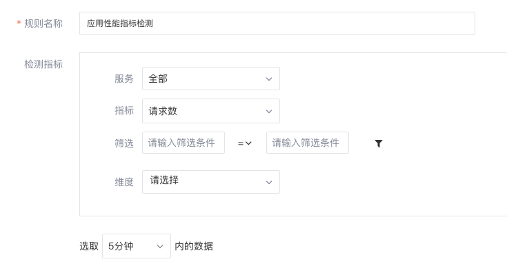
"Process Anomaly Detection" monitors process data within the workspace, supports setting trigger alerts for one or more field types of process data. For example: you can set alerts based on the number of occurrences where the 'host' field in process data is 'izaqbin' and the 'state' field is 'sleep'.

"User Access Metric Detection" monitors metric data of "User Access Monitoring" within the workspace. By setting threshold ranges, alerts are triggered when metrics reach thresholds. Supports setting alerts for single metrics and custom alert levels.
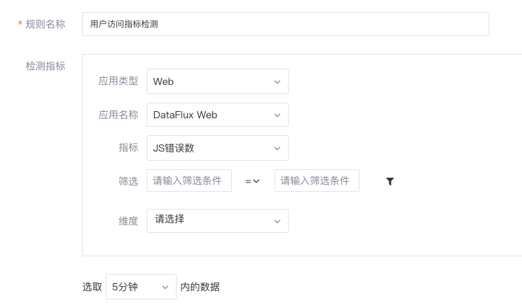
"APM Metric Detection" monitors metric data of "APM" within the workspace. By setting threshold ranges, alerts are triggered when metrics reach thresholds. Supports setting alerts for single metrics and custom alert levels.
Optimized Integration
Log into the DataFlux workspace, enter the "Integration" page to view all supported collectors. Simultaneously, click "Quickly get DataKit installation command" in the upper right to directly obtain DataKit installation commands for installation. After installation, more collectors can be enabled to collect data metrics.
Optimized Log Generate Metrics
Log generate metrics added selecting log source. You can generate metrics by selecting log source, filtering logs, configuring dimensions, aggregation frequency, defining measurement, metric name, and aggregation rules. [Learn more about log generate metrics]

Optimized Log Explorer
After log data is collected into DataFlux, you can view all log sources and their content in the DataFlux Studio console "Logs". Supports selecting log sources to view via search.
Optimized User Access Monitoring Explorer
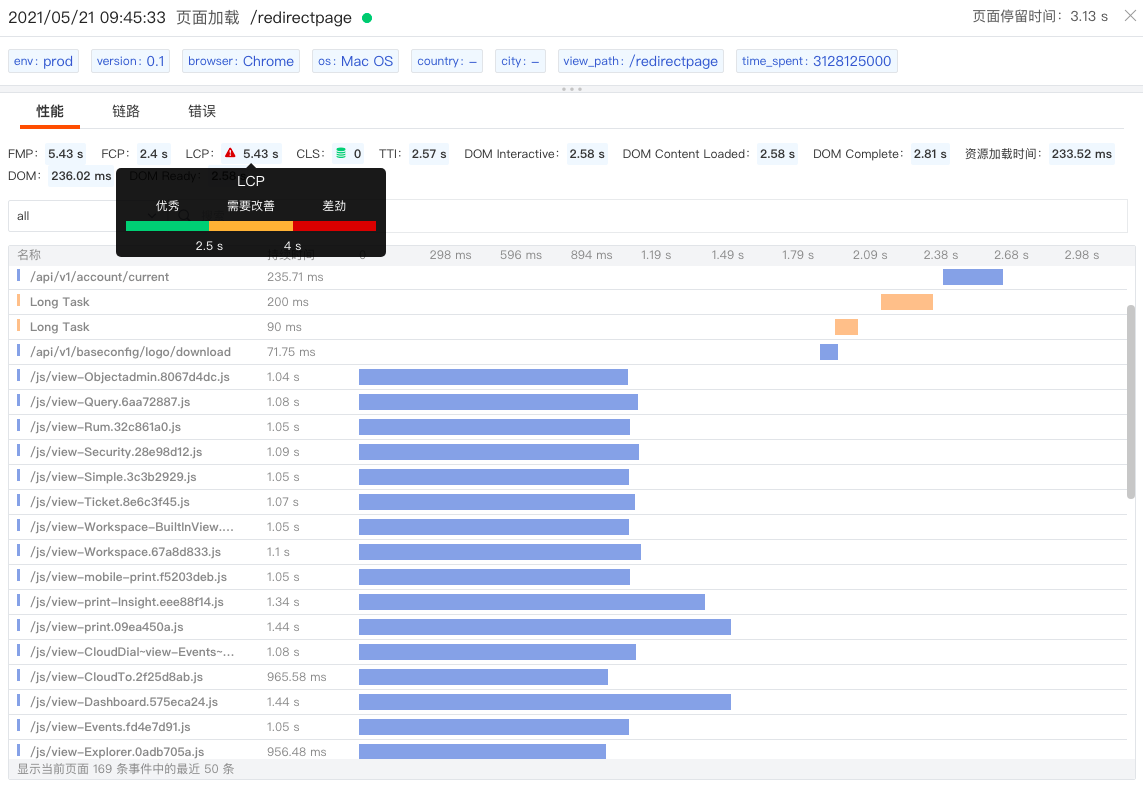
In the user access monitoring detail page "Performance", you can view front-end page performance, including page loading time, content drawing time, interaction time, input delay, etc. Taking the figure below as an example, the LCP (Largest Contentful Paint) metric reached 5.43 seconds, while the recommended time is within 2.5 seconds, indicating slow page loading speed requiring optimization. Supports filtering and searching, helping users quickly locate resources and content.
Switch to "Links" to view requests sent to backend applications, including resource call occurrence time, content, and duration. For example: you can view each ajax request returned via the xhr object.
Switch to "Errors" to quickly locate front-end errors through error occurrence details, including error message, error type, and occurrence time.
Optimized Built-in Views
Built-in views are divided into system views and user views, applicable in scenarios.
System views are view templates provided by the system with integrations, supporting modification, export, and restore. Users can directly "Export" system views or "Modify" system views. By "Restoring" system views, modified system views can be converted back to original system views. Restoration cannot be undone.
User views are views saved as templates after user customization, supporting modification, export, and deletion. In "Built-in Views" - "User Views", by clicking "Create User View", you can create user-custom view templates. Specific configurations can refer to Scenarios and Views.
Optimized Chart Lock Time Optimization
Dashboard views support locking chart time ranges,不受 global time widget restrictions. After successful setting, the upper right of the chart displays the user-set time, such as "xx minutes", "xx hours", "xx days".
Optimized Nested Functions
All chart component nested functions optimized to built-in functions, no longer calling DataFlux Func functions, implemented via DQL. Removed nested function time interval options.
May 7, 2021
DataFlux Studio
Added Log Backup
DataFlux basic logs are stored for up to 60 days. If longer storage and viewing are needed, basic logs need to be backed up. DataFlux supports backing up logs for storage up to 720 days.
Enter the "Logs" - "Backup Logs" page, data is empty by default. Select a time range to view corresponding backup logs. DataFlux supports querying and analyzing logs by selecting time ranges, searching keywords, filtering, etc. Click a log to view its details including log generation time and content.

Added Security Check
DataFlux supports timely monitoring, querying, and associating all inspection events through "Security Check". While promptly discovering vulnerabilities, anomalies, and risks, it helps improve inspection quality, problem analysis, and problem handling capabilities.
Before starting security checks, you need to install [DataKit] and [security-checker]. After configuration, enter "Security Check" and query and analyze by selecting time ranges, searching keywords, filtering, etc.
Added New User Guide
Upon first registering and logging into DataFlux, you can start using DataFlux via the new user guide. Following the guide steps, users can complete datakit installation, nginx data collection, and view corresponding data in logs. After closing the guide, you can reopen it by clicking the workspace user name - "New User Guide".
Added Bar Chart Group Stacked Display
Chart Stacked Bar Chart
Bar charts support [Metric Stack] and [Group Stack], off by default. When enabled, [Metric Stack] is selected by default. The right side shows "Method" options, including default, percentage.
- Metric Stack: Stacks and compares grouped tag data with metrics as the dimension.
- Group Stack: Stacks and compares metric data with grouped tags as the dimension.
Event Explorer Stacked Bar Chart
DataFlux supports viewing statistics of events occurring at different time points and in different states via bar chart stacking.
Added Tencent Cloud, AWS Cloud Host Details
If the host is a cloud host and "Cloud Association" is configured, clicking the host name in the list slides out to view "Cloud Vendor Information" of the cloud host object, including cloud platform, instance name, instance ID, instance specification, region, availability zone, creation time, network type, payment type, IP address, etc.
Added Host Operation Status Integration
Host integration operation status has three statuses: normally operating integrations, normally operating integrations with built-in monitoring views, and integrations with errors:
- Normally operating integrations: clicking has no response.
- Integrations with built-in monitoring views: clicking drops down "View Monitoring View", click to view the corresponding monitoring view.

- Integrations with errors: clicking allows viewing the last error feedback message.

Added Correlation Analysis Built-in Pages
- Infrastructure hosts added process and container built-in pages.
- Logs added process and link built-in pages.
- Links added host monitoring view and log built-in pages.
Optimized APM Topology Chart
In the "APM" "Service" list, you can switch the list to topology chart mode to view call relationships between various services.
- Added selecting time range via timeline.
- Added topology chart zoom in/out; when zoomed in, a small thumbnail can be viewed in the lower left.
- Added three node size dimensions.
- Added highlighting the corresponding service when selected, other services and connection lines turn gray.

Optimized Operation Events and Notification Events
- Operation events moved to "Management" - "Basic Settings" - "Security Audit", click "View" to see operation security events.
- Notification events moved to the left menu "Notifications", click "Notifications" to view all notification events.
Optimized Billing Usage Statistics Views
- Billing usage statistics views added log backup statistics.
April 15, 2021
DataFlux Studio
Enabled New DataFlux Logo
Adopting a robot brain approach, not only has a strong technological sense, highlighting DataFlux's powerful capabilities in massive data integration, processing, and analysis, but also like a robot, it can be real-time, fast, and infinitely scalable, providing easy-to-use, flexible, and diverse visual charts for data analysis, business operation analysis, etc., improving operational efficiency.

Added Cloud Testing
DataFlux provides an out-of-the-box cloud testing solution for users, supports HTTP protocol testing, utilizes a global monitoring network, end-to-end tracking of webpage and application performance, etc., records all testing real-time feedback information, provides DNS, SSL, TTFB, and other performance test results, helping you discover problems in advance, locate problems, and improve user experience.
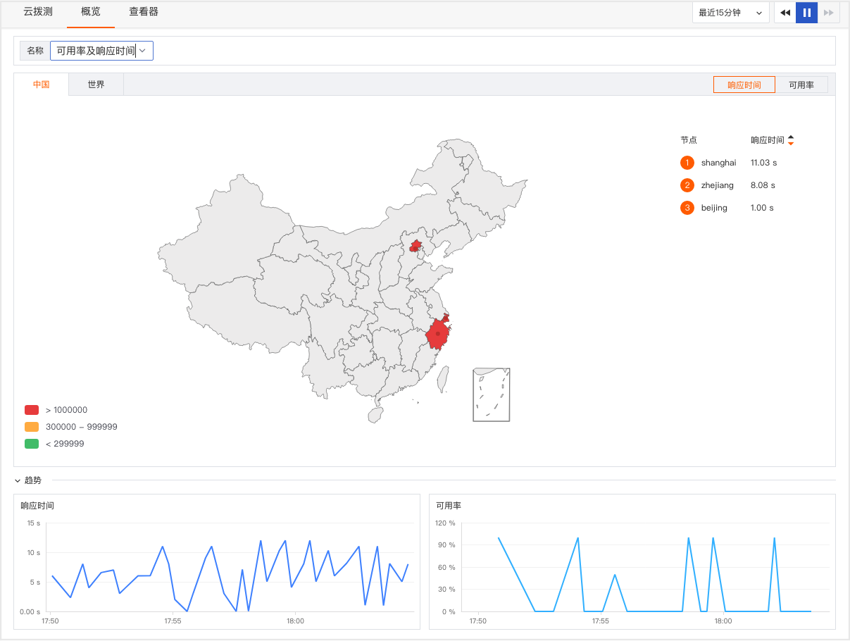
DataFlux cloud testing supports analyzing response time and availability of current testing tasks from geographical and trend dimensions.
Added Container Object Distribution Chart
[Container Object] added honeycomb distribution chart. On the container list page, click the icon on the left of the list to switch to container distribution chart display. Through the distribution chart, you can visually query container distribution information. The distribution chart supports the following functions:
- Search: Input search keywords.
- Filter: Filter tags and select filtering objects, multiple selections possible.
- Group: Group display objects, multiple selections possible.
- Fill: Select the metric for filling. The metric value size determines the fill legend color.
- Fill Rule: Fill legend colors according to fill metric results. Divide the metric's maximum and minimum values into five equal parts,得到5 intervals, corresponding to five colors respectively.
Added Alibaba Cloud Cloud Host Details
If the host is a cloud host and "Cloud Association" is configured, clicking the host name in the list slides out to view "Cloud Vendor Information" of the cloud host object, including cloud platform, instance name, instance ID, instance specification, region, availability zone, creation time, network type, payment type, IP address, etc.
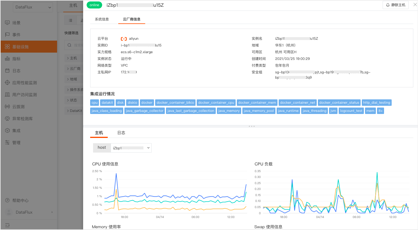
Added Table Chart Metric Sorting
Table charts support metric sorting, sorted by the first query's metric by default. Clicking the header switches ascending/descending order, corresponding Top/Bottom in the query synchronously adjusts. Clicking other query metrics for sorting, corresponding Top/Bottom in the query synchronously adjusts.
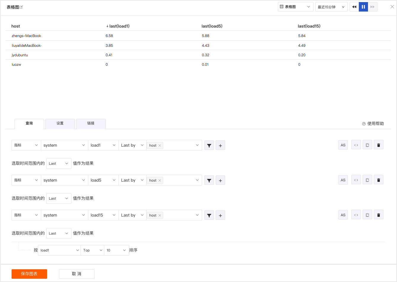
Added Link Quick Filter Option "Duration"
- Default progress bar minimum and maximum values are the minimum and maximum durations in the [Link] data list.
- Supports dragging the progress bar to adjust max/min values, input box values change synchronously.
- Supports manually inputting max/min values, "press Enter" or "click outside input box" to perform filter search.
- Input turns red when不规范, no search performed. Correct format: pure "number" or "number+ns/μs/ms/s/min".
- If no unit is entered for search, "s" is directly appended to the input number for filter search by default.
- If a unit is manually entered, search is performed directly.
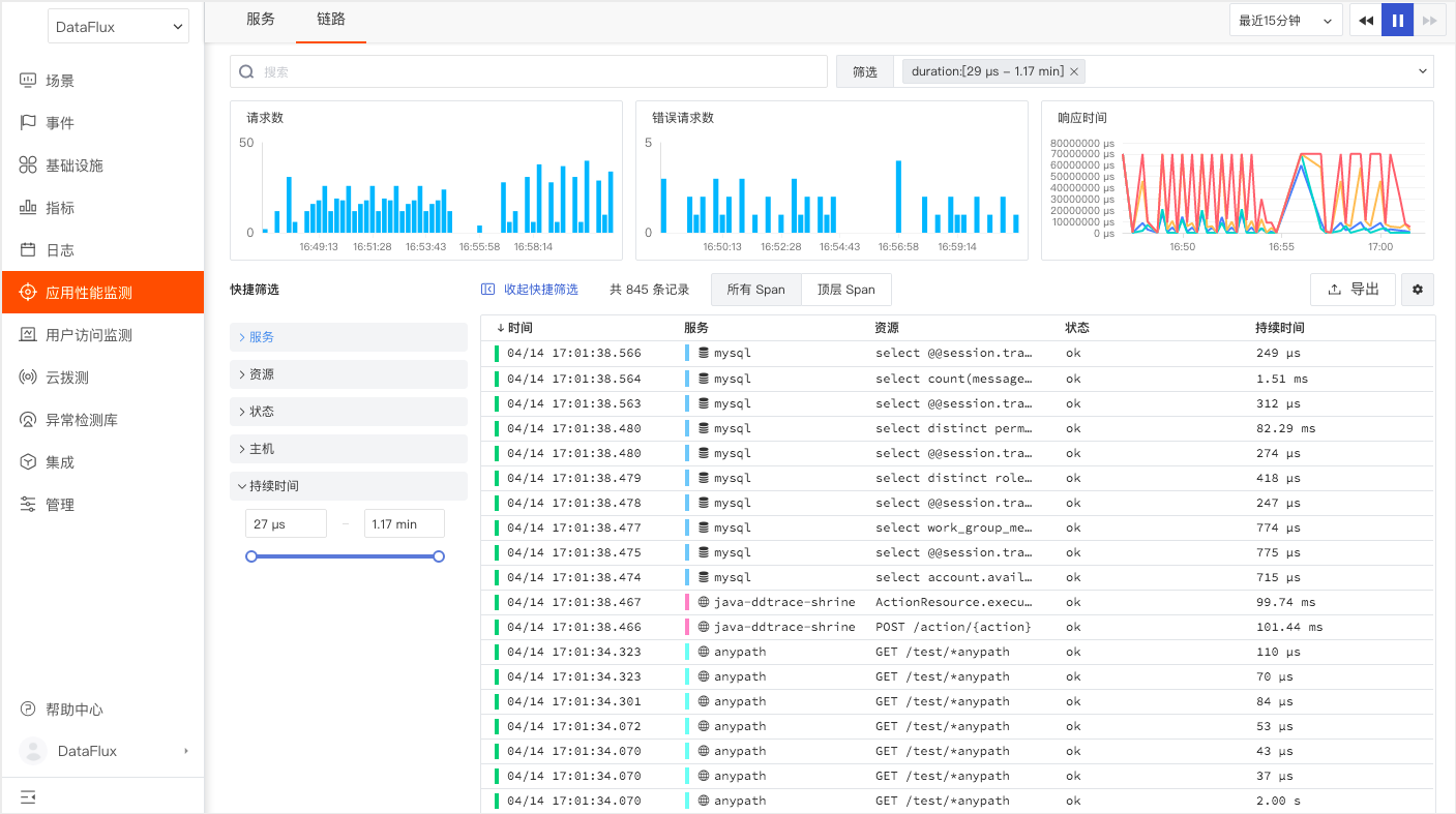
Added Email Group
Added email group notification target in [Notification Targets] management. Email groups can add multiple members simultaneously. After adding, select the email group in the anomaly detection library's "Alert Settings", and alert emails will be sent to added member mailboxes simultaneously.
Optimized Anomaly Detection Library
DataFlux includes various built-in detection libraries, out-of-the-box. Supports host and other built-in detection libraries. After enabling, you can receive related anomaly event alerts.
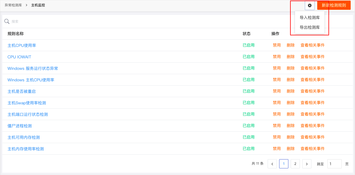
Supports "Import/Export Detection Library" in "Detection Library". After configuring all detection rules, you can export the detection library via JSON file. The exported detection library can be imported into other detection libraries. Importing verifies duplicate-named detection items, allowing "Replace" or "Skip".
Optimized Object Explorer and Details
- Host objects added operating system small icon display.
- Container objects added container type small icon display.
- Process slide-out detail page added display "Start Time".
Optimized Data Storage Policy, Billing, and Bills
- Workspace management basic information added change data storage policy.
- Workspace management usage statistics optimized to billing and bills.
April 7, 2021
DataFlux Studio
Added View Variable Object Mapping
When using "Object Mapping", you must first define a view variable based on an object class field. After configuring object mapping in "View Variables", you need to use the mapped tag field as grouping in "Chart Query", enable "Field Mapping" in "Chart Settings", then you can view the set object mapping display in the view chart.
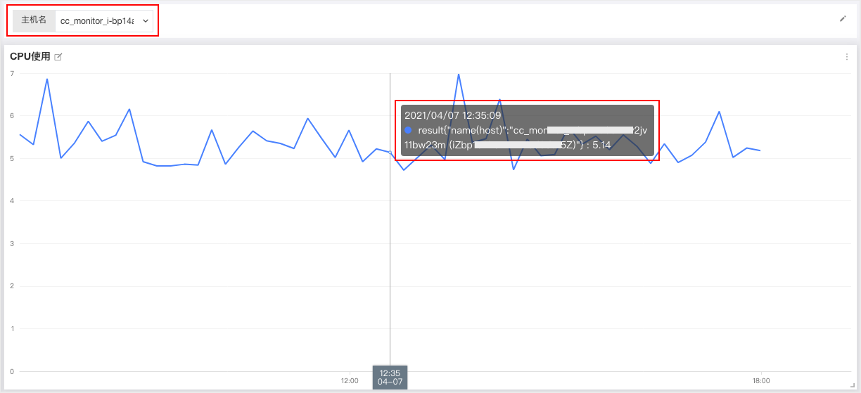
Optimized Event Grouping
DataFlux supports "Anomaly Events" grouping and aggregating related events by "Detection Item". Click to view "Aggregated Events" to quickly view associated event lists, anomaly event status distributions on different hosts, and metric monitoring, etc. Anomaly event status distribution includes critical, error, warning, ok, and Mute, corresponding to five status colors. Background is green, filled with corresponding status colors backward from the event occurrence time point. Fill range is the detection frequency. When grouping contains host and host mute is set, mute time range displays as gray.
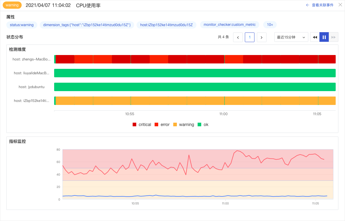
Optimized Detection Item Query
"Detection Rules" "Detection Metrics" in "Anomaly Detection Library" only allow adding one query, adds Simple Query by default. Supports switching between Simple Query and "Expression Query". Unified changing "Detection Rules" "Trigger Conditions" M1 to Result. Supports adding AS alias for queries.

DataKit (v1.1.4-rc2)
- Fixed issue where Alibaba Cloud monitoring data collector (aliyuncms)频繁采集 causing some other collectors to freeze.
March 25, 2021
DataFlux Studio
Added Cloud Service Association
DataFlux supports centrally managing AccessKey information of cloud service accounts through "Cloud Association". After configuration, you can regularly synchronize cloud host information under the associated cloud account in [Infrastructure-Hosts], displaying all cloud host information such as CPU, memory, network, disk, etc.

If association is no longer needed, you can delete the associated Alibaba Cloud RAM sub-account AK information. After deleting association information, association invalidation notification events are triggered, viewable in Events-Notification Events. More details on cloud association can be found in the document Cloud Association.

Added Operation Event Audit
DataFlux supports security audit of workspace operation events. Operation events are uniformly stored in Events - "Operation Events".

Added Host Mute
If operations like stress testing on a single cloud host trigger frequent alerts, you can temporarily enable the host mute function for such alert notifications. In "Infrastructure" - "Hosts", click the cloud host details to select host mute time.

All muted host lists can be viewed in "Anomaly Detection Library" - "Host Mute Management". After deleting a muted host, you can receive alert notifications for the corresponding host again.

Added Notification Target: WeCom Robot
DataFlux supports users managing alert notification targets. Currently supports adding email, DingTalk robot, WeCom robot, and Webhook custom.
Optimized Event Explorer, Added Event Grouping Aggregation View
In the event list Explorer, through the grouping function, DataFlux supports quickly aggregating and counting related events based on grouping tags. For example, in "Anomaly Events", based on "Detection Item" grouping, you can quickly obtain all events triggered by that detection item. By switching the aggregated event list, you can view details of these events.

Optimized Link Service Filtering and Topology Chart
In the "APM" "Service" list, supports switching the list to topology chart mode to view call relationships between various services. Supports filtering display via different performance metrics, and customizing link service performance metric color ranges.

Other Optimized Features
- Optimized logs, events, infrastructure, APM, user access detection Explorer search and export, added export to view. Optimized logs, events, links, infrastructure-containers, infrastructure-processes detail page tag filtering, associated query analysis.
- Optimized time widget, optimized single query charts (overview chart, gauge, top list) simple query and expression query switching under scenario views.
- Optimized host offline display: When host is offline status, CPU usage rate, MEM usage rate, load are not displayed, values filled as " - ".
- Optimized anomaly detection library detection rules, added level detection, range detection, and mutation detection.
DataKit (v1.1.4-rc1)
- Process collector message field added more information for full-text search.
- Host object collector supports custom tags for cloud attribute synchronization.
DataKit (v1.1.4-rc0)
- Added file collector, testing collector, and HTTP packet collector.
- Built-in support for ActiveMQ/Kafka/RabbitMQ/gin (Gin HTTP access log)/Zap (third-party log framework) log cutting.
- Enriched [http://localhost:9529/stats] page statistical information, added诸如 collection frequency (n/min), each collection data size, etc.
- DataKit itself added certain cache space (lost upon restart), avoiding occasional network reasons causing data loss.
- Improved Pipeline date conversion function,提升 accuracy. Additionally added more Pipeline functions (parse_duration()/parse_date()).
- Trace data added more business fields (project/env/version/http_method/http_status_code).
- Other collectors various detail improvements.
March 4, 2021
DataFlux Studio
1. Optimized Time Series Chart, Bar Chart, Top List, Log Stream Chart, Alert Statistics Chart, Object List Chart
- Time Series Chart: Added "Display Density", including "Lower: 60 points", "Low: 180 points", "Medium: 360 points", "High: 720 points". Added "Stacked Display", only supports bar charts, off by default.
- Top List: Chart display optimized.
- Bar Chart: Chart display optimized.
- Log Stream Chart: Added search box, supports searching message content.
- Alert Statistics Chart: Query display optimized.
- Object List Chart: Query display optimized.
2. Added Automatic Unit Conversion
- Default query result values automatically convert units following "Scientific notation K, M, B",保留两位小数点 (1 thousand = 1K, 1 million = 1M, 1 billion = 1B).
- RMB automatically converts units "Yuan, Ten Thousand, Hundred Million",保留两位小数点.
- After setting unit,取消 scientific notation, display according to user-set unit.
3. Added Object Management
DataFlux supports users managing alert notification targets. Currently supports adding DingTalk robot notification configuration and Webhook custom notification configuration.

4. Adjusted Events, Logs, Link Tracing, Application Monitoring, Object Hosts, Object Containers, Object Processes, Object Other Explorers, supports exporting CSV documents, maximum supports exporting the most recent 5000 data entries.
- Events
DataFlux supports collecting all event data generated based on the "Anomaly Detection Library". Users can view and search all event data within the workspace on the Events page.

- Object Hosts
DataFlux supports collecting object host data. In the "Objects" host list, you can view and search all host object data information.

Clicking the host name in the list slides out the detail page to view detailed information of the host object, including basic information, CPU, memory, network, hard disk, etc.

- Object Containers
DataFlux supports collecting object container data. In the "Objects" container list, you can view and search all container object data information. Clicking the container name in the list slides out the detail page to view detailed information of the container object.

- Object Processes
DataFlux supports collecting object process data. In the "Objects" process list, you can view and search all process object data information. Clicking the process name in the list slides out the detail page to view detailed information of the process object.

- Object Other
DataFlux supports collecting object other data, such as Alibaba Cloud ECS, etc. In the "Objects" other list, you can view and search all other object data information. Clicking the other object name in the list slides out the detail page to view detailed information of the other object.

- Logs
DataFlux supports collecting various format log data, including system logs, Nginx logs, Apache logs, and multiple other log data, quickly viewing and analyzing all log data in the current workspace.

- Link Tracing
DataFlux supports viewing link services and link lists in "Link Tracing". In the service list, you can view or search all services receiving link data. In the link list, you can query link data, export link data, view link details, and perform full analysis of link performance through flame charts, span lists, etc.
DataFlux simultaneously supports light and dark theme display, here using dark as an example.
Service List

Link Topology

Link List

Flame Chart

- Application Monitoring
DataFlux supports collecting Web, Android, iOS, and mini-program application data, and provides application monitoring scenarios to quickly view and analyze application status. Taking Web application as an example:
Web Application Explorer

Web Application Details

February 2, 2021
DataFlux Studio
- Added time series chart style area chart.
- Added object hosts, containers, processes, added host honeycomb chart.
- Optimized anomaly detection, added built-in detection library.
- Optimized events, objects, logs, links, application Explorers and page functions.
- Optimized log stream chart chart query.
- Optimized top list, gauge, overview chart chart queries, added expression query mode.
- Optimized visual chart queries, simple query and DQL query support mutual switching.
- Optimized grouping logic, including scatter plots, bubble charts, maps, honeycomb charts, table charts.
- Optimized filter conditions support real-time filtering.
DataKit
- Added host object data collection.
- Added container object data collection.
- Added process object data collection.
January 14, 2021
DataFlux Studio
- Added Explorer layout, optimized data structure, supports object/link/RUM/logs and other module query/analysis.
- Added mini-program application monitoring.
- Added time series chart, chart type can choose line chart or bar chart.
- Adjusted chart UI.
- Adjusted log stream chart chart query and settings.
- Optimized bar chart, top list, table chart related settings.
- Threshold detection adjusted to DQL UI query mode.