Service Map
On the Service Map page, you can intuitively view the invocation relationships between services through the topology diagram.
Workspace Scope
When entering the Service Map page, the system only displays service nodes and invocation relationships within the current workspace by default. Without cross-workspace authorization configured, service nodes, invocation edges, and metric data from other workspaces are not visible.
If the current workspace has been authorized to access data from other workspaces, you can switch the viewing dimension using the workspace scope selector at the top of the page:
- Current Workspace: Only displays the service topology of the current workspace (default option);
- All Workspaces: Displays the service topology of the current workspace and all accessible workspaces;
- Authorized Workspaces: Multi-select specific authorized workspaces to view their service topology.
Search, filtering, service count statistics, node colors, and topology metrics on the page are all calculated in real-time based on the currently selected workspace scope. If the current workspace has no cross-workspace authorization, other workspace options will not be displayed on the page.
Note
The default delay for current service topology data is 5 minutes. Support for adjusting the max_delay parameter within a range of 1 to 5 minutes (minute granularity) is available (❗️Only for Deployment Plan users). You can flexibly set it according to your business real-time requirements.
-
SaaS Commercial Plan configures data visibility scope through cross-workspace authorization. Only workspace owners, administrators, or roles with cross-workspace authorization management permissions can configure this. After authorization takes effect, the authorized workspace can view the corresponding data in ServiceMap; after authorization is revoked, the corresponding workspace will immediately lose the ability to view the ServiceMap data from the source workspace;
-
Deployment Plan configures data visibility scope through the site dimension.
Single Service
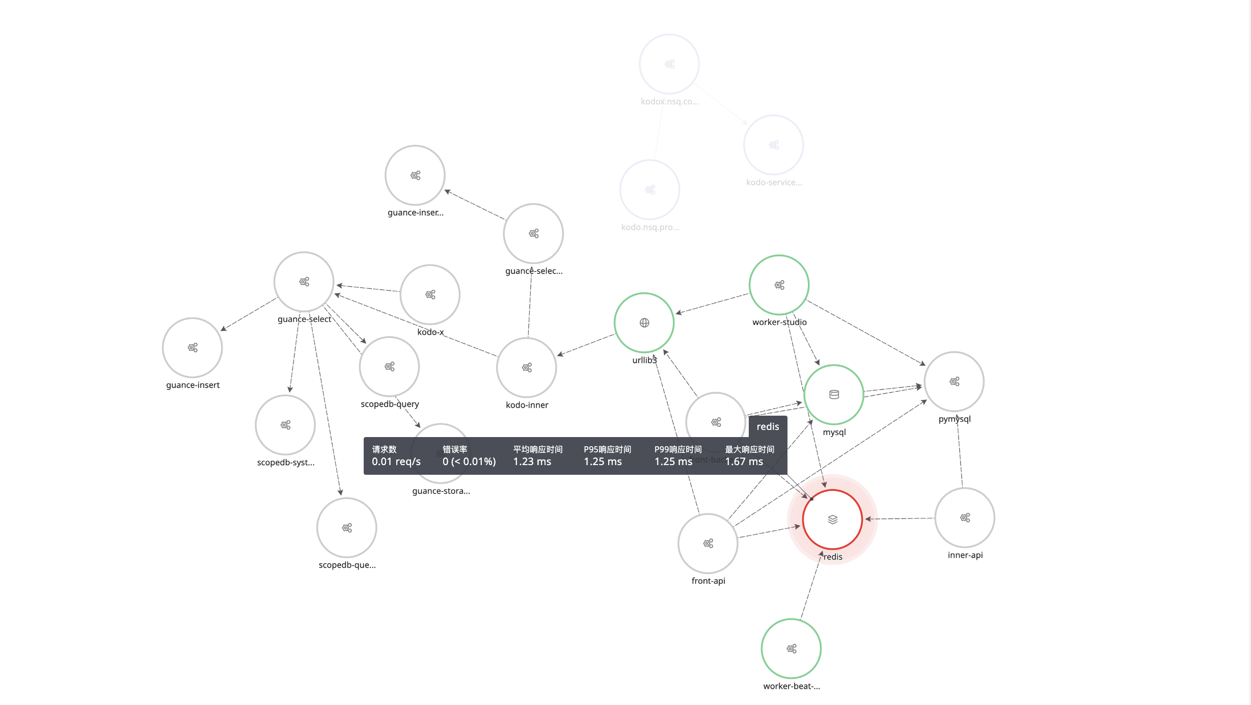
Hovering over a single service node highlights that service, while other unrelated services and connection lines turn gray. You can view key metric data for that service, such as request count, error rate, average response time, P99/P95 response times, and maximum response time.
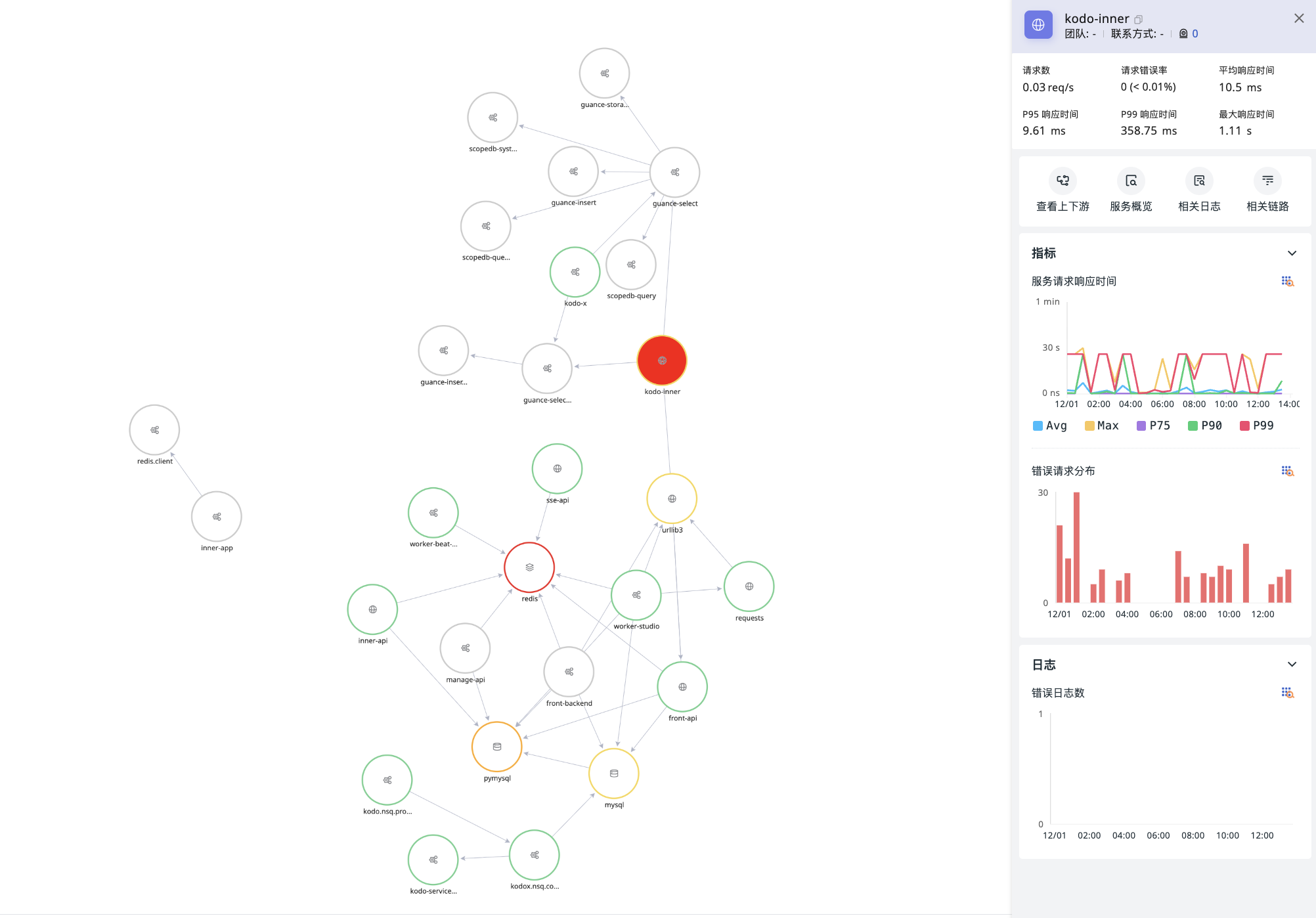
View Service Details
On the default open page, besides intuitively displaying the invocation relationships between services within the currently selected workspace scope, clicking on any service node slides out a panel to view detailed information about that service. It mainly includes the following elements:
- Service name, etc., and its corresponding team, contact information, alert count, etc.;
- Basic metrics for the current service: request count, error rate, average response time, P99/P95 response times, and maximum response time;
- Click to view the upstream/downstream of the current service, service overview, and associated logs and traces;
- Anomaly trend charts for metrics (service request response time, error request distribution) and logs (error log count).
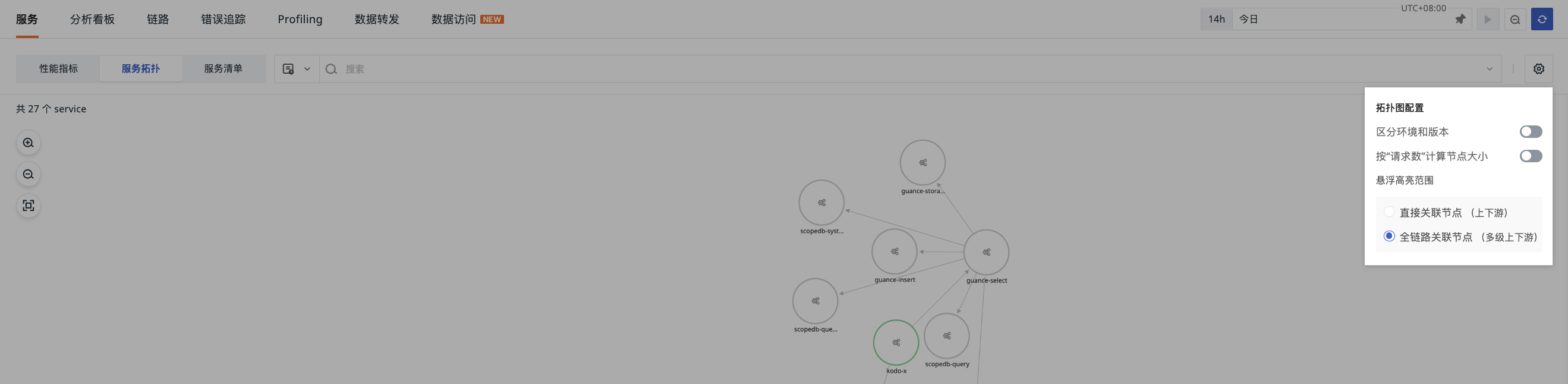
Manage Topology
-
Zoom in, zoom out, or fully display the current service topology;
-
Support for selecting different performance metrics to match service node colors, including request count, P50/P75/P95/P99 response times, maximum response time, and error rate;
-
Customize Colors: Set the color range for the selected "Fill Metric" for service nodes.
-
Customize Intervals: Customize the color interval range for the selected Fill Metric for service nodes. The system will automatically divide into 5 numerical intervals based on the maximum and minimum values of the selected metric within this topology, with each interval corresponding to a color;
- Node Size: There are 3 sizes for nodes. The maximum (Max) and minimum (Min) values of requests per second for the service are divided into three equal parts, resulting in three intervals corresponding to 3 graphic sizes.
Note
When the requests per second is less than 0.01, the interface display value will be uniformly marked as < 0.01. However, please note that the node size calculation is still based on the actual numerical value.
-
Topology Diagram Configuration:
- Distinguish Environment and Version: Draw the trace topology diagram based on two dimensions: service (
service) and service environment version (service+env+version). When enabled, the system will draw the service topology diagram according to different environment versions; - Whether to calculate node size based on "Request Count";
- Select Hover Highlight Range: Directly associated nodes (upstream/downstream) / Full-link associated nodes (multi-level upstream/downstream).
- Only Show Services Matching Filter Conditions: When enabled, the service topology will filter service nodes based on the current filter conditions, retaining only nodes that meet the conditions themselves, and hiding nodes that do not meet the conditions.
- Distinguish Environment and Version: Draw the trace topology diagram based on two dimensions: service (
Cross-Workspace Query
Prerequisite
All Commercial Plan workspaces belong to the same Organization ID, i.e., they have the same organization.
If the same Trace data is split and belongs to different workspaces, complete trace data cannot be viewed within a single workspace. Cross-workspace Service Map query ensures the continuity of data query. You can directly click the button in the current workspace to view the upstream/downstream invocation topology of the current service.
Data Source Definitions and DQL Query
For more details, please refer to Service Map Data Source Definitions.