Metrics Analysis
After data is collected and reported to the workspace, you can query and analyze Metrics and other data types on the Metrics > Metrics Analysis page.
Query Modes
Metrics Analysis supports four query modes:
- Simple Query: Visually select the Measurement, metric, and aggregation method.
- Expression Query: Perform secondary calculations based on simple query results.
- PromQL Query: Input native Prometheus query statements.
- Data Source Query: Connect to external data sources.
For more details, refer to Chart Queries.
Query results can be viewed in four visualization modes:
- Area Chart
- Line Chart
- Bar Chart
- Table Chart
Table Chart
In Table Chart mode, four display options are supported:
- Time Series Mode
- Grouping Mode
- Query Tool
- Prom: Returns only PromQL query results.
In the first three display modes, query results return a maximum of 2,000 records by default. To adjust the number of records returned, you can specify the slimit parameter, with a maximum of 10,000 data records.
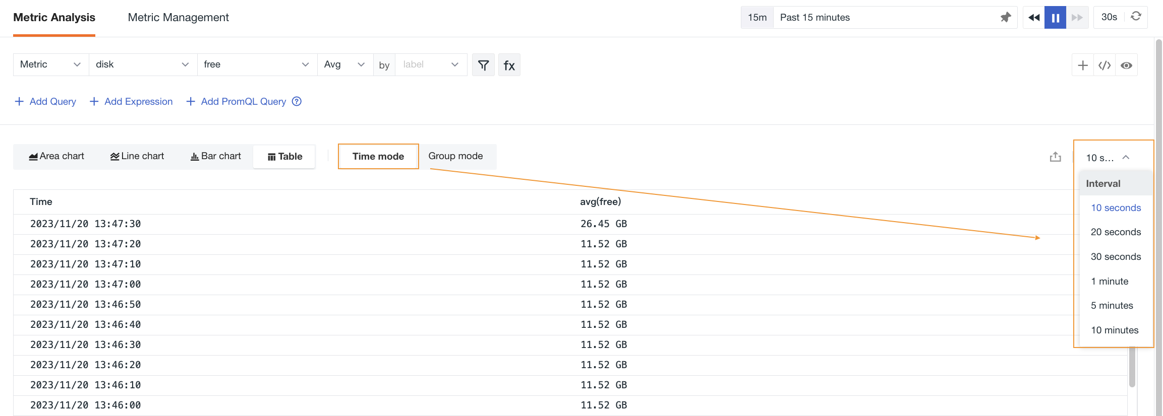
In Time Series Mode, you can display query data by selecting different time intervals.
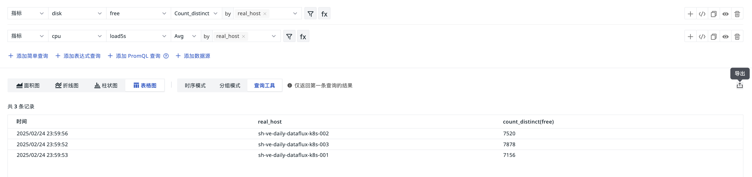
The results returned by the "Query Tool" are consistent with those in "Shortcut > Query Tool". If you add multiple queries and enable status, the results of the first query are returned by default; a maximum of 2,000 records can be exported.
Prom mode supports exporting query results. If a time range is specified in the PromQL query statement, all data within that range is displayed, unaffected by the page's Time Widget.
For more information on data queries, refer to Chart Queries and Query Tool.
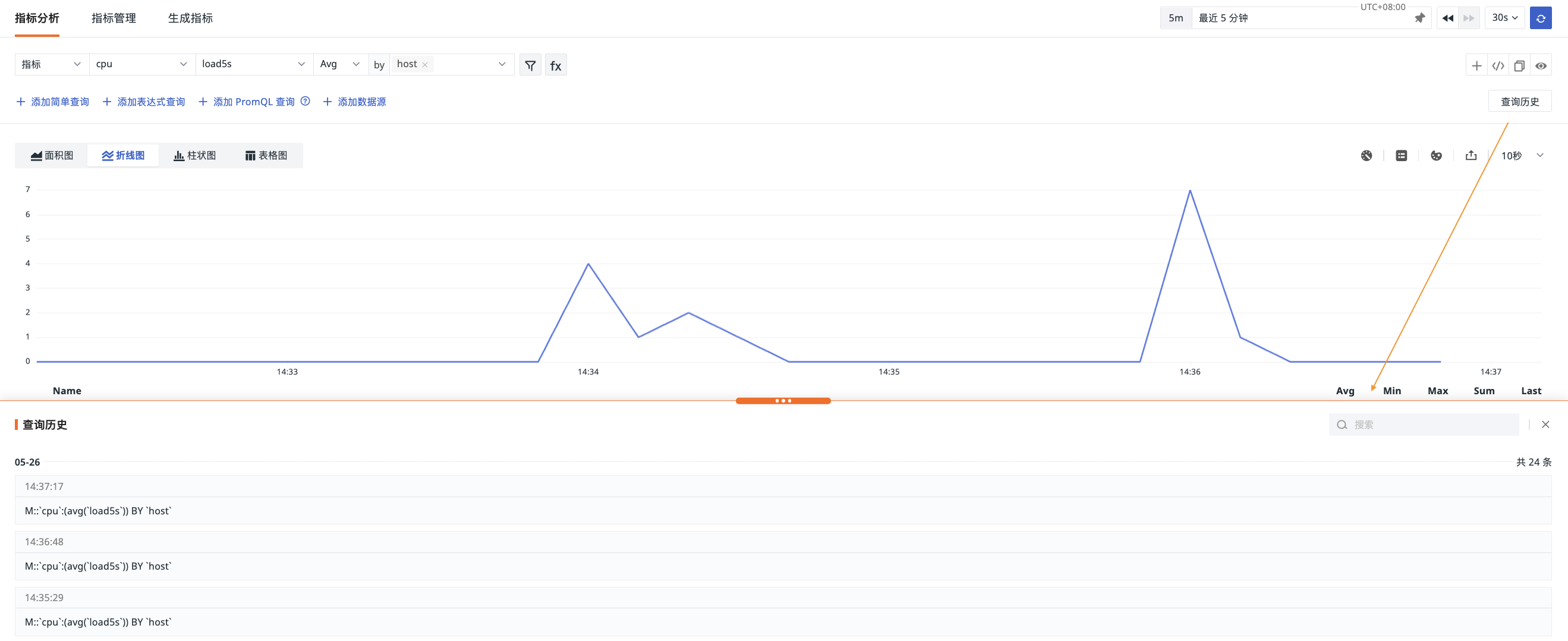
Query History
Through the "Query History" entry, you can view query data from the past week, including query statements and their corresponding times.
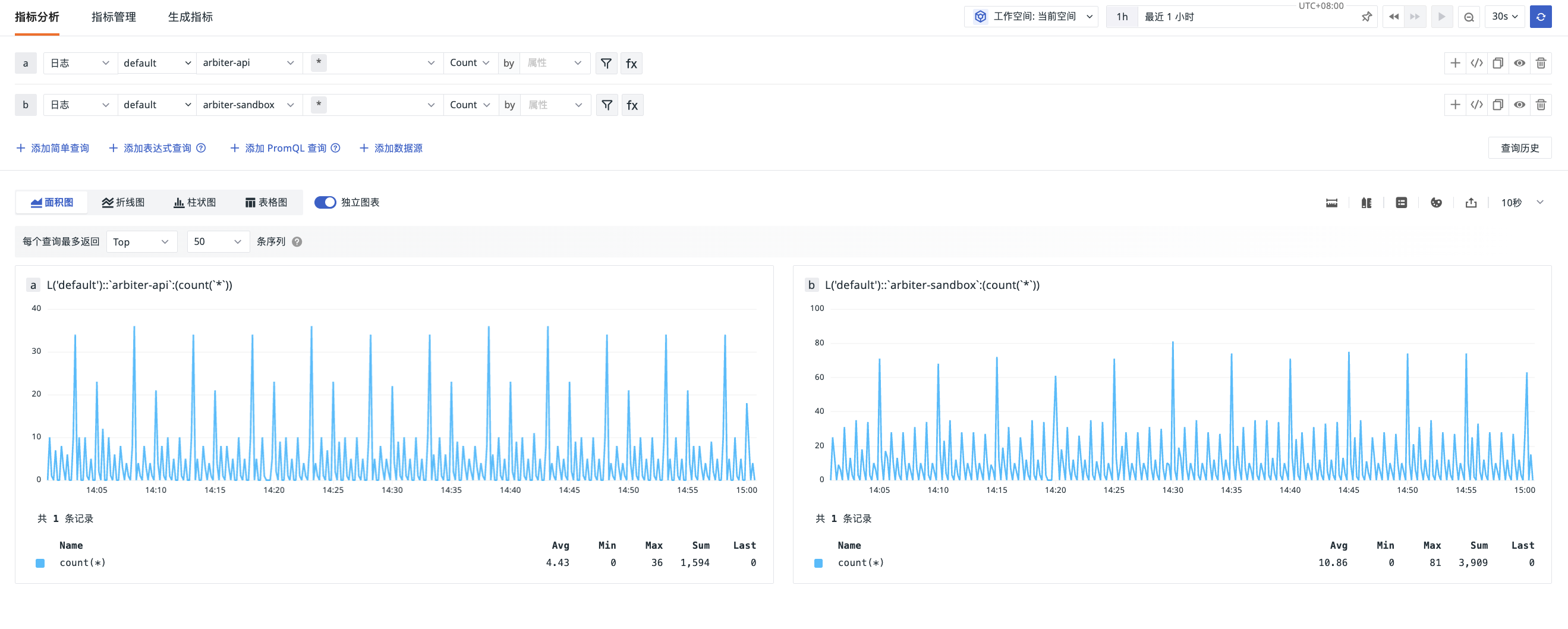
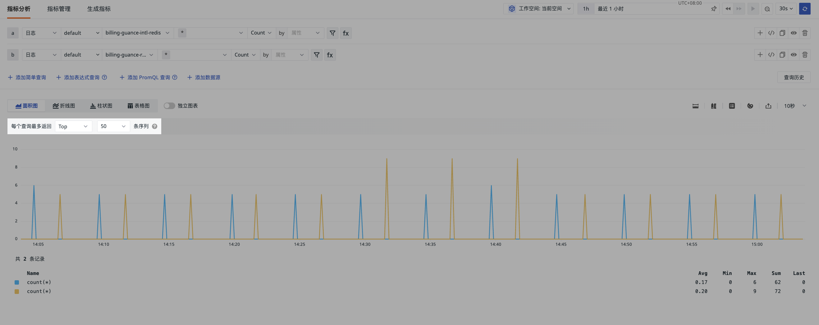
Independent Charts
Note
The independent chart toggle is automatically hidden when there is only one query statement.
When you have added multiple queries simultaneously and the units of the query results are inconsistent, you can enable Independent Chart Mode. As shown below:
- Before enabling independent charts:
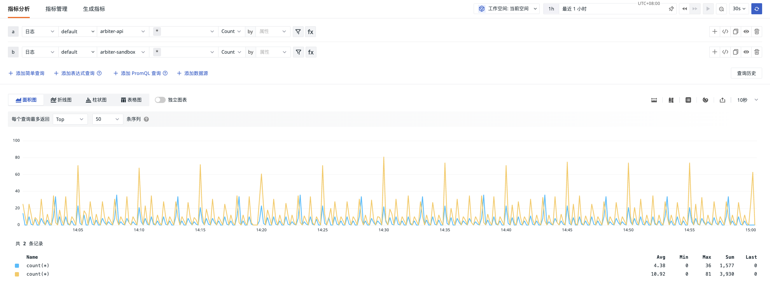
- After enabling independent charts:
Manage Queries
You can manage the Metrics Analysis page through the following operations.
Query Return Quantity Limit
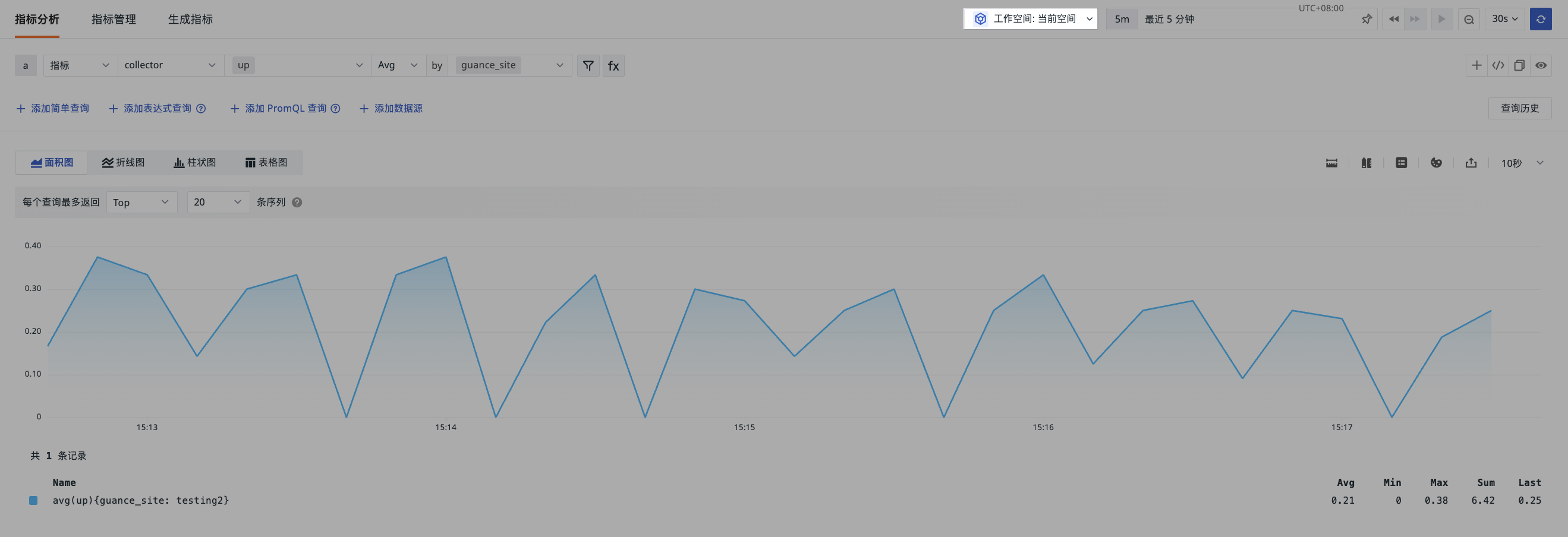
When querying raw data, returning an excessive number of data points can easily cause slow loading of charts such as line charts and area charts, affecting the user experience.
In such cases, you can specify that each query returns a certain number (20/50/100/500) of the largest or smallest sorted data series. The system sorts each series based on its last value within the query time range and returns the Top N or Bottom N results. For example, selecting Top 5 from 20 series will return the 5 series with the largest last-point values.
Note
- This setting only takes effect for area charts, line charts, and bar charts.
- If a
slimitis declared in the query statement, theslimitin the query statement takes precedence.
Cross-Workspace Query
You can perform joint queries across multiple workspaces within the current site, thereby obtaining a complete Metrics view of different businesses or projects under that site for comprehensive analysis and comparison.
Analysis Charts
Clicking on a specific data point in a chart allows you to view Metrics with similar trends, drill down for analysis, or view associated data such as logs, traces, and processes.
For more details, refer to Analysis Charts.
Data Format
The numerical values in query results support flexible display format settings, allowing you to set decimal places:
- 0/1/2/3 decimal places
- Full precision
You can also configure whether to display data based on thousand separators and scientific notation.
Unit
You can configure units for displaying query data.
For specific configuration steps, refer to Units.
Legend
The Legend is an auxiliary element of a chart, used to distinguish data through different colors, points, and shapes. You can use the legend button in the upper right corner of the Explorer to hide the legend or adjust its position to the bottom or right side.
Colors
To better distinguish data trends of different Metrics through colors, you can click the color settings button in the upper right corner of the Explorer to customize and modify the legend colors.
Export
After completing Metrics analysis and obtaining query results, you can click the export button to perform the following operations:
- Export as CSV file
- Export to Notebook
- Export to Dashboard
- Copy to Clipboard
Time Interval
The time interval refers to the length of time between data points in a Time Series Chart. You can use the Time Interval in the upper right corner of the Explorer to set the interval precisely to 10 seconds, 20 seconds, 30 seconds, 1 minute, 5 minutes, or 10 minutes.
The Time Widget affects the data display range in Metrics Analysis, so the available time intervals are automatically adjusted based on the Time Widget's range. For example, if you choose to view Metrics data from the last 15 minutes, you cannot select "1 hour" as the time interval.